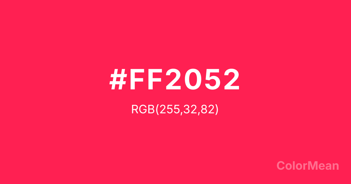
Awesome (#FF2052) Color Information
Awesome (#FF2052) RGB value is (255, 32, 82). The hex color red value is 255, green is 32, and blue is 82. Its HSL format shows a hue of 347°, saturation of 100 percent, and lightness of 56 percent. The CMYK process values are 0 percent, 87 percent, 68 percent, 0 percent.
Awesome (#FF2052) Color Meaning
Awesome (#FF2052) pulses with unfiltered exuberance, digital-native joy, and chromatic confidence. This electric pink-red sits at the edge of screen gamuts—engineered to pop in social feeds and mobile notifications. Psychologically, Awesome (#FF2052) triggers immediate emotional engagement; it’s impossible to ignore and unapologetically bold. Designers use it in gaming interfaces, youth campaigns, and viral content where stopping the scroll is the first goal. Unlike traditional reds tied to danger or passion, Awesome rejects gravity—it’s fun first, meaning later. Spiritually, it represents celebration without occasion: joy as default state. Use Awesome (#FF2052) when your brand thrives on energy, community, and the kind of confidence that doesn’t ask for permission.
Color Conversion
Convert Awesome (#FF2052) across different color models and formats. These conversions help designers work seamlessly between digital and print media, ensuring this color maintains its intended appearance across RGB screens, CMYK printers, and HSL color manipulations.
RGB Values & CMYK Values
RGB Values
CMYK Values
Color Variations
Awesome (#FF2052) harmonies come to life through carefully balanced shades, tints, and tones, giving this color depth and flexibility across light and dark variations. Shades add richness, tints bring an airy softness, and tones soften intensity, making it easy to pair in clean, modern palettes.
Color Harmonies
Awesome (#FF2052) harmonies create beautiful relationships with other colors based on their position on the color wheel. Each harmony type offers unique design possibilities, enabling cohesive and visually appealing color schemes.
Analogous
Colors adjacent on the color wheel (30° apart)
Complementary
Colors opposite on the color wheel (180° apart)
Split Complementary
Three colors using one base hue and the two hues beside its opposite
Triadic
Three colors evenly spaced (120° apart)
Tetradic
Four colors forming a rectangle on the wheel
Square
Four colors evenly spaced (90° apart)
Double Split
Four colors formed from two base hues and the colors next to their opposites
Monochromatic
Variations of a single hue
Contrast Checker
(WCAG 2.1) Test Awesome (#FF2052) for accessibility compliance against white and black backgrounds. Proper contrast ensures this color remains readable and usable for all audiences, meeting WCAG 2.1 standards for both normal and large text applications.
Sample Text
This is how your text will look with these colors.
Large Text (18pt+)
Normal Text
UI Components
Color Blindness Simulator
See how #FF2052 appears to people with different types of color vision deficiencies. These simulations help create more inclusive designs that consider how this color is perceived across various visual abilities.
Normal Vision
protanopia
Note: These simulations are approximations. Actual color vision deficiency varies by individual.
CSS Examples
Background Color
Text Color
Sample Text
Border Color
Box Shadow
Text Shadow
Sample Text
Gradient
Awesome (#FF2052) Color FAQs
Frequently asked questions about Awesome (#FF2052) color meaning, symbolism, and applications. Click on any question to expand detailed answers.
