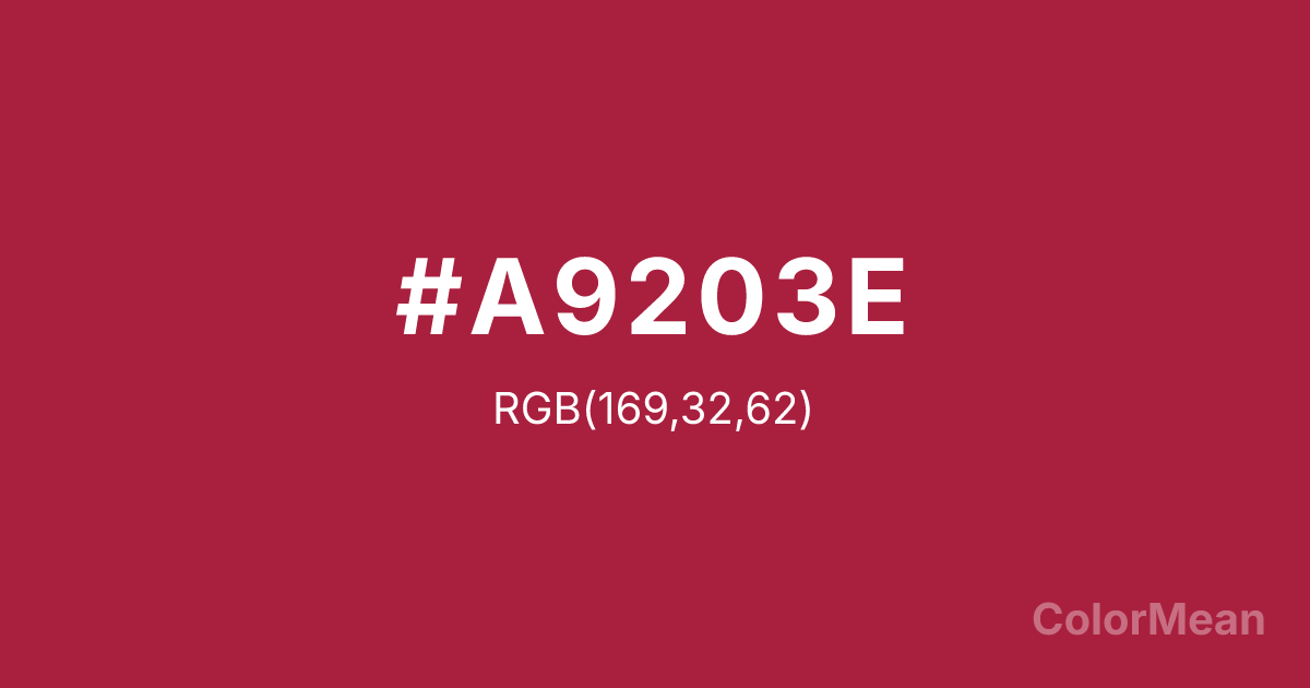
Deep Carmine (#A9203E) Color Information
Deep Carmine (#A9203E) RGB value is (169, 32, 62). The hex color red value is 169, green is 32, and blue is 62. Its HSL format shows a hue of 347°, saturation of 68 percent, and lightness of 39 percent. The CMYK process values are 0 percent, 81 percent, 63 percent, 34 percent.
Deep Carmine (#A9203E) Color Meaning
Deep Carmine (#A9203E) signifies dramatic intensity, historical luxury, and bold substance. This deep, slightly brownish red is the color of the carmine dye, suggesting old master paintings, theatrical curtains, and rich wine. Psychologically, Deep Carmine (#A9203E) evokes a sense of grand drama, matured passion, and weighty, aesthetic importance. It culturally references Renaissance art, luxury velvet, and the solemnity of certain historical uniforms. Spiritually, this color represents passion made permanent, the depth of sensory experience, and desire that has been culturally codified, embodying a rich and historical intensity.
Color Conversion
Convert Deep Carmine (#A9203E) across different color models and formats. These conversions help designers work seamlessly between digital and print media, ensuring this color maintains its intended appearance across RGB screens, CMYK printers, and HSL color manipulations.
RGB Values & CMYK Values
RGB Values
CMYK Values
Color Variations
Deep Carmine (#A9203E) harmonies come to life through carefully balanced shades, tints, and tones, giving this color depth and flexibility across light and dark variations. Shades add richness, tints bring an airy softness, and tones soften intensity, making it easy to pair in clean, modern palettes.
Color Harmonies
Deep Carmine (#A9203E) harmonies create beautiful relationships with other colors based on their position on the color wheel. Each harmony type offers unique design possibilities, enabling cohesive and visually appealing color schemes.
Analogous
Colors adjacent on the color wheel (30° apart)
Complementary
Colors opposite on the color wheel (180° apart)
Split Complementary
Three colors using one base hue and the two hues beside its opposite
Triadic
Three colors evenly spaced (120° apart)
Tetradic
Four colors forming a rectangle on the wheel
Square
Four colors evenly spaced (90° apart)
Double Split
Four colors formed from two base hues and the colors next to their opposites
Monochromatic
Variations of a single hue
Contrast Checker
(WCAG 2.1) Test Deep Carmine (#A9203E) for accessibility compliance against white and black backgrounds. Proper contrast ensures this color remains readable and usable for all audiences, meeting WCAG 2.1 standards for both normal and large text applications.
Sample Text
This is how your text will look with these colors.
Large Text (18pt+)
Normal Text
UI Components
Color Blindness Simulator
See how #A9203E appears to people with different types of color vision deficiencies. These simulations help create more inclusive designs that consider how this color is perceived across various visual abilities.
Normal Vision
protanopia
Note: These simulations are approximations. Actual color vision deficiency varies by individual.
CSS Examples
Background Color
Text Color
Sample Text
Border Color
Box Shadow
Text Shadow
Sample Text
Gradient
Deep Carmine (#A9203E) Color FAQs
Frequently asked questions about Deep Carmine (#A9203E) color meaning, symbolism, and applications. Click on any question to expand detailed answers.
