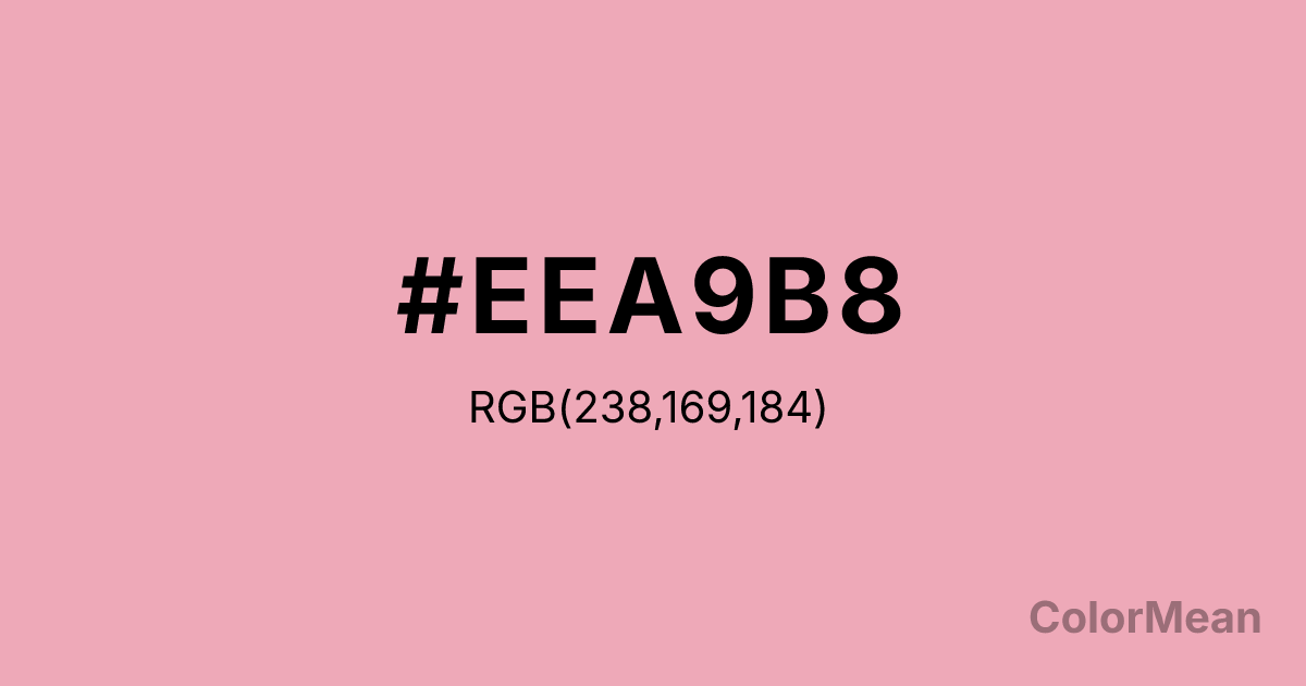
Pink2 (#EEA9B8) Color Information
Pink2 (#EEA9B8) RGB value is (238, 169, 184). The hex color red value is 238, green is 169, and blue is 184. Its HSL format shows a hue of 347°, saturation of 67 percent, and lightness of 80 percent. The CMYK process values are 0 percent, 29 percent, 23 percent, 7 percent.
Pink2 (#EEA9B8) Color Meaning
Pink2 (#EEA9B8) conveys a shaded, more subdued step in the systematic pink gradient, offering reliability and moderate warmth. This slightly darker and less saturated pink is the workhorse of the series, used for consistent backgrounds, borders, or less prominent interactive elements that still require a gentle tone. Psychologically, Pink2 (#EEA9B8) provides steady, unobtrusive reassurance, maintaining a soft atmosphere without the bright pop of its lighter sibling. It is the color of a supportive, constant presence in a digital environment. This shade is dependable gentleness. Symbolically, Pink2 (#EEA9B8) represents calibrated care, sentiment that is sustained but not intense. In the architecture of the X11 color system, Pink2 (#EEA9B8) exists to create hierarchy and dimension within a single emotional palette, allowing designers to build interfaces with depth that remain uniformly friendly. It is the practical implementation of a systematic approach to visual emotion.
Color Conversion
Convert Pink2 (#EEA9B8) across different color models and formats. These conversions help designers work seamlessly between digital and print media, ensuring this color maintains its intended appearance across RGB screens, CMYK printers, and HSL color manipulations.
RGB Values & CMYK Values
RGB Values
CMYK Values
Color Variations
Pink2 (#EEA9B8) harmonies come to life through carefully balanced shades, tints, and tones, giving this color depth and flexibility across light and dark variations. Shades add richness, tints bring an airy softness, and tones soften intensity, making it easy to pair in clean, modern palettes.
Color Harmonies
Pink2 (#EEA9B8) harmonies create beautiful relationships with other colors based on their position on the color wheel. Each harmony type offers unique design possibilities, enabling cohesive and visually appealing color schemes.
Analogous
Colors adjacent on the color wheel (30° apart)
Complementary
Colors opposite on the color wheel (180° apart)
Split Complementary
Three colors using one base hue and the two hues beside its opposite
Triadic
Three colors evenly spaced (120° apart)
Tetradic
Four colors forming a rectangle on the wheel
Square
Four colors evenly spaced (90° apart)
Double Split
Four colors formed from two base hues and the colors next to their opposites
Monochromatic
Variations of a single hue
Contrast Checker
(WCAG 2.1) Test Pink2 (#EEA9B8) for accessibility compliance against white and black backgrounds. Proper contrast ensures this color remains readable and usable for all audiences, meeting WCAG 2.1 standards for both normal and large text applications.
Sample Text
This is how your text will look with these colors.
Large Text (18pt+)
Normal Text
UI Components
Color Blindness Simulator
See how #EEA9B8 appears to people with different types of color vision deficiencies. These simulations help create more inclusive designs that consider how this color is perceived across various visual abilities.
Normal Vision
protanopia
Note: These simulations are approximations. Actual color vision deficiency varies by individual.
CSS Examples
Background Color
Text Color
Sample Text
Border Color
Box Shadow
Text Shadow
Sample Text
Gradient
Pink2 (#EEA9B8) Color FAQs
Frequently asked questions about Pink2 (#EEA9B8) color meaning, symbolism, and applications. Click on any question to expand detailed answers.
