#F4BBF9 Color Information
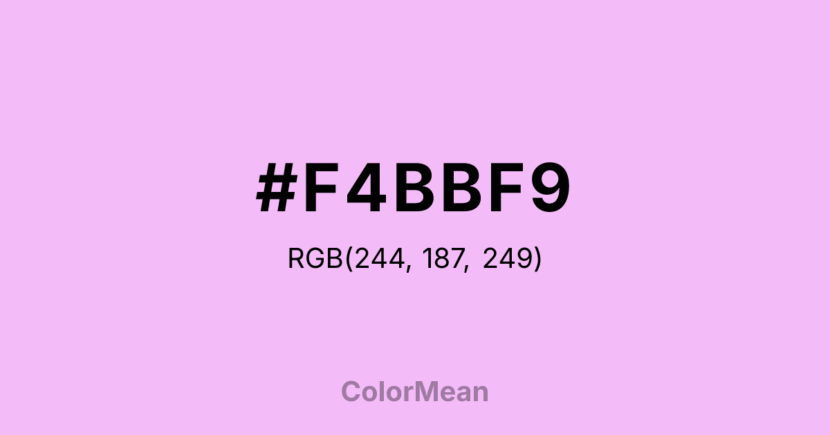
#F4BBF9 RGB value is (244, 187, 249). The hex color red value is 244, green is 187, and blue is 249. Its HSL format shows a hue of 295°, saturation of 84 percent, and lightness of 85 percent. The CMYK process values are 2 percent, 25 percent, 0 percent, 2 percent.
#F4BBF9 Color Meaning
Color #F4BBF9 radiates gentle futurism, playful empathy, and digitized softness. Unlike traditional lavenders tied to nostalgia, #F4BBF9 bright pink-purple glows with the innocence of notification alerts, animated interfaces, and inclusive design. Color #F4BBF9 balances high visibility with emotional warmth—making #F4BBF9 effective in youth-oriented apps, mental health platforms, and accessibility-focused UIs where approachability must coexist with clarity. Psychologically, color #F4BBF9 reduces perceived friction in digital interactions by signaling safety without infantilizing. #F4BBF9 appears in Web3 and creator-economy branding to denote community, imagination, and low-barrier participation. Spiritually, color #F4BBF9 represents tenderness engineered for scale: care translated into code. #F4BBF9 is not passive—#F4BBF9 actively invites, includes, and reassures. In chromatic terms, #F4BBF9 softens the edge of technology without dulling its spark.
Color Conversion
Convert #F4BBF9 across different color models and formats. These conversions help designers work seamlessly between digital and print media, ensuring this color maintains its intended appearance across RGB screens, CMYK printers, and HSL color manipulations.
RGB Values & CMYK Values
RGB Values
CMYK Values
Color Variations
#F4BBF9 harmonies come to life through carefully balanced shades, tints, and tones, giving this color depth and flexibility across light and dark variations. Shades add richness, tints bring an airy softness, and tones soften intensity, making it easy to pair in clean, modern palettes.
Color Harmonies
#F4BBF9 harmonies create beautiful relationships with other colors based on their position on the color wheel. Each harmony type offers unique design possibilities, enabling cohesive and visually appealing color schemes.
Analogous
Colors adjacent on the color wheel (30° apart)
Complementary
Colors opposite on the color wheel (180° apart)
Split Complementary
Three colors using one base hue and the two hues beside its opposite
Triadic
Three colors evenly spaced (120° apart)
Tetradic
Four colors forming a rectangle on the wheel
Square
Four colors evenly spaced (90° apart)
Double Split
Four colors formed from two base hues and the colors next to their opposites
Monochromatic
Variations of a single hue
Contrast Checker
(WCAG 2.1) Test #F4BBF9 for accessibility compliance against white and black backgrounds. Proper contrast ensures this color remains readable and usable for all audiences, meeting WCAG 2.1 standards for both normal and large text applications.
Sample Text
This is how your text will look with these colors.
Large Text (18pt+)
Normal Text
UI Components
Color Blindness Simulator
See how #F4BBF9 appears to people with different types of color vision deficiencies. These simulations help create more inclusive designs that consider how this color is perceived across various visual abilities.
Normal Vision
protanopia
Note: These simulations are approximations. Actual color vision deficiency varies by individual.
CSS Examples
Background Color
Text Color
Sample Text
Border Color
Box Shadow
Text Shadow
Sample Text
Gradient
#F4BBF9 Color FAQs
Frequently asked questions about #F4BBF9 color meaning, symbolism, and applications. Click on any question to expand detailed answers.
