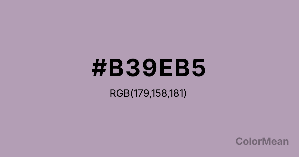
Pastel Purple (#B39EB5) Color Information
Pastel Purple (#B39EB5) RGB value is (179, 158, 181). The hex color red value is 179, green is 158, and blue is 181. Its HSL format shows a hue of 295°, saturation of 13 percent, and lightness of 66 percent. The CMYK process values are 1 percent, 13 percent, 0 percent, 29 percent.
Pastel Purple (#B39EB5) Color Meaning
Pastel Purple (#B39EB5) signifies whimsical mystery, artistic sensitivity, and understated uniqueness. This grayish, medium purple suggests dried lavender, heather fields, or watercolor washes, conveying a sense of creative melancholy and gentle nonconformity. Psychologically, Pastel Purple (#B39EB5) encourages imaginative thought and intuitive feeling in a soft, accessible way. It fosters a sense of quiet individuality and reflective creativity, making it suitable for spaces dedicated to art, meditation, or personal expression. This color is mystical without being intimidating. Culturally, Pastel Purple (#B39EB5) is linked to bohemian style, alternative wellness, and independent artistic communities. Symbolically, it represents a bridge between the mundane and the magical, intuition made approachable, and spirituality made personal. Therefore, Pastel Purple (#B39EB5) embodies a democratized sense of wonder, offering a color code for creativity and introspection that feels inclusive, gentle, and respectfully idiosyncratic.
Color Conversion
Convert Pastel Purple (#B39EB5) across different color models and formats. These conversions help designers work seamlessly between digital and print media, ensuring this color maintains its intended appearance across RGB screens, CMYK printers, and HSL color manipulations.
RGB Values & CMYK Values
RGB Values
CMYK Values
Color Variations
Pastel Purple (#B39EB5) harmonies come to life through carefully balanced shades, tints, and tones, giving this color depth and flexibility across light and dark variations. Shades add richness, tints bring an airy softness, and tones soften intensity, making it easy to pair in clean, modern palettes.
Color Harmonies
Pastel Purple (#B39EB5) harmonies create beautiful relationships with other colors based on their position on the color wheel. Each harmony type offers unique design possibilities, enabling cohesive and visually appealing color schemes.
Analogous
Colors adjacent on the color wheel (30° apart)
Complementary
Colors opposite on the color wheel (180° apart)
Split Complementary
Three colors using one base hue and the two hues beside its opposite
Triadic
Three colors evenly spaced (120° apart)
Tetradic
Four colors forming a rectangle on the wheel
Square
Four colors evenly spaced (90° apart)
Double Split
Four colors formed from two base hues and the colors next to their opposites
Monochromatic
Variations of a single hue
Contrast Checker
(WCAG 2.1) Test Pastel Purple (#B39EB5) for accessibility compliance against white and black backgrounds. Proper contrast ensures this color remains readable and usable for all audiences, meeting WCAG 2.1 standards for both normal and large text applications.
Sample Text
This is how your text will look with these colors.
Large Text (18pt+)
Normal Text
UI Components
Color Blindness Simulator
See how #B39EB5 appears to people with different types of color vision deficiencies. These simulations help create more inclusive designs that consider how this color is perceived across various visual abilities.
Normal Vision
protanopia
Note: These simulations are approximations. Actual color vision deficiency varies by individual.
CSS Examples
Background Color
Text Color
Sample Text
Border Color
Box Shadow
Text Shadow
Sample Text
Gradient
Pastel Purple (#B39EB5) Color FAQs
Frequently asked questions about Pastel Purple (#B39EB5) color meaning, symbolism, and applications. Click on any question to expand detailed answers.
