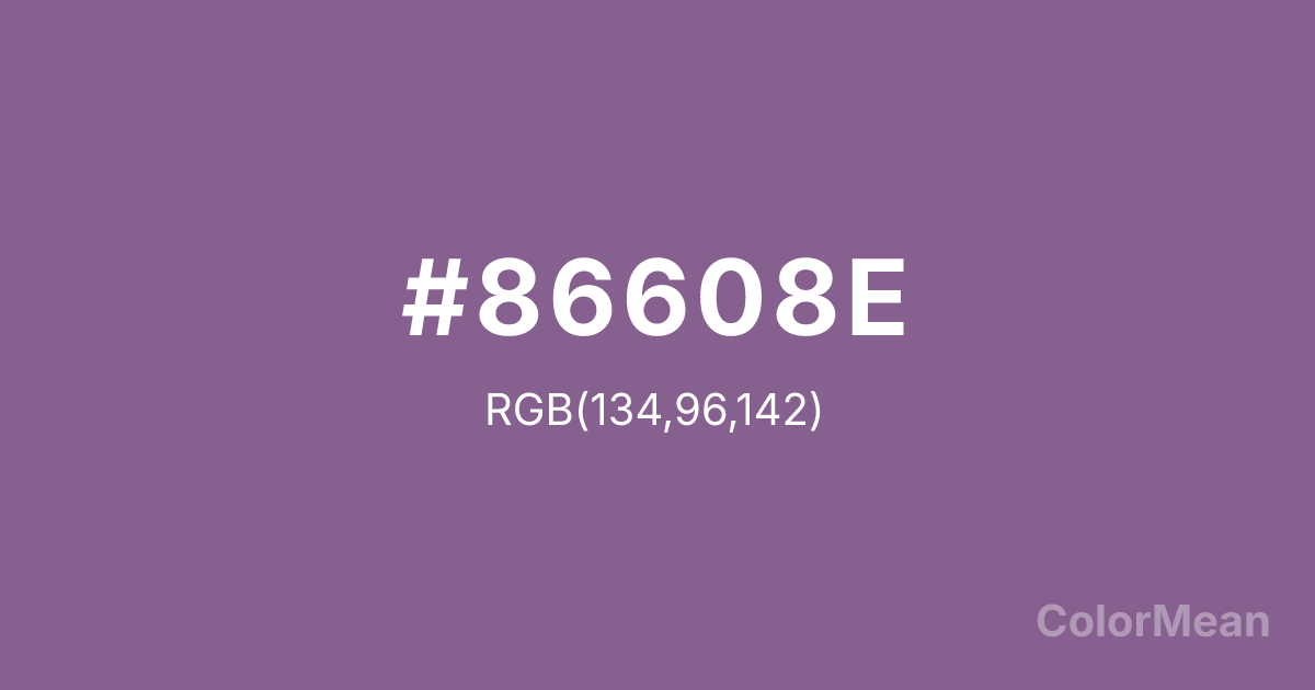
Pomp and Power (#86608E) Color Information
Pomp and Power (#86608E) RGB value is (134, 96, 142). The hex color red value is 134, green is 96, and blue is 142. Its HSL format shows a hue of 290°, saturation of 19 percent, and lightness of 47 percent. The CMYK process values are 6 percent, 32 percent, 0 percent, 44 percent.
Pomp and Power (#86608E) Color Meaning
Pomp and Power (#86608E) signifies dignified flamboyance, theatrical authority, and complex grandeur. This muted, reddish-purple balances regal purple with a dusty, softened quality, suggesting aged velvet curtains, ceremonial robes, and a power that is both ostentatious and weathered by time. Psychologically, Pomp and Power (#86608E) conveys a sense of dramatic confidence, historical significance, and a performance of status that is aware of its own spectacle. It stimulates the imagination with its narrative weight and sense of tradition. This color is authority expressed with a flourish. Culturally, Pomp and Power (#86608E) is linked to the performing arts, particularly theater and opera, as well as historical pageantry and academic regalia. Symbolically, it represents the intersection of might and display, the role one plays in society, and the rich, complex layers of institutional history. Therefore, Pomp and Power (#86608E) embodies a color concept where influence is inseparable from its presentation, and tradition carries a inherent sense of drama and depth.
Color Conversion
Convert Pomp and Power (#86608E) across different color models and formats. These conversions help designers work seamlessly between digital and print media, ensuring this color maintains its intended appearance across RGB screens, CMYK printers, and HSL color manipulations.
RGB Values & CMYK Values
RGB Values
CMYK Values
Color Variations
Pomp and Power (#86608E) harmonies come to life through carefully balanced shades, tints, and tones, giving this color depth and flexibility across light and dark variations. Shades add richness, tints bring an airy softness, and tones soften intensity, making it easy to pair in clean, modern palettes.
Color Harmonies
Pomp and Power (#86608E) harmonies create beautiful relationships with other colors based on their position on the color wheel. Each harmony type offers unique design possibilities, enabling cohesive and visually appealing color schemes.
Analogous
Colors adjacent on the color wheel (30° apart)
Complementary
Colors opposite on the color wheel (180° apart)
Split Complementary
Three colors using one base hue and the two hues beside its opposite
Triadic
Three colors evenly spaced (120° apart)
Tetradic
Four colors forming a rectangle on the wheel
Square
Four colors evenly spaced (90° apart)
Double Split
Four colors formed from two base hues and the colors next to their opposites
Monochromatic
Variations of a single hue
Contrast Checker
(WCAG 2.1) Test Pomp and Power (#86608E) for accessibility compliance against white and black backgrounds. Proper contrast ensures this color remains readable and usable for all audiences, meeting WCAG 2.1 standards for both normal and large text applications.
Sample Text
This is how your text will look with these colors.
Large Text (18pt+)
Normal Text
UI Components
Color Blindness Simulator
See how #86608E appears to people with different types of color vision deficiencies. These simulations help create more inclusive designs that consider how this color is perceived across various visual abilities.
Normal Vision
protanopia
Note: These simulations are approximations. Actual color vision deficiency varies by individual.
CSS Examples
Background Color
Text Color
Sample Text
Border Color
Box Shadow
Text Shadow
Sample Text
Gradient
Pomp and Power (#86608E) Color FAQs
Frequently asked questions about Pomp and Power (#86608E) color meaning, symbolism, and applications. Click on any question to expand detailed answers.
