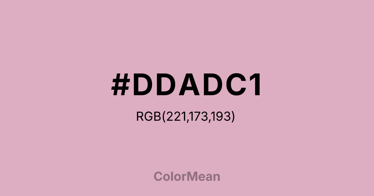
#DDADC1 Color Information
#DDADC1 RGB value is (221, 173, 193). The hex color red value is 221, green is 173, and blue is 193. Its HSL format shows a hue of 335°, saturation of 41 percent, and lightness of 77 percent. The CMYK process values are 0 percent, 22 percent, 13 percent, 13 percent.
#DDADC1 Color Meaning
Color #DDADC1 embodies soft radiance, nurtured beauty, and approachable luxury. #DDADC1 warm, medium pink has a pearlescent quality, suggesting blushing cheeks, cultured pearls, and the soft glow of dawn. Psychologically, color #DDADC1 is comforting and dignifying, promoting feelings of self-worth, gentle confidence, and a sense of being cared for and valued. #DDADC1 offers a warmth that feels inherent and luminous, not applied or garish. #DDADC1 color is preciousness made friendly and wearable. Symbolically, color #DDADC1 represents inner beauty that shines through, value formed through gentle pressure, and a heart that remains soft and glowing despite experience. #DDADC1 is the color of compassion that has matured into wisdom. Culturally, #DDADC1 appears in cosmetics, jewelry branding, and designs aiming for a classic, feminine elegance that is neither childish nor severe. Color #DDADC1 acts as a bridge between innocent pink and sophisticated mauve, offering a tone of mature, gentle grace.
Color Conversion
Convert #DDADC1 across different color models and formats. These conversions help designers work seamlessly between digital and print media, ensuring this color maintains its intended appearance across RGB screens, CMYK printers, and HSL color manipulations.
RGB Values & CMYK Values
RGB Values
CMYK Values
Color Variations
#DDADC1 harmonies come to life through carefully balanced shades, tints, and tones, giving this color depth and flexibility across light and dark variations. Shades add richness, tints bring an airy softness, and tones soften intensity, making it easy to pair in clean, modern palettes.
Color Harmonies
#DDADC1 harmonies create beautiful relationships with other colors based on their position on the color wheel. Each harmony type offers unique design possibilities, enabling cohesive and visually appealing color schemes.
Analogous
Colors adjacent on the color wheel (30° apart)
Complementary
Colors opposite on the color wheel (180° apart)
Split Complementary
Three colors using one base hue and the two hues beside its opposite
Triadic
Three colors evenly spaced (120° apart)
Tetradic
Four colors forming a rectangle on the wheel
Square
Four colors evenly spaced (90° apart)
Double Split
Four colors formed from two base hues and the colors next to their opposites
Monochromatic
Variations of a single hue
Contrast Checker
(WCAG 2.1) Test #DDADC1 for accessibility compliance against white and black backgrounds. Proper contrast ensures this color remains readable and usable for all audiences, meeting WCAG 2.1 standards for both normal and large text applications.
Sample Text
This is how your text will look with these colors.
Large Text (18pt+)
Normal Text
UI Components
Color Blindness Simulator
See how #DDADC1 appears to people with different types of color vision deficiencies. These simulations help create more inclusive designs that consider how this color is perceived across various visual abilities.
Normal Vision
protanopia
Note: These simulations are approximations. Actual color vision deficiency varies by individual.
CSS Examples
Background Color
Text Color
Sample Text
Border Color
Box Shadow
Text Shadow
Sample Text
Gradient
#DDADC1 Color FAQs
Frequently asked questions about #DDADC1 color meaning, symbolism, and applications. Click on any question to expand detailed answers.

