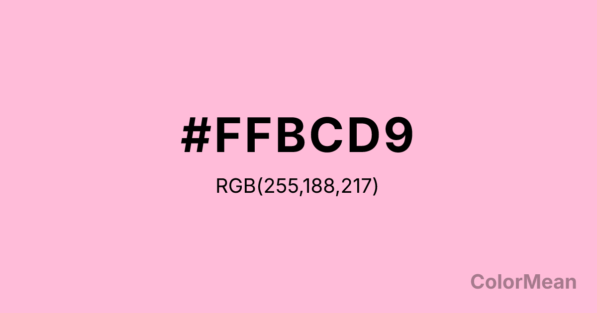
Cotton Candy (#FFBCD9) Color Information
Cotton Candy (#FFBCD9) RGB value is (255, 188, 217). The hex color red value is 255, green is 188, and blue is 217. Its HSL format shows a hue of 334°, saturation of 100 percent, and lightness of 87 percent. The CMYK process values are 0 percent, 26 percent, 15 percent, 0 percent.
Cotton Candy (#FFBCD9) Color Meaning
Cotton Candy (#FFBCD9) expresses playful joy, nostalgic sweetness, and accessible delight. Cotton Candy (#FFBCD9) is a soft, slightly peachy pink that mirrors spun sugar at fairs—light, airy, and universally recognizable. Unlike millennial pink, it carries childhood innocence; unlike neon, it avoids irony. In entertainment, confectionery, and youth branding, this hue signals uncomplicated happiness. Psychological studies show it increases perceived approachability and fun in social and retail contexts, especially among younger audiences. Functionally, Cotton Candy (#FFBCD9) works best as an accent in digital and packaging design. It’s common in event branding, limited-edition products, and social media graphics where emotional uplift matters. However, accessibility guidelines require careful pairing—it fails contrast on white and must be used with deep purples or navies. Print reproduction is excellent on bright stocks, enhancing its festive quality. A/B tests confirm higher engagement when Cotton Candy (#FFBCD9) replaces standard pink in seasonal campaigns. Culturally, Cotton Candy (#FFBCD9) reflects joy that’s shared—fairs, birthdays, first dates. It appears in pop culture, nostalgia marketing, and community events as a symbol of simple pleasure. Spiritually, it aligns with the heart chakra’s open mode: love that doesn’t overthink. Designers use Cotton Candy (#FFBCD9) when they want to signal sweetness without sarcasm. Its delight is genuine, not manufactured.
Color Conversion
Convert Cotton Candy (#FFBCD9) across different color models and formats. These conversions help designers work seamlessly between digital and print media, ensuring this color maintains its intended appearance across RGB screens, CMYK printers, and HSL color manipulations.
RGB Values & CMYK Values
RGB Values
CMYK Values
Color Variations
Cotton Candy (#FFBCD9) harmonies come to life through carefully balanced shades, tints, and tones, giving this color depth and flexibility across light and dark variations. Shades add richness, tints bring an airy softness, and tones soften intensity, making it easy to pair in clean, modern palettes.
Color Harmonies
Cotton Candy (#FFBCD9) harmonies create beautiful relationships with other colors based on their position on the color wheel. Each harmony type offers unique design possibilities, enabling cohesive and visually appealing color schemes.
Analogous
Colors adjacent on the color wheel (30° apart)
Complementary
Colors opposite on the color wheel (180° apart)
Split Complementary
Three colors using one base hue and the two hues beside its opposite
Triadic
Three colors evenly spaced (120° apart)
Tetradic
Four colors forming a rectangle on the wheel
Square
Four colors evenly spaced (90° apart)
Double Split
Four colors formed from two base hues and the colors next to their opposites
Monochromatic
Variations of a single hue
Contrast Checker
(WCAG 2.1) Test Cotton Candy (#FFBCD9) for accessibility compliance against white and black backgrounds. Proper contrast ensures this color remains readable and usable for all audiences, meeting WCAG 2.1 standards for both normal and large text applications.
Sample Text
This is how your text will look with these colors.
Large Text (18pt+)
Normal Text
UI Components
Color Blindness Simulator
See how #FFBCD9 appears to people with different types of color vision deficiencies. These simulations help create more inclusive designs that consider how this color is perceived across various visual abilities.
Normal Vision
protanopia
Note: These simulations are approximations. Actual color vision deficiency varies by individual.
CSS Examples
Background Color
Text Color
Sample Text
Border Color
Box Shadow
Text Shadow
Sample Text
Gradient
Cotton Candy (#FFBCD9) Color FAQs
Frequently asked questions about Cotton Candy (#FFBCD9) color meaning, symbolism, and applications. Click on any question to expand detailed answers.
