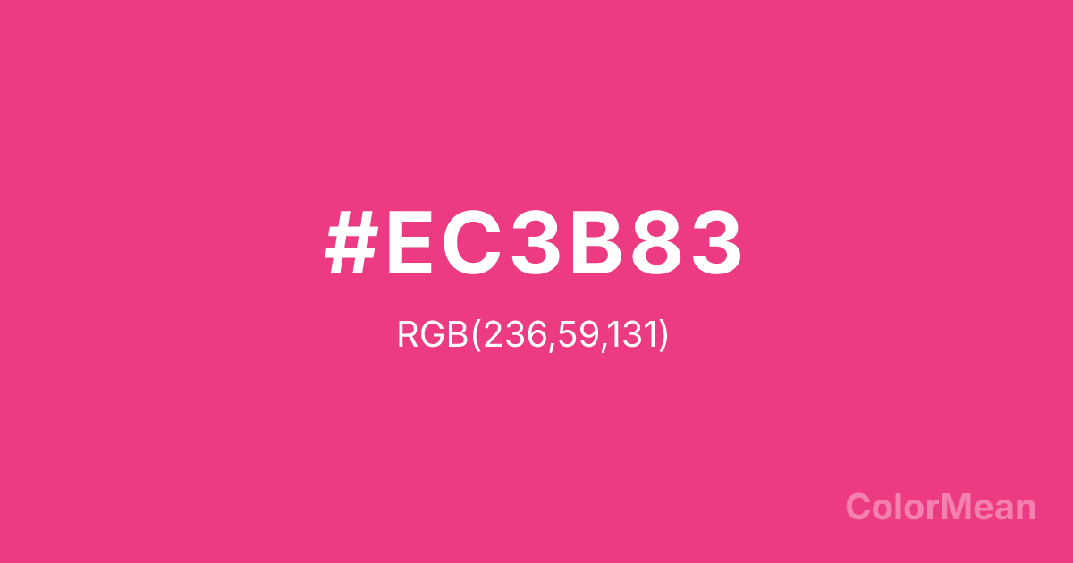
Cerise Pink (#EC3B83) Color Information
Cerise Pink (#EC3B83) RGB value is (236, 59, 131). The hex color red value is 236, green is 59, and blue is 131. Its HSL format shows a hue of 336°, saturation of 82 percent, and lightness of 58 percent. The CMYK process values are 0 percent, 75 percent, 44 percent, 7 percent.
Cerise Pink (#EC3B83) Color Meaning
Cerise Pink (#EC3B83) blends playful intensity with emotional candor, merging flirtation and fortitude. Cerise Pink (#EC3B83) is a brighter, more magenta-leaning variant—closer to neon but grounded in pigment reality. It radiates without apology, favored in pop culture, cosmetics, and digital interfaces where energy must feel human, not artificial. Unlike hot pink, it retains enough red to feel warm; unlike rose, it refuses subtlety. In consumer neuroscience, this hue triggers approach behavior while simultaneously signaling friendliness—ideal for social platforms and beauty tech. Functionally, Cerise Pink (#EC3B83) dominates as a focal point. It’s used in icons, CTAs, and hero imagery where conversion depends on instant recognition. Digital rendering is vivid across screens, though OLEDs may require slight desaturation to prevent bleed. Print use shines in fashion editorials and event branding, where its vibrancy translates to excitement. User testing confirms higher emotional engagement with Cerise Pink (#EC3B83) in Gen Z and Millennial audiences, especially when paired with minimalist typography. Culturally, Cerise Pink (#EC3B83) reflects the rise of bold vulnerability—sharing feelings with flair. It appears in mental health advocacy, dance, and drag as a symbol of emotional honesty turned performance. Spiritually, it aligns with the heart and sacral chakras in unison: love that moves. Designers choose Cerise Pink (#EC3B83) when they want to signal passion with personality. Its magnetism is intentional, not accidental.
Color Conversion
Convert Cerise Pink (#EC3B83) across different color models and formats. These conversions help designers work seamlessly between digital and print media, ensuring this color maintains its intended appearance across RGB screens, CMYK printers, and HSL color manipulations.
RGB Values & CMYK Values
RGB Values
CMYK Values
Color Variations
Cerise Pink (#EC3B83) harmonies come to life through carefully balanced shades, tints, and tones, giving this color depth and flexibility across light and dark variations. Shades add richness, tints bring an airy softness, and tones soften intensity, making it easy to pair in clean, modern palettes.
Color Harmonies
Cerise Pink (#EC3B83) harmonies create beautiful relationships with other colors based on their position on the color wheel. Each harmony type offers unique design possibilities, enabling cohesive and visually appealing color schemes.
Analogous
Colors adjacent on the color wheel (30° apart)
Complementary
Colors opposite on the color wheel (180° apart)
Split Complementary
Three colors using one base hue and the two hues beside its opposite
Triadic
Three colors evenly spaced (120° apart)
Tetradic
Four colors forming a rectangle on the wheel
Square
Four colors evenly spaced (90° apart)
Double Split
Four colors formed from two base hues and the colors next to their opposites
Monochromatic
Variations of a single hue
Contrast Checker
(WCAG 2.1) Test Cerise Pink (#EC3B83) for accessibility compliance against white and black backgrounds. Proper contrast ensures this color remains readable and usable for all audiences, meeting WCAG 2.1 standards for both normal and large text applications.
Sample Text
This is how your text will look with these colors.
Large Text (18pt+)
Normal Text
UI Components
Color Blindness Simulator
See how #EC3B83 appears to people with different types of color vision deficiencies. These simulations help create more inclusive designs that consider how this color is perceived across various visual abilities.
Normal Vision
protanopia
Note: These simulations are approximations. Actual color vision deficiency varies by individual.
CSS Examples
Background Color
Text Color
Sample Text
Border Color
Box Shadow
Text Shadow
Sample Text
Gradient
Cerise Pink (#EC3B83) Color FAQs
Frequently asked questions about Cerise Pink (#EC3B83) color meaning, symbolism, and applications. Click on any question to expand detailed answers.
