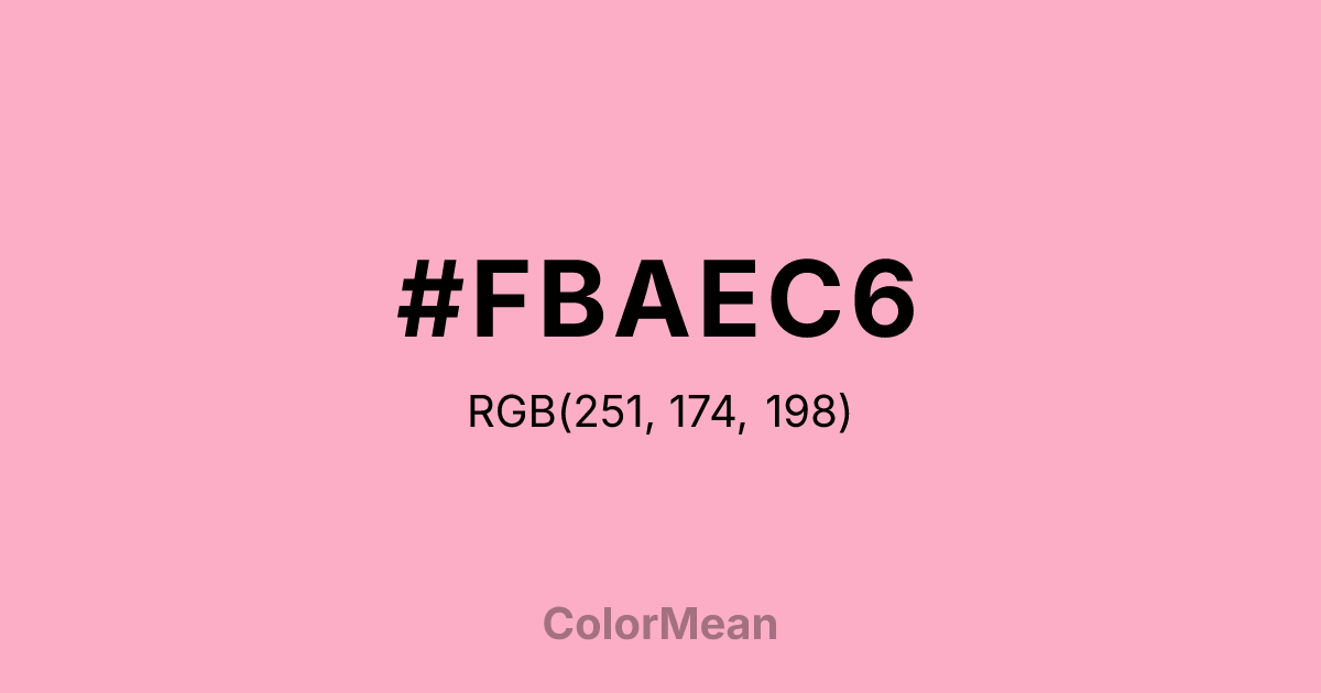
#FBAEC6 Color Information
#FBAEC6 RGB value is (251, 174, 198). The hex color red value is 251, green is 174, and blue is 198. Its HSL format shows a hue of 341°, saturation of 91 percent, and lightness of 83 percent. The CMYK process values are 0 percent, 31 percent, 21 percent, 2 percent.
#FBAEC6 Color Meaning
Color #FBAEC6 evokes gentle resilience, soft assertiveness, and quiet cultural pride. Color #FBAEC6 draws its name from the Dianthus flower, a symbol of ideal femininity in Japanese tradition that balances grace with inner strength. Unlike saccharine pinks, #FBAEC6 muted rose carries a grounded delicacy—airy but not fragile, romantic but not passive. Historically, #FBAEC6 reflects the Edo-period aesthetic of iki, a refined understatement that values subtlety over spectacle. Psychologically, color #FBAEC6 calms without infantilizing. Studies in color psychology suggest that soft pinks reduce aggression and foster emotional safety, particularly in high-stress environments. #FBAEC6 shade avoids the overstimulation of brighter pinks while retaining warmth, making #FBAEC6 effective in healthcare, education, and inclusive branding. Its low saturation supports focus without emotional suppression—ideal for spaces where empathy and clarity must coexist. Culturally, color #FBAEC6 bridges East Asian heritage and global minimalism. #FBAEC6 appears in contemporary Japanese fashion, ceramics, and even national sports branding (e.g., Japan’s women’s soccer team, nicknamed “Nadeshiko Japan”). Outside Japan, #FBAEC6 resonates with movements toward mindful femininity—rejecting pink as purely decorative and reclaiming #FBAEC6 as a hue of quiet confidence. Designers use #FBAEC6 to signal approachability without compromising sophistication. Symbolically, color #FBAEC6 represents endurance wrapped in softness. #FBAEC6 is the color of petals that survive wind, of voices that speak gently but persistently. In branding or spatial design, #FBAEC6 communicates care without condescension and strength without sharpness. #FBAEC6’s not the pink of cliché—#FBAEC6’s the pink of considered presence.
Color Conversion
Convert #FBAEC6 across different color models and formats. These conversions help designers work seamlessly between digital and print media, ensuring this color maintains its intended appearance across RGB screens, CMYK printers, and HSL color manipulations.
RGB Values & CMYK Values
RGB Values
CMYK Values
Color Variations
#FBAEC6 harmonies come to life through carefully balanced shades, tints, and tones, giving this color depth and flexibility across light and dark variations. Shades add richness, tints bring an airy softness, and tones soften intensity, making it easy to pair in clean, modern palettes.
Color Harmonies
#FBAEC6 harmonies create beautiful relationships with other colors based on their position on the color wheel. Each harmony type offers unique design possibilities, enabling cohesive and visually appealing color schemes.
Analogous
Colors adjacent on the color wheel (30° apart)
Complementary
Colors opposite on the color wheel (180° apart)
Split Complementary
Three colors using one base hue and the two hues beside its opposite
Triadic
Three colors evenly spaced (120° apart)
Tetradic
Four colors forming a rectangle on the wheel
Square
Four colors evenly spaced (90° apart)
Double Split
Four colors formed from two base hues and the colors next to their opposites
Monochromatic
Variations of a single hue
Contrast Checker
(WCAG 2.1) Test #FBAEC6 for accessibility compliance against white and black backgrounds. Proper contrast ensures this color remains readable and usable for all audiences, meeting WCAG 2.1 standards for both normal and large text applications.
Sample Text
This is how your text will look with these colors.
Large Text (18pt+)
Normal Text
UI Components
Color Blindness Simulator
See how #FBAEC6 appears to people with different types of color vision deficiencies. These simulations help create more inclusive designs that consider how this color is perceived across various visual abilities.
Normal Vision
protanopia
Note: These simulations are approximations. Actual color vision deficiency varies by individual.
CSS Examples
Background Color
Text Color
Sample Text
Border Color
Box Shadow
Text Shadow
Sample Text
Gradient
#FBAEC6 Color FAQs
Frequently asked questions about #FBAEC6 color meaning, symbolism, and applications. Click on any question to expand detailed answers.

