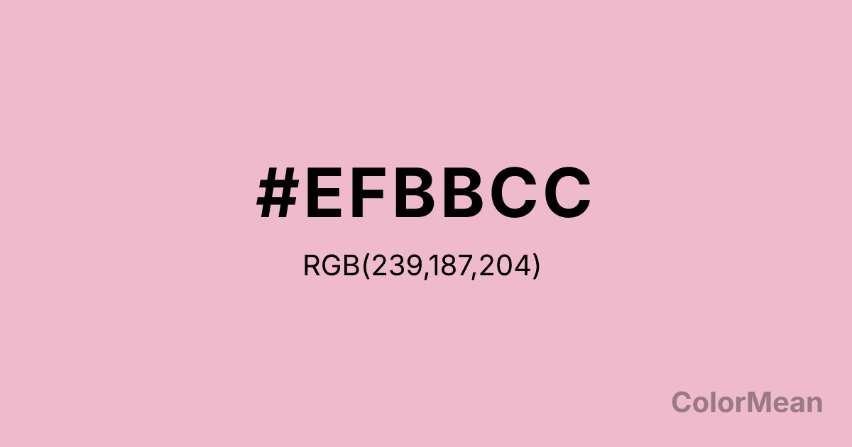
Cameo Pink (#EFBBCC) Color Information
Cameo Pink (#EFBBCC) RGB value is (239, 187, 204). The hex color red value is 239, green is 187, and blue is 204. Its HSL format shows a hue of 340°, saturation of 62 percent, and lightness of 84 percent. The CMYK process values are 0 percent, 22 percent, 15 percent, 6 percent.
Cameo Pink (#EFBBCC) Color Meaning
Cameo Pink (#EFBBCC) expresses gentle assertion, nostalgic softness, and feminized resilience. Cameo Pink (#EFBBCC) is a desaturated rose with grey undertones, named after carved gemstone portraits that blend delicacy with durability. Unlike bubblegum or hot pink, it avoids juvenility by muting its chroma—making it acceptable in professional and mature contexts. Color psychology links such dusty pinks to compassion without sentimentality; they soften authority rather than undermine it. Hospitals and wellness brands use Cameo Pink (#EFBBCC) to convey care that is nurturing but not cloying. In design, Cameo Pink (#EFBBCC) serves as a bridge between traditional femininity and modern minimalism. It appears in editorial layouts, boutique packaging, and senior-focused health products where warmth must feel intentional, not accidental. Research on gender and color perception shows that desaturated pinks like Cameo Pink (#EFBBCC) are increasingly embraced across demographics as symbols of empathy and emotional intelligence—not just gender. Digital tests confirm it offers sufficient contrast against dark greys for readable body text, expanding its functional range beyond accent use. Symbolically, Cameo Pink (#EFBBCC) represents strength wrapped in tact. It is the color of quiet advocacy, matriarchal wisdom, and healing through presence. In spiritual practice, it aligns with the heart chakra’s receptive mode—listening as an act of love. Cameo Pink (#EFBBCC) rarely demands the spotlight but creates space for others to be seen. Designers use it when they want to humanize data, soften technology, or signal inclusive care. Its power lies not in volume but in consistency.
Color Conversion
Convert Cameo Pink (#EFBBCC) across different color models and formats. These conversions help designers work seamlessly between digital and print media, ensuring this color maintains its intended appearance across RGB screens, CMYK printers, and HSL color manipulations.
RGB Values & CMYK Values
RGB Values
CMYK Values
Color Variations
Cameo Pink (#EFBBCC) harmonies come to life through carefully balanced shades, tints, and tones, giving this color depth and flexibility across light and dark variations. Shades add richness, tints bring an airy softness, and tones soften intensity, making it easy to pair in clean, modern palettes.
Color Harmonies
Cameo Pink (#EFBBCC) harmonies create beautiful relationships with other colors based on their position on the color wheel. Each harmony type offers unique design possibilities, enabling cohesive and visually appealing color schemes.
Analogous
Colors adjacent on the color wheel (30° apart)
Complementary
Colors opposite on the color wheel (180° apart)
Split Complementary
Three colors using one base hue and the two hues beside its opposite
Triadic
Three colors evenly spaced (120° apart)
Tetradic
Four colors forming a rectangle on the wheel
Square
Four colors evenly spaced (90° apart)
Double Split
Four colors formed from two base hues and the colors next to their opposites
Monochromatic
Variations of a single hue
Contrast Checker
(WCAG 2.1) Test Cameo Pink (#EFBBCC) for accessibility compliance against white and black backgrounds. Proper contrast ensures this color remains readable and usable for all audiences, meeting WCAG 2.1 standards for both normal and large text applications.
Sample Text
This is how your text will look with these colors.
Large Text (18pt+)
Normal Text
UI Components
Color Blindness Simulator
See how #EFBBCC appears to people with different types of color vision deficiencies. These simulations help create more inclusive designs that consider how this color is perceived across various visual abilities.
Normal Vision
protanopia
Note: These simulations are approximations. Actual color vision deficiency varies by individual.
CSS Examples
Background Color
Text Color
Sample Text
Border Color
Box Shadow
Text Shadow
Sample Text
Gradient
Cameo Pink (#EFBBCC) Color FAQs
Frequently asked questions about Cameo Pink (#EFBBCC) color meaning, symbolism, and applications. Click on any question to expand detailed answers.
