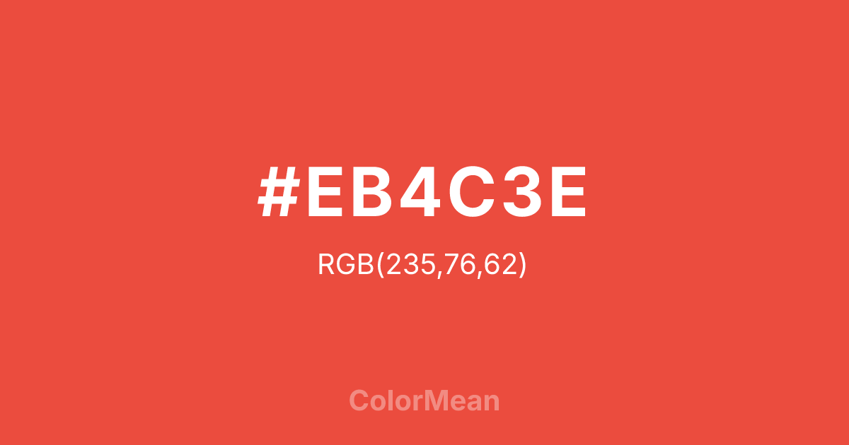
#EB4C3E Color Information
#EB4C3E RGB value is (235, 76, 62). The hex color red value is 235, green is 76, and blue is 62. Its HSL format shows a hue of 5°, saturation of 81 percent, and lightness of 58 percent. The CMYK process values are 0 percent, 68 percent, 74 percent, 8 percent.
#EB4C3E Color Meaning
Color #EB4C3E blends warmth with edge, merging approachability and assertiveness in a single chromatic stroke. Color #EB4C3E is a coral-leaning red—brighter than salmon, deeper than rose—designed to feel human yet dynamic. Unlike cooler pinks, #EB4C3E carries orange undertones that evoke energy and sociability; unlike pure reds, #EB4C3E softens aggression with warmth. In consumer psychology, #EB4C3E hue increases perceived friendliness in service brands without sacrificing urgency. Fast-casual restaurants and telehealth platforms use color #EB4C3E to signal care that acts quickly. Functionally, color #EB4C3E performs well across media. #EB4C3E offers strong contrast against dark backgrounds and remains legible in small text with proper weighting. Digital accessibility tools confirm #EB4C3E passes AA standards for large text, making #EB4C3E viable for mobile CTAs. In packaging, #EB4C3E conveys freshness and approachability—common in beverages, snacks, and personal care. A/B testing shows higher engagement when color #EB4C3E replaces standard red in female-targeted campaigns, suggesting nuanced emotional resonance. Culturally, color #EB4C3E reflects modern empathy: caring that doesn’t wait to be asked. #EB4C3E appears in mental health apps and community initiatives as a symbol of active support. Spiritually, #EB4C3E aligns with the heart and sacral chakras in tandem—feeling and doing. Designers use color #EB4C3E when they want to signal warmth with willpower. #EB4C3E’s not passive pink—#EB4C3E’s pink with a plan.
Color Conversion
Convert #EB4C3E across different color models and formats. These conversions help designers work seamlessly between digital and print media, ensuring this color maintains its intended appearance across RGB screens, CMYK printers, and HSL color manipulations.
RGB Values & CMYK Values
RGB Values
CMYK Values
Color Variations
#EB4C3E harmonies come to life through carefully balanced shades, tints, and tones, giving this color depth and flexibility across light and dark variations. Shades add richness, tints bring an airy softness, and tones soften intensity, making it easy to pair in clean, modern palettes.
Color Harmonies
#EB4C3E harmonies create beautiful relationships with other colors based on their position on the color wheel. Each harmony type offers unique design possibilities, enabling cohesive and visually appealing color schemes.
Analogous
Colors adjacent on the color wheel (30° apart)
Complementary
Colors opposite on the color wheel (180° apart)
Split Complementary
Three colors using one base hue and the two hues beside its opposite
Triadic
Three colors evenly spaced (120° apart)
Tetradic
Four colors forming a rectangle on the wheel
Square
Four colors evenly spaced (90° apart)
Double Split
Four colors formed from two base hues and the colors next to their opposites
Monochromatic
Variations of a single hue
Contrast Checker
(WCAG 2.1) Test #EB4C3E for accessibility compliance against white and black backgrounds. Proper contrast ensures this color remains readable and usable for all audiences, meeting WCAG 2.1 standards for both normal and large text applications.
Sample Text
This is how your text will look with these colors.
Large Text (18pt+)
Normal Text
UI Components
Color Blindness Simulator
See how #EB4C3E appears to people with different types of color vision deficiencies. These simulations help create more inclusive designs that consider how this color is perceived across various visual abilities.
Normal Vision
protanopia
Note: These simulations are approximations. Actual color vision deficiency varies by individual.
CSS Examples
Background Color
Text Color
Sample Text
Border Color
Box Shadow
Text Shadow
Sample Text
Gradient
#EB4C3E Color FAQs
Frequently asked questions about #EB4C3E color meaning, symbolism, and applications. Click on any question to expand detailed answers.

