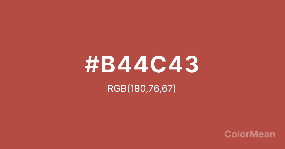
Pearl Pink (#B44C43) Color Information
Pearl Pink (#B44C43) RGB value is (180, 76, 67). The hex color red value is 180, green is 76, and blue is 67. Its HSL format shows a hue of 5°, saturation of 46 percent, and lightness of 48 percent. The CMYK process values are 0 percent, 58 percent, 63 percent, 29 percent.
Pearl Pink (#B44C43) Color Meaning
Pearl Pink (#B44C43) signifies muted passion, weathered sweetness, and sturdy affection. This dusky, reddish-pink resembles faded roses, old brick, and dried coral, suggesting a romantic sentiment that has endured exposure and time. Psychologically, Pearl Pink (#B44C43) provides comforting warmth and emotional resilience, blending the nurturing quality of pink with a more robust, earthy stability. It fosters feelings of enduring care, mature love, and affectionate strength that does not shy away from reality. This color feels both tender and strong. Culturally, Pearl Pink (#B44C43) is found in historical textiles, vintage signage, and designs aiming for a "heritage" feel with a touch of romance. Symbolically, it represents love that has built a home, passion that has weathered seasons, and beauty that is valued for its history as much as its appearance. Pearl Pink (#B44C43) offers a more complex, adult alternative to bright pinks, carrying a narrative of duration, memory, and love that has been tested and remains.
Color Conversion
Convert Pearl Pink (#B44C43) across different color models and formats. These conversions help designers work seamlessly between digital and print media, ensuring this color maintains its intended appearance across RGB screens, CMYK printers, and HSL color manipulations.
RGB Values & CMYK Values
RGB Values
CMYK Values
Color Variations
Pearl Pink (#B44C43) harmonies come to life through carefully balanced shades, tints, and tones, giving this color depth and flexibility across light and dark variations. Shades add richness, tints bring an airy softness, and tones soften intensity, making it easy to pair in clean, modern palettes.
Color Harmonies
Pearl Pink (#B44C43) harmonies create beautiful relationships with other colors based on their position on the color wheel. Each harmony type offers unique design possibilities, enabling cohesive and visually appealing color schemes.
Analogous
Colors adjacent on the color wheel (30° apart)
Complementary
Colors opposite on the color wheel (180° apart)
Split Complementary
Three colors using one base hue and the two hues beside its opposite
Triadic
Three colors evenly spaced (120° apart)
Tetradic
Four colors forming a rectangle on the wheel
Square
Four colors evenly spaced (90° apart)
Double Split
Four colors formed from two base hues and the colors next to their opposites
Monochromatic
Variations of a single hue
Contrast Checker
(WCAG 2.1) Test Pearl Pink (#B44C43) for accessibility compliance against white and black backgrounds. Proper contrast ensures this color remains readable and usable for all audiences, meeting WCAG 2.1 standards for both normal and large text applications.
Sample Text
This is how your text will look with these colors.
Large Text (18pt+)
Normal Text
UI Components
Color Blindness Simulator
See how #B44C43 appears to people with different types of color vision deficiencies. These simulations help create more inclusive designs that consider how this color is perceived across various visual abilities.
Normal Vision
protanopia
Note: These simulations are approximations. Actual color vision deficiency varies by individual.
CSS Examples
Background Color
Text Color
Sample Text
Border Color
Box Shadow
Text Shadow
Sample Text
Gradient
Pearl Pink (#B44C43) Color FAQs
Frequently asked questions about Pearl Pink (#B44C43) color meaning, symbolism, and applications. Click on any question to expand detailed answers.
