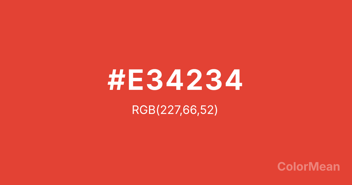
Vermilion (#E34234) Color Information
Vermilion (#E34234) RGB value is (227, 66, 52). The hex color red value is 227, green is 66, and blue is 52. Its HSL format shows a hue of 5°, saturation of 76 percent, and lightness of 55 percent. The CMYK process values are 0 percent, 71 percent, 77 percent, 11 percent.
Vermilion (#E34234) Color Meaning
Vermilion (#CB2821 / #D9381E / #E34234) signifies vitality, courage, and dynamic transformation. This bright, intense red conveys energy, motivation, and creativity. Psychologically, Vermilion (#CB2821) encourages assertiveness, decisiveness, and physical engagement, stimulating both mind and body. Culturally, Vermilion has been historically important in both East and West. In Western traditions, it represents excitement and bold expression, while in Eastern cultures, it is deeply spiritual, symbolizing prosperity, protection, and sacred rituals. Fengshui incorporates Vermilion to energize areas of action, fame, or personal growth. Spiritually, Vermilion (#E34234) aligns with the Root and Sacral chakras, supporting grounding, passion, and vitality. As a vivid red shade, it exudes life force, making it popular in ceremonial art, design elements, and attention-grabbing highlights. Its presence in visual media ensures both emotional intensity and aesthetic warmth.
Color Conversion
Convert Vermilion (#E34234) across different color models and formats. These conversions help designers work seamlessly between digital and print media, ensuring this color maintains its intended appearance across RGB screens, CMYK printers, and HSL color manipulations.
RGB Values & CMYK Values
RGB Values
CMYK Values
Color Variations
Vermilion (#E34234) harmonies come to life through carefully balanced shades, tints, and tones, giving this color depth and flexibility across light and dark variations. Shades add richness, tints bring an airy softness, and tones soften intensity, making it easy to pair in clean, modern palettes.
Color Harmonies
Vermilion (#E34234) harmonies create beautiful relationships with other colors based on their position on the color wheel. Each harmony type offers unique design possibilities, enabling cohesive and visually appealing color schemes.
Analogous
Colors adjacent on the color wheel (30° apart)
Complementary
Colors opposite on the color wheel (180° apart)
Split Complementary
Three colors using one base hue and the two hues beside its opposite
Triadic
Three colors evenly spaced (120° apart)
Tetradic
Four colors forming a rectangle on the wheel
Square
Four colors evenly spaced (90° apart)
Double Split
Four colors formed from two base hues and the colors next to their opposites
Monochromatic
Variations of a single hue
Contrast Checker
(WCAG 2.1) Test Vermilion (#E34234) for accessibility compliance against white and black backgrounds. Proper contrast ensures this color remains readable and usable for all audiences, meeting WCAG 2.1 standards for both normal and large text applications.
Sample Text
This is how your text will look with these colors.
Large Text (18pt+)
Normal Text
UI Components
Color Blindness Simulator
See how #E34234 appears to people with different types of color vision deficiencies. These simulations help create more inclusive designs that consider how this color is perceived across various visual abilities.
Normal Vision
protanopia
Note: These simulations are approximations. Actual color vision deficiency varies by individual.
CSS Examples
Background Color
Text Color
Sample Text
Border Color
Box Shadow
Text Shadow
Sample Text
Gradient
Vermilion (#E34234) Color FAQs
Frequently asked questions about Vermilion (#E34234) color meaning, symbolism, and applications. Click on any question to expand detailed answers.
