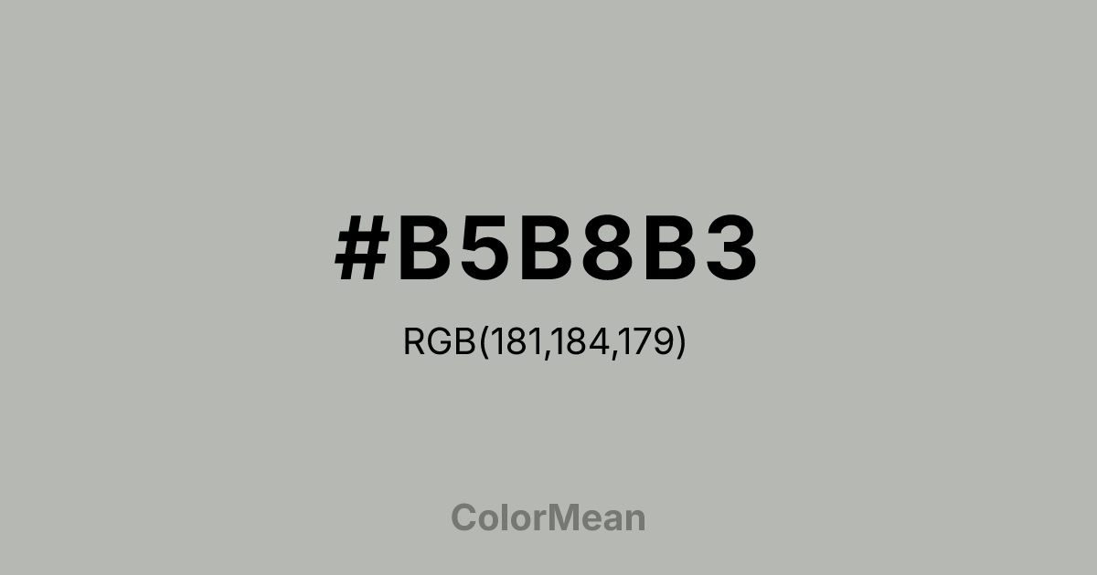
#B5B8B3 Color Information
#B5B8B3 RGB value is (181, 184, 179). The hex color red value is 181, green is 184, and blue is 179. Its HSL format shows a hue of 96°, saturation of 3 percent, and lightness of 71 percent. The CMYK process values are 2 percent, 0 percent, 3 percent, 28 percent.
#B5B8B3 Color Meaning
Color #B5B8B3 signifies neutral stability, composed detachment, and mineral stillness. #B5B8B3 cool greenish-grey mirrors natural agate stone, suggesting smoothed surfaces, timeless patience, and non-reactive observation. Psychologically, color #B5B8B3 provides a stable, non-distracting backdrop that cools emotional intensity and promotes objective analysis. #B5B8B3 avoids the sterility of pure grey by adding a whisper of green—enough to feel organic, not mechanical. Culturally, #B5B8B3 references industrial design, monastic silence, and the polished elegance of semi-precious stones. Architects and product designers use #B5B8B3 to convey durability without coldness. Spiritually, color #B5B8B3 represents the middle path, balanced judgment, and earthly grounding. #B5B8B3 acts as a contemplative buffer between extremes, embodying quiet endurance. In digital interfaces, #B5B8B3 reduces visual noise while maintaining sophistication—ideal for dashboards, editorial layouts, and professional portfolios.
Color Conversion
Convert #B5B8B3 across different color models and formats. These conversions help designers work seamlessly between digital and print media, ensuring this color maintains its intended appearance across RGB screens, CMYK printers, and HSL color manipulations.
RGB Values & CMYK Values
RGB Values
CMYK Values
Color Variations
#B5B8B3 harmonies come to life through carefully balanced shades, tints, and tones, giving this color depth and flexibility across light and dark variations. Shades add richness, tints bring an airy softness, and tones soften intensity, making it easy to pair in clean, modern palettes.
Color Harmonies
#B5B8B3 harmonies create beautiful relationships with other colors based on their position on the color wheel. Each harmony type offers unique design possibilities, enabling cohesive and visually appealing color schemes.
Analogous
Colors adjacent on the color wheel (30° apart)
Complementary
Colors opposite on the color wheel (180° apart)
Split Complementary
Three colors using one base hue and the two hues beside its opposite
Triadic
Three colors evenly spaced (120° apart)
Tetradic
Four colors forming a rectangle on the wheel
Square
Four colors evenly spaced (90° apart)
Double Split
Four colors formed from two base hues and the colors next to their opposites
Monochromatic
Variations of a single hue
Contrast Checker
(WCAG 2.1) Test #B5B8B3 for accessibility compliance against white and black backgrounds. Proper contrast ensures this color remains readable and usable for all audiences, meeting WCAG 2.1 standards for both normal and large text applications.
Sample Text
This is how your text will look with these colors.
Large Text (18pt+)
Normal Text
UI Components
Color Blindness Simulator
See how #B5B8B3 appears to people with different types of color vision deficiencies. These simulations help create more inclusive designs that consider how this color is perceived across various visual abilities.
Normal Vision
protanopia
Note: These simulations are approximations. Actual color vision deficiency varies by individual.
CSS Examples
Background Color
Text Color
Sample Text
Border Color
Box Shadow
Text Shadow
Sample Text
Gradient
#B5B8B3 Color FAQs
Frequently asked questions about #B5B8B3 color meaning, symbolism, and applications. Click on any question to expand detailed answers.
