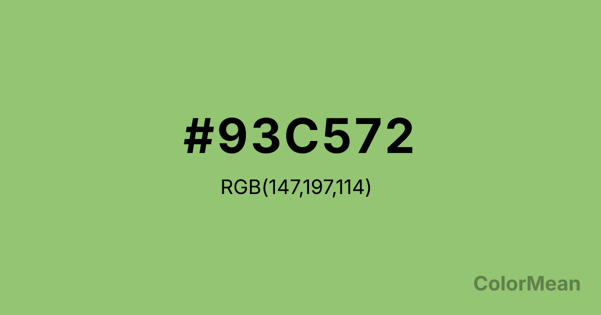
Pistachio (#93C572) Color Information
Pistachio (#93C572) RGB value is (147, 197, 114). The hex color red value is 147, green is 197, and blue is 114. Its HSL format shows a hue of 96°, saturation of 42 percent, and lightness of 61 percent. The CMYK process values are 25 percent, 0 percent, 42 percent, 23 percent.
Pistachio (#93C572) Color Meaning
Pistachio (#93C572) signifies quiet refreshment, wholesome balance, and subtle sophistication. This soft, yellowish-green resembles the nut's interior, suggesting natural flavor, mindful consumption, and understated luxury. Psychologically, Pistachio (#93C572) is calming and subtly uplifting, promoting feelings of well-being, clean satisfaction, and harmonious balance. It offers a sense of gentle vitality and nutritious abundance that feels both healthy and pleasurable. This color is a refined, modern take on nature's palette. Symbolically, Pistachio (#93C572) represents cultivated taste, a treat that is both indulgent and virtuous, and growth that is careful and intentional. It is the color of sustainable luxury and mindful living. Culturally, it appears in wellness branding, eco-conscious design, and gourmet food packaging, conveying a message of quality, natural goodness, and sophisticated restraint. Pistachio (#93C572) embodies an aesthetic where health and pleasure are not in conflict but are elegantly intertwined.
Color Conversion
Convert Pistachio (#93C572) across different color models and formats. These conversions help designers work seamlessly between digital and print media, ensuring this color maintains its intended appearance across RGB screens, CMYK printers, and HSL color manipulations.
RGB Values & CMYK Values
RGB Values
CMYK Values
Color Variations
Pistachio (#93C572) harmonies come to life through carefully balanced shades, tints, and tones, giving this color depth and flexibility across light and dark variations. Shades add richness, tints bring an airy softness, and tones soften intensity, making it easy to pair in clean, modern palettes.
Color Harmonies
Pistachio (#93C572) harmonies create beautiful relationships with other colors based on their position on the color wheel. Each harmony type offers unique design possibilities, enabling cohesive and visually appealing color schemes.
Analogous
Colors adjacent on the color wheel (30° apart)
Complementary
Colors opposite on the color wheel (180° apart)
Split Complementary
Three colors using one base hue and the two hues beside its opposite
Triadic
Three colors evenly spaced (120° apart)
Tetradic
Four colors forming a rectangle on the wheel
Square
Four colors evenly spaced (90° apart)
Double Split
Four colors formed from two base hues and the colors next to their opposites
Monochromatic
Variations of a single hue
Contrast Checker
(WCAG 2.1) Test Pistachio (#93C572) for accessibility compliance against white and black backgrounds. Proper contrast ensures this color remains readable and usable for all audiences, meeting WCAG 2.1 standards for both normal and large text applications.
Sample Text
This is how your text will look with these colors.
Large Text (18pt+)
Normal Text
UI Components
Color Blindness Simulator
See how #93C572 appears to people with different types of color vision deficiencies. These simulations help create more inclusive designs that consider how this color is perceived across various visual abilities.
Normal Vision
protanopia
Note: These simulations are approximations. Actual color vision deficiency varies by individual.
CSS Examples
Background Color
Text Color
Sample Text
Border Color
Box Shadow
Text Shadow
Sample Text
Gradient
Pistachio (#93C572) Color FAQs
Frequently asked questions about Pistachio (#93C572) color meaning, symbolism, and applications. Click on any question to expand detailed answers.
