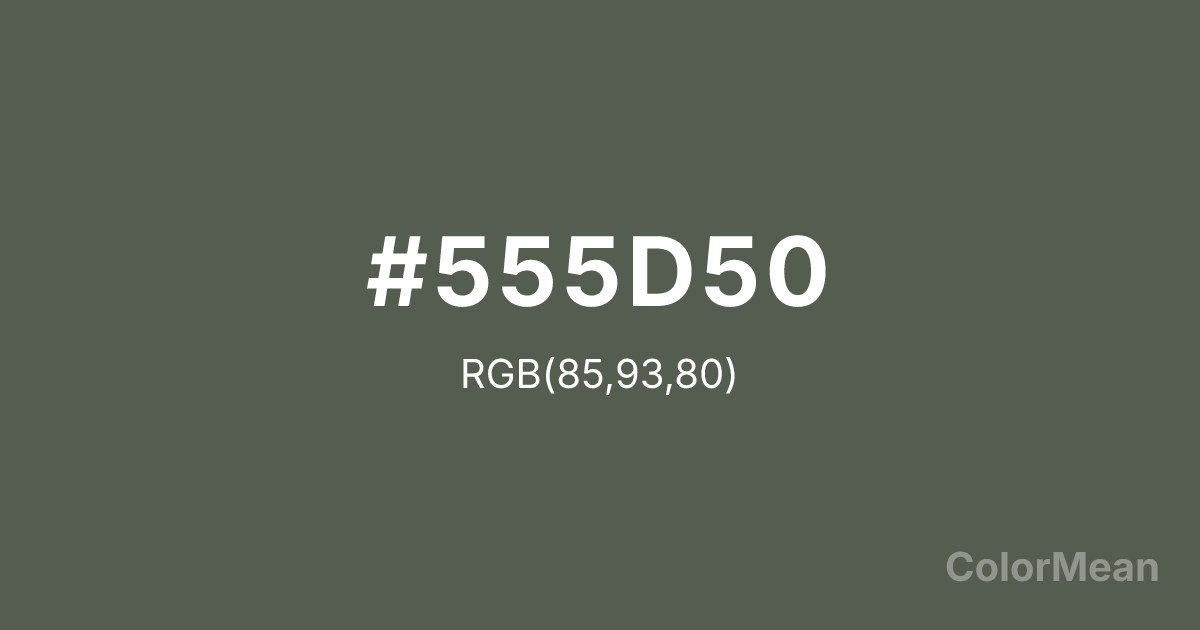
Ebony (#555D50) Color Information
Ebony (#555D50) RGB value is (85, 93, 80). The hex color red value is 85, green is 93, and blue is 80. Its HSL format shows a hue of 97°, saturation of 8 percent, and lightness of 34 percent. The CMYK process values are 9 percent, 0 percent, 14 percent, 64 percent.
Ebony (#555D50) Color Meaning
Ebony (#555D50) conveys dignified restraint, understated authority, and structural depth. This near-black green-gray avoids the starkness of pure black while retaining gravitas, making it ideal for contexts requiring seriousness without severity. Ebony (#555D50) absorbs light softly, creating visual weight that anchors compositions without overwhelming them. Research in environmental psychology shows that deep, desaturated tones like Ebony (#555D50) enhance perceived sophistication in luxury branding and editorial design. Historically, Ebony (#555D50) references the dense tropical hardwood once prized for musical instruments and fine furniture, symbolizing craftsmanship and endurance. Unlike cooler charcoals, its subtle olive undertone adds organic nuance, suggesting a connection to forest shadows and aged patina. Spiritually, Ebony (#555D50) represents introspection, hidden knowledge, and the quiet confidence that comes from experience. It serves as a visual pause—a color that listens before it speaks.
Color Conversion
Convert Ebony (#555D50) across different color models and formats. These conversions help designers work seamlessly between digital and print media, ensuring this color maintains its intended appearance across RGB screens, CMYK printers, and HSL color manipulations.
RGB Values & CMYK Values
RGB Values
CMYK Values
Color Variations
Ebony (#555D50) harmonies come to life through carefully balanced shades, tints, and tones, giving this color depth and flexibility across light and dark variations. Shades add richness, tints bring an airy softness, and tones soften intensity, making it easy to pair in clean, modern palettes.
Color Harmonies
Ebony (#555D50) harmonies create beautiful relationships with other colors based on their position on the color wheel. Each harmony type offers unique design possibilities, enabling cohesive and visually appealing color schemes.
Analogous
Colors adjacent on the color wheel (30° apart)
Complementary
Colors opposite on the color wheel (180° apart)
Split Complementary
Three colors using one base hue and the two hues beside its opposite
Triadic
Three colors evenly spaced (120° apart)
Tetradic
Four colors forming a rectangle on the wheel
Square
Four colors evenly spaced (90° apart)
Double Split
Four colors formed from two base hues and the colors next to their opposites
Monochromatic
Variations of a single hue
Contrast Checker
(WCAG 2.1) Test Ebony (#555D50) for accessibility compliance against white and black backgrounds. Proper contrast ensures this color remains readable and usable for all audiences, meeting WCAG 2.1 standards for both normal and large text applications.
Sample Text
This is how your text will look with these colors.
Large Text (18pt+)
Normal Text
UI Components
Color Blindness Simulator
See how #555D50 appears to people with different types of color vision deficiencies. These simulations help create more inclusive designs that consider how this color is perceived across various visual abilities.
Normal Vision
protanopia
Note: These simulations are approximations. Actual color vision deficiency varies by individual.
CSS Examples
Background Color
Text Color
Sample Text
Border Color
Box Shadow
Text Shadow
Sample Text
Gradient
Ebony (#555D50) Color FAQs
Frequently asked questions about Ebony (#555D50) color meaning, symbolism, and applications. Click on any question to expand detailed answers.
