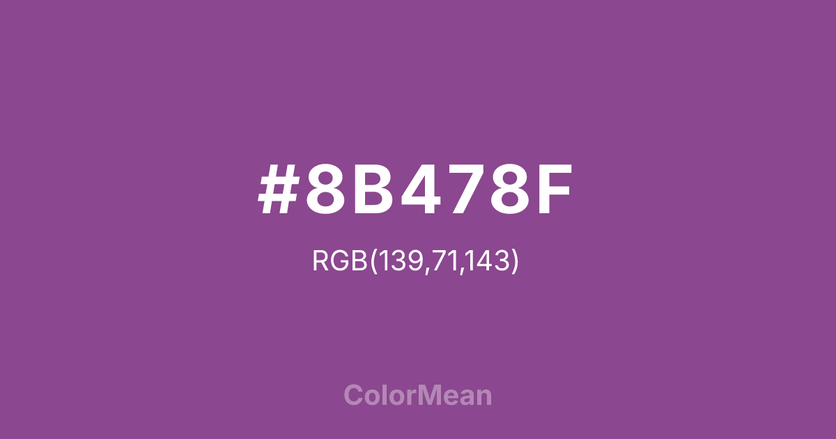
#8B478F Color Information
#8B478F RGB value is (139, 71, 143). The hex color red value is 139, green is 71, and blue is 143. Its HSL format shows a hue of 297°, saturation of 34 percent, and lightness of 42 percent. The CMYK process values are 3 percent, 50 percent, 0 percent, 44 percent.
#8B478F Color Meaning
Color #8B478F deepens emotion into dignity. #8B478F desaturated, wine-tinged purple functions as the darkest in the Orchid sequence—closer to plum than petal. Color #8B478F suggests introspection, legacy, and quiet confidence. #8B478F’s the color of private strength. In print, color #8B478F mimics aged ink and botanical illustrations, making #8B478F ideal for heritage publishing and archival design. Color #8B478F feels timeless because #8B478F references real history, not digital novelty. Designers use color #8B478F when they want warmth in shadow—think book interiors, luxury stationery, or ceremonial branding. Paired with parchment or deep green, color #8B478F creates palettes that feel both emotional and restrained. Color #8B478F doesn’t perform—#8B478F endures. And in a world of fleeting attention, that depth is rare.
Color Conversion
Convert #8B478F across different color models and formats. These conversions help designers work seamlessly between digital and print media, ensuring this color maintains its intended appearance across RGB screens, CMYK printers, and HSL color manipulations.
RGB Values & CMYK Values
RGB Values
CMYK Values
Color Variations
#8B478F harmonies come to life through carefully balanced shades, tints, and tones, giving this color depth and flexibility across light and dark variations. Shades add richness, tints bring an airy softness, and tones soften intensity, making it easy to pair in clean, modern palettes.
Color Harmonies
#8B478F harmonies create beautiful relationships with other colors based on their position on the color wheel. Each harmony type offers unique design possibilities, enabling cohesive and visually appealing color schemes.
Analogous
Colors adjacent on the color wheel (30° apart)
Complementary
Colors opposite on the color wheel (180° apart)
Split Complementary
Three colors using one base hue and the two hues beside its opposite
Triadic
Three colors evenly spaced (120° apart)
Tetradic
Four colors forming a rectangle on the wheel
Square
Four colors evenly spaced (90° apart)
Double Split
Four colors formed from two base hues and the colors next to their opposites
Monochromatic
Variations of a single hue
Contrast Checker
(WCAG 2.1) Test #8B478F for accessibility compliance against white and black backgrounds. Proper contrast ensures this color remains readable and usable for all audiences, meeting WCAG 2.1 standards for both normal and large text applications.
Sample Text
This is how your text will look with these colors.
Large Text (18pt+)
Normal Text
UI Components
Color Blindness Simulator
See how #8B478F appears to people with different types of color vision deficiencies. These simulations help create more inclusive designs that consider how this color is perceived across various visual abilities.
Normal Vision
protanopia
Note: These simulations are approximations. Actual color vision deficiency varies by individual.
CSS Examples
Background Color
Text Color
Sample Text
Border Color
Box Shadow
Text Shadow
Sample Text
Gradient
#8B478F Color FAQs
Frequently asked questions about #8B478F color meaning, symbolism, and applications. Click on any question to expand detailed answers.

