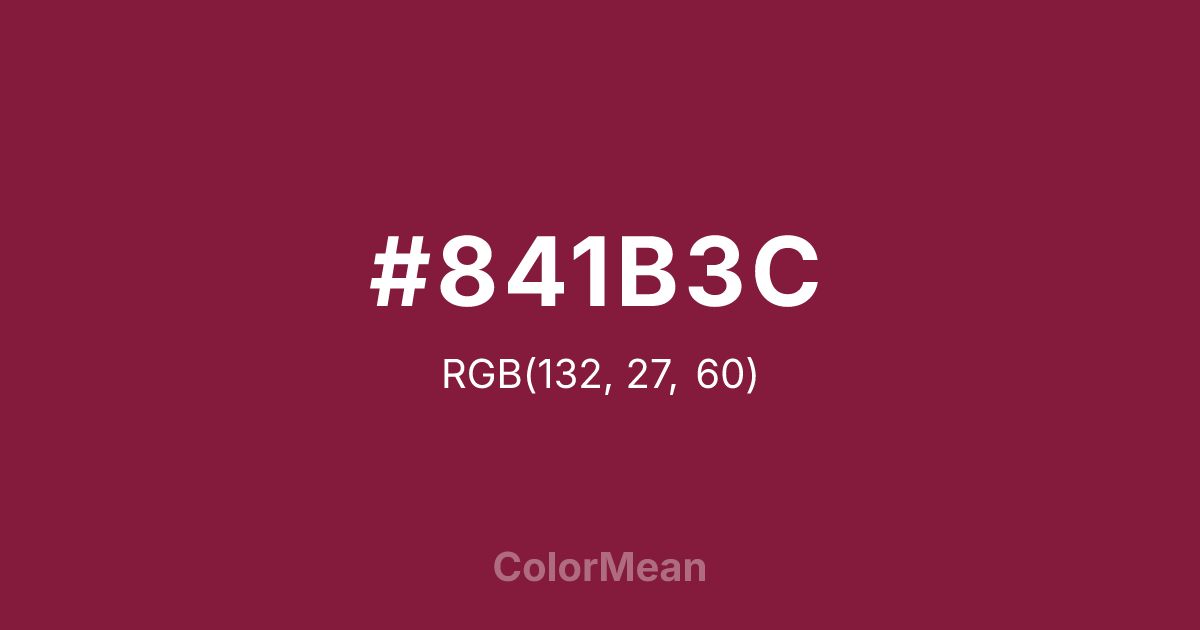
#841B3C Color Information
#841B3C RGB value is (132, 27, 60). The hex color red value is 132, green is 27, and blue is 60. Its HSL format shows a hue of 341°, saturation of 66 percent, and lightness of 31 percent. The CMYK process values are 0 percent, 80 percent, 55 percent, 48 percent.
#841B3C Color Meaning
Color #841B3C embodies vinous dignity, historical depth, and restrained passion. Color #841B3C is a deep, slightly purplish red named after the Bordeaux wine—rich, complex, and quietly authoritative. Unlike crimson, #841B3C avoids urgency; unlike burgundy, #841B3C carries more red than blue. In British and academic contexts, #841B3C signals tradition with discretion: think Oxford brogues, library bindings, and heritage uniforms. Psychological research links such deep reds to increased perceived sophistication and trust in luxury and education sectors. In design, color #841B3C functions as a premium primary or accent. #841B3C pairs powerfully with camel, cream, and slate, creating palettes that feel timeless without nostalgia. Digital use is strong in dark-mode interfaces, where #841B3C adds warmth without glare. Print reproduction is excellent, especially in letterpress and embossed finishes that enhance its tactile depth. Consumer studies show products in color #841B3C are rated as more artisanal and enduring than those in brighter reds. Symbolically, color #841B3C represents passion that matures. #841B3C is not the red of impulse but of reflection—aged in oak, shared in silence, remembered in detail. In spiritual practice, #841B3C aligns with the root chakra’s protective mode: love that preserves. Designers use color #841B3C when they want to signal depth with dignity. Its richness is earned through time.
Color Conversion
Convert #841B3C across different color models and formats. These conversions help designers work seamlessly between digital and print media, ensuring this color maintains its intended appearance across RGB screens, CMYK printers, and HSL color manipulations.
RGB Values & CMYK Values
RGB Values
CMYK Values
Color Variations
#841B3C harmonies come to life through carefully balanced shades, tints, and tones, giving this color depth and flexibility across light and dark variations. Shades add richness, tints bring an airy softness, and tones soften intensity, making it easy to pair in clean, modern palettes.
Color Harmonies
#841B3C harmonies create beautiful relationships with other colors based on their position on the color wheel. Each harmony type offers unique design possibilities, enabling cohesive and visually appealing color schemes.
Analogous
Colors adjacent on the color wheel (30° apart)
Complementary
Colors opposite on the color wheel (180° apart)
Split Complementary
Three colors using one base hue and the two hues beside its opposite
Triadic
Three colors evenly spaced (120° apart)
Tetradic
Four colors forming a rectangle on the wheel
Square
Four colors evenly spaced (90° apart)
Double Split
Four colors formed from two base hues and the colors next to their opposites
Monochromatic
Variations of a single hue
Contrast Checker
(WCAG 2.1) Test #841B3C for accessibility compliance against white and black backgrounds. Proper contrast ensures this color remains readable and usable for all audiences, meeting WCAG 2.1 standards for both normal and large text applications.
Sample Text
This is how your text will look with these colors.
Large Text (18pt+)
Normal Text
UI Components
Color Blindness Simulator
See how #841B3C appears to people with different types of color vision deficiencies. These simulations help create more inclusive designs that consider how this color is perceived across various visual abilities.
Normal Vision
protanopia
Note: These simulations are approximations. Actual color vision deficiency varies by individual.
CSS Examples
Background Color
Text Color
Sample Text
Border Color
Box Shadow
Text Shadow
Sample Text
Gradient
#841B3C Color FAQs
Frequently asked questions about #841B3C color meaning, symbolism, and applications. Click on any question to expand detailed answers.
