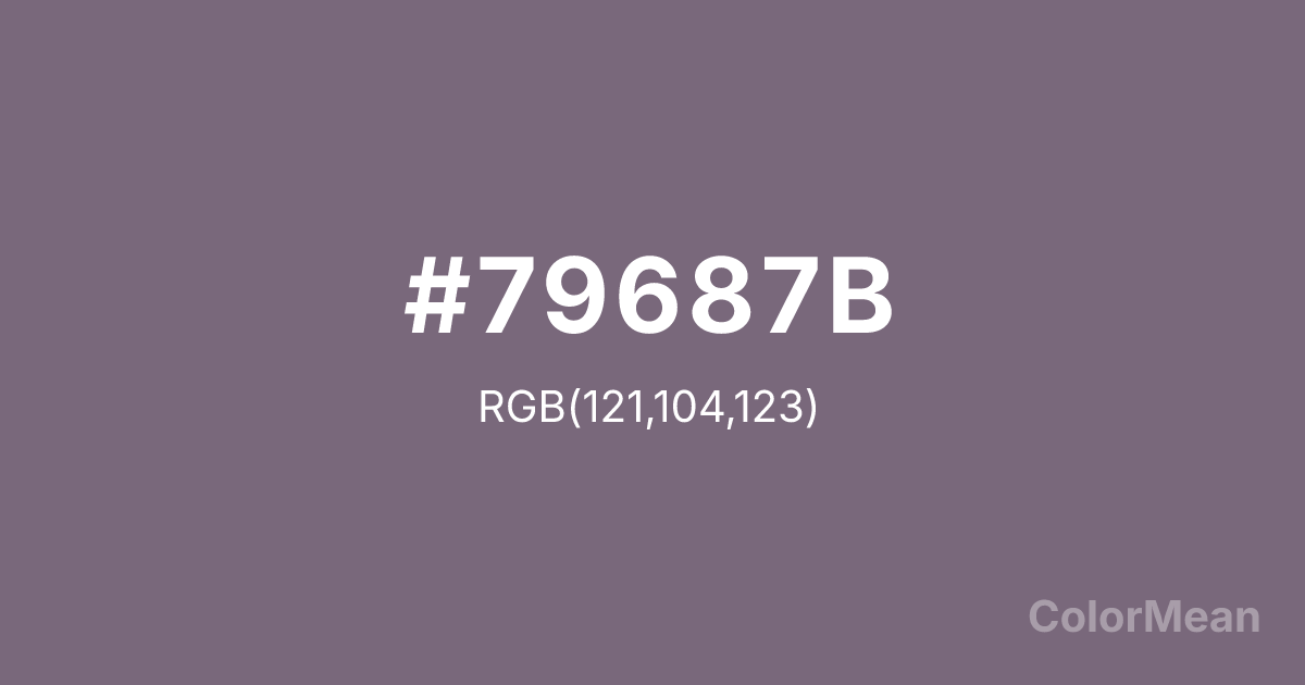
#79687B Color Information
#79687B RGB value is (121, 104, 123). The hex color red value is 121, green is 104, and blue is 123. Its HSL format shows a hue of 294°, saturation of 8 percent, and lightness of 45 percent. The CMYK process values are 2 percent, 15 percent, 0 percent, 52 percent.
#79687B Color Meaning
Color #79687B tempers floral gentleness with ashen restraint. Neither pink nor purple dominates—instead, color #79687B settles into a cool, grayed harmony that evokes dried herbs, twilight mist, and well-worn linens. Color #79687B carries the memory of scent without its sweetness, making #79687B ideal for minimalist wellness, editorial design, and inclusive elegance. Perceptual studies show that low-saturation purples like color #79687B reduce anxiety in high-stimulus environments—particularly in healthcare interfaces and transit signage—because they occupy a “restful” zone between warm and cool. Color #79687B doesn’t soothe through brightness; #79687B calms through neutrality. Designers use color #79687B when they want emotional resonance without gendered cliché. Culturally, #79687B references Victorian mourning attire reinterpreted through modern austerity. Today, color #79687B appears in gender-neutral fashion, ceramic tableware, and literary branding where subtlety signals intelligence. Paired with warm greige or deep olive, color #79687B creates depth through tonal contrast, not chromatic clash. #79687B’s the color of quiet presence—felt, not seen.
Color Conversion
Convert #79687B across different color models and formats. These conversions help designers work seamlessly between digital and print media, ensuring this color maintains its intended appearance across RGB screens, CMYK printers, and HSL color manipulations.
RGB Values & CMYK Values
RGB Values
CMYK Values
Color Variations
#79687B harmonies come to life through carefully balanced shades, tints, and tones, giving this color depth and flexibility across light and dark variations. Shades add richness, tints bring an airy softness, and tones soften intensity, making it easy to pair in clean, modern palettes.
Color Harmonies
#79687B harmonies create beautiful relationships with other colors based on their position on the color wheel. Each harmony type offers unique design possibilities, enabling cohesive and visually appealing color schemes.
Analogous
Colors adjacent on the color wheel (30° apart)
Complementary
Colors opposite on the color wheel (180° apart)
Split Complementary
Three colors using one base hue and the two hues beside its opposite
Triadic
Three colors evenly spaced (120° apart)
Tetradic
Four colors forming a rectangle on the wheel
Square
Four colors evenly spaced (90° apart)
Double Split
Four colors formed from two base hues and the colors next to their opposites
Monochromatic
Variations of a single hue
Contrast Checker
(WCAG 2.1) Test #79687B for accessibility compliance against white and black backgrounds. Proper contrast ensures this color remains readable and usable for all audiences, meeting WCAG 2.1 standards for both normal and large text applications.
Sample Text
This is how your text will look with these colors.
Large Text (18pt+)
Normal Text
UI Components
Color Blindness Simulator
See how #79687B appears to people with different types of color vision deficiencies. These simulations help create more inclusive designs that consider how this color is perceived across various visual abilities.
Normal Vision
protanopia
Note: These simulations are approximations. Actual color vision deficiency varies by individual.
CSS Examples
Background Color
Text Color
Sample Text
Border Color
Box Shadow
Text Shadow
Sample Text
Gradient
#79687B Color FAQs
Frequently asked questions about #79687B color meaning, symbolism, and applications. Click on any question to expand detailed answers.
