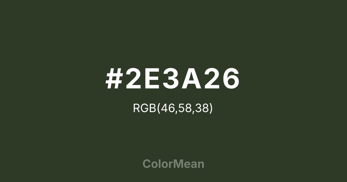
#2E3A26 Color Information
#2E3A26 RGB value is (46, 58, 38). The hex color red value is 46, green is 58, and blue is 38. Its HSL format shows a hue of 96°, saturation of 21 percent, and lightness of 19 percent. The CMYK process values are 21 percent, 0 percent, 34 percent, 77 percent.
#2E3A26 Color Meaning
Color #2E3A26 signifies industrial resilience, mineral depth, and restrained vitality. Color #2E3A26 is a deep, almost-black green historically derived from chromium oxide—used in military vehicles, industrial machinery, and early 20th-century architecture for its durability and low reflectivity. Unlike forest or emerald greens, #2E3A26 carries no organic softness; instead, #2E3A26 evokes oxidized metal, shaded concrete, and weathered steel. In environmental psychology, such dark, desaturated greens reduce perceived visual clutter in high-stress workspaces, promoting focus through suppression of distraction. Functionally, color #2E3A26 serves as a robust alternative to black in typography, UI design, and print. #2E3A26 provides excellent contrast against warm off-whites while reducing eye strain better than pure black—especially in long-form reading environments. Print reproduction is highly stable across uncoated stocks, making #2E3A26 ideal for technical manuals, institutional reports, and sustainable packaging where “earthy” must still feel precise. Consumer studies show products using color #2E3A26 are perceived as more durable and utilitarian than those in standard greys. Symbolically, color #2E3A26 represents strength that endures through function, not form. #2E3A26 is the color of infrastructure, not ornament. In cultural contexts, #2E3A26 appears in industrial heritage branding, urban renewal projects, and minimalist fashion as a symbol of honest labor. Spiritually, #2E3A26 aligns with the root chakra’s grounded mode: stability through utility. Designers choose color #2E3A26 when they want authority that works quietly. Its power lies in its refusal to perform.
Color Conversion
Convert #2E3A26 across different color models and formats. These conversions help designers work seamlessly between digital and print media, ensuring this color maintains its intended appearance across RGB screens, CMYK printers, and HSL color manipulations.
RGB Values & CMYK Values
RGB Values
CMYK Values
Color Variations
#2E3A26 harmonies come to life through carefully balanced shades, tints, and tones, giving this color depth and flexibility across light and dark variations. Shades add richness, tints bring an airy softness, and tones soften intensity, making it easy to pair in clean, modern palettes.
Color Harmonies
#2E3A26 harmonies create beautiful relationships with other colors based on their position on the color wheel. Each harmony type offers unique design possibilities, enabling cohesive and visually appealing color schemes.
Analogous
Colors adjacent on the color wheel (30° apart)
Complementary
Colors opposite on the color wheel (180° apart)
Split Complementary
Three colors using one base hue and the two hues beside its opposite
Triadic
Three colors evenly spaced (120° apart)
Tetradic
Four colors forming a rectangle on the wheel
Square
Four colors evenly spaced (90° apart)
Double Split
Four colors formed from two base hues and the colors next to their opposites
Monochromatic
Variations of a single hue
Contrast Checker
(WCAG 2.1) Test #2E3A26 for accessibility compliance against white and black backgrounds. Proper contrast ensures this color remains readable and usable for all audiences, meeting WCAG 2.1 standards for both normal and large text applications.
Sample Text
This is how your text will look with these colors.
Large Text (18pt+)
Normal Text
UI Components
Color Blindness Simulator
See how #2E3A26 appears to people with different types of color vision deficiencies. These simulations help create more inclusive designs that consider how this color is perceived across various visual abilities.
Normal Vision
protanopia
Note: These simulations are approximations. Actual color vision deficiency varies by individual.
CSS Examples
Background Color
Text Color
Sample Text
Border Color
Box Shadow
Text Shadow
Sample Text
Gradient
#2E3A26 Color FAQs
Frequently asked questions about #2E3A26 color meaning, symbolism, and applications. Click on any question to expand detailed answers.

