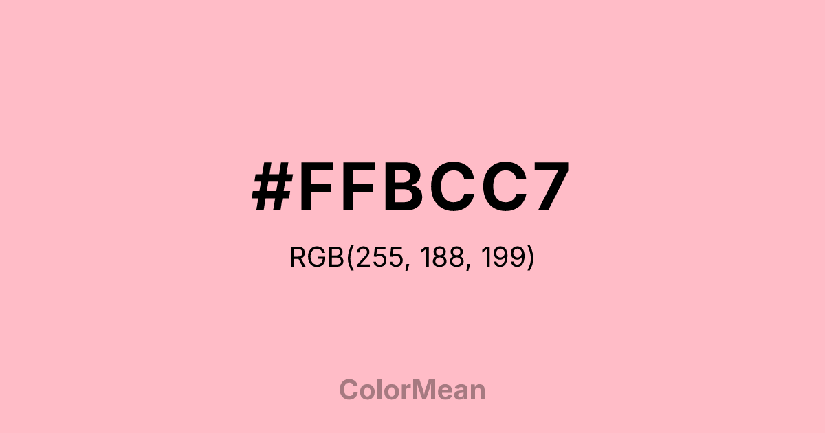
#FFBCC7 Color Information
#FFBCC7 RGB value is (255, 188, 199). The hex color red value is 255, green is 188, and blue is 199. Its HSL format shows a hue of 350°, saturation of 100 percent, and lightness of 87 percent. The CMYK process values are 0 percent, 26 percent, 22 percent, 0 percent.
#FFBCC7 Color Meaning
Color #FFBCC7 expresses ephemeral beauty, gentle renewal, and collective hope. Color #FFBCC7 is a soft, slightly peachy pink inspired by sakura blooms—fleeting, delicate, and deeply communal. In Japanese aesthetics, #FFBCC7 symbolizes mono no aware: the bittersweet awareness of impermanence. Modern color psychology links such pale pinks to reduced anxiety in public spaces, especially during seasonal transitions. Color #FFBCC7 doesn’t demand—#FFBCC7 invites reflection. In branding, #FFBCC7 hue appears in wellness, travel, and cultural initiatives where transience is framed as beauty. #FFBCC7’s common in spring campaigns, memorial designs, and mindfulness apps. Digital use requires care—#FFBCC7 fails contrast standards on white—but pairs beautifully with deep navy or charcoal for readable text. Print reproduction is excellent on bright white stock, enhancing its ethereal quality. Consumer studies show higher emotional engagement with content framed in color #FFBCC7 versus standard pastels. Symbolically, color #FFBCC7 represents unity in fragility. #FFBCC7 is not the pink of individual love but of shared moments—festivals, memorials, first blooms. In spiritual practice, #FFBCC7 aligns with the heart chakra’s open mode: love that accepts endings. Designers choose color #FFBCC7 when they want to signal hope that’s honest about time. Its power lies in its brevity.
Color Conversion
Convert #FFBCC7 across different color models and formats. These conversions help designers work seamlessly between digital and print media, ensuring this color maintains its intended appearance across RGB screens, CMYK printers, and HSL color manipulations.
RGB Values & CMYK Values
RGB Values
CMYK Values
Color Variations
#FFBCC7 harmonies come to life through carefully balanced shades, tints, and tones, giving this color depth and flexibility across light and dark variations. Shades add richness, tints bring an airy softness, and tones soften intensity, making it easy to pair in clean, modern palettes.
Color Harmonies
#FFBCC7 harmonies create beautiful relationships with other colors based on their position on the color wheel. Each harmony type offers unique design possibilities, enabling cohesive and visually appealing color schemes.
Analogous
Colors adjacent on the color wheel (30° apart)
Complementary
Colors opposite on the color wheel (180° apart)
Split Complementary
Three colors using one base hue and the two hues beside its opposite
Triadic
Three colors evenly spaced (120° apart)
Tetradic
Four colors forming a rectangle on the wheel
Square
Four colors evenly spaced (90° apart)
Double Split
Four colors formed from two base hues and the colors next to their opposites
Monochromatic
Variations of a single hue
Contrast Checker
(WCAG 2.1) Test #FFBCC7 for accessibility compliance against white and black backgrounds. Proper contrast ensures this color remains readable and usable for all audiences, meeting WCAG 2.1 standards for both normal and large text applications.
Sample Text
This is how your text will look with these colors.
Large Text (18pt+)
Normal Text
UI Components
Color Blindness Simulator
See how #FFBCC7 appears to people with different types of color vision deficiencies. These simulations help create more inclusive designs that consider how this color is perceived across various visual abilities.
Normal Vision
protanopia
Note: These simulations are approximations. Actual color vision deficiency varies by individual.
CSS Examples
Background Color
Text Color
Sample Text
Border Color
Box Shadow
Text Shadow
Sample Text
Gradient
#FFBCC7 Color FAQs
Frequently asked questions about #FFBCC7 color meaning, symbolism, and applications. Click on any question to expand detailed answers.
