Pink (#FFC0CB) Color Information
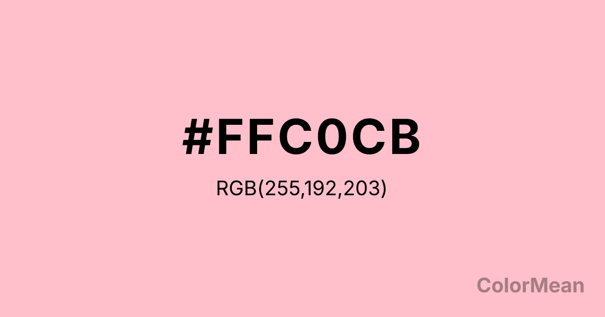
Pink (#FFC0CB) RGB value is (255, 192, 203). The hex color red value is 255, green is 192, and blue is 203. Its HSL format shows a hue of 350°, saturation of 100 percent, and lightness of 88 percent. The CMYK process values are 0 percent, 25 percent, 20 percent, 0 percent.
Pink (#FFC0CB) Color Meaning
Pink (#FFC0CB) embodies universal tenderness, gentle compassion, and romantic innocence. As the standard web color for pink, this light, warm hue is culturally codified as the color of nurturing affection, playful femininity, and sentimental care. Psychologically, Pink (#FFC0CB) is calming and emotionally supportive, reducing feelings of anger and aggression while promoting kindness, hopefulness, and unconditional acceptance. It creates an atmosphere of approachable softness and benign, cheerful sentiment. This color is a global signifier for "sweet" and "kind." Culturally, Pink (#FFC0CB) is ubiquitous in products and imagery targeting girls, Valentine's Day iconography, and branding for care-oriented services. Symbolically, it represents the heart unguarded, love in its most generalized form, and a retreat from harshness into a world of gentle emotion. Therefore, Pink (#FFC0CB) acts as a powerful, if sometimes reductive, social signal, carrying immense cultural weight regarding gender, emotion, and the aesthetics of care.
Color Conversion
Convert Pink (#FFC0CB) across different color models and formats. These conversions help designers work seamlessly between digital and print media, ensuring this color maintains its intended appearance across RGB screens, CMYK printers, and HSL color manipulations.
RGB Values & CMYK Values
RGB Values
CMYK Values
Color Variations
Pink (#FFC0CB) harmonies come to life through carefully balanced shades, tints, and tones, giving this color depth and flexibility across light and dark variations. Shades add richness, tints bring an airy softness, and tones soften intensity, making it easy to pair in clean, modern palettes.
Color Harmonies
Pink (#FFC0CB) harmonies create beautiful relationships with other colors based on their position on the color wheel. Each harmony type offers unique design possibilities, enabling cohesive and visually appealing color schemes.
Analogous
Colors adjacent on the color wheel (30° apart)
Complementary
Colors opposite on the color wheel (180° apart)
Split Complementary
Three colors using one base hue and the two hues beside its opposite
Triadic
Three colors evenly spaced (120° apart)
Tetradic
Four colors forming a rectangle on the wheel
Square
Four colors evenly spaced (90° apart)
Double Split
Four colors formed from two base hues and the colors next to their opposites
Monochromatic
Variations of a single hue
Contrast Checker
(WCAG 2.1) Test Pink (#FFC0CB) for accessibility compliance against white and black backgrounds. Proper contrast ensures this color remains readable and usable for all audiences, meeting WCAG 2.1 standards for both normal and large text applications.
Sample Text
This is how your text will look with these colors.
Large Text (18pt+)
Normal Text
UI Components
Color Blindness Simulator
See how #FFC0CB appears to people with different types of color vision deficiencies. These simulations help create more inclusive designs that consider how this color is perceived across various visual abilities.
Normal Vision
protanopia
Note: These simulations are approximations. Actual color vision deficiency varies by individual.
CSS Examples
Background Color
Text Color
Sample Text
Border Color
Box Shadow
Text Shadow
Sample Text
Gradient
Pink (#FFC0CB) Color FAQs
Frequently asked questions about Pink (#FFC0CB) color meaning, symbolism, and applications. Click on any question to expand detailed answers.
