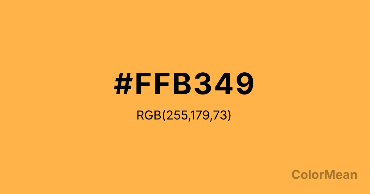
#FFB349 Color Information
#FFB349 RGB value is (255, 179, 73). The hex color red value is 255, green is 179, and blue is 73. Its HSL format shows a hue of 35°, saturation of 100 percent, and lightness of 64 percent. The CMYK process values are 0 percent, 30 percent, 71 percent, 0 percent.
#FFB349 Color Meaning
Color #FFB349 evokes gentle warmth, approachable energy, and creative comfort. #FFB349 soft, peachy orange suggests a sunset glow, ripe apricots, or the cozy light of a table lamp. Psychologically, color #FFB349 is inviting and uplifting without being overpowering, stimulating sociability, creativity, and a sense of optimistic warmth. #FFB349 fosters feelings of encouragement and wholesome vitality, making #FFB349 an excellent hue for spaces designed for collaboration, casual conversation, or creative work. #FFB349 color blends the energy of orange with a comforting, human-centric softness. Culturally, color #FFB349 is found in mid-century modern design, contemporary lifestyle branding, and educational settings for young children. Symbolically, #FFB349 represents friendly innovation, nourishing creativity, and enthusiasm that is sustainable and kind. Therefore, color #FFB349 acts as a visual catalyst for positive interaction and idea generation, providing an energizing backdrop that feels safe, inviting, and mentally stimulating.
Color Conversion
Convert #FFB349 across different color models and formats. These conversions help designers work seamlessly between digital and print media, ensuring this color maintains its intended appearance across RGB screens, CMYK printers, and HSL color manipulations.
RGB Values & CMYK Values
RGB Values
CMYK Values
Color Variations
#FFB349 harmonies come to life through carefully balanced shades, tints, and tones, giving this color depth and flexibility across light and dark variations. Shades add richness, tints bring an airy softness, and tones soften intensity, making it easy to pair in clean, modern palettes.
Color Harmonies
#FFB349 harmonies create beautiful relationships with other colors based on their position on the color wheel. Each harmony type offers unique design possibilities, enabling cohesive and visually appealing color schemes.
Analogous
Colors adjacent on the color wheel (30° apart)
Complementary
Colors opposite on the color wheel (180° apart)
Split Complementary
Three colors using one base hue and the two hues beside its opposite
Triadic
Three colors evenly spaced (120° apart)
Tetradic
Four colors forming a rectangle on the wheel
Square
Four colors evenly spaced (90° apart)
Double Split
Four colors formed from two base hues and the colors next to their opposites
Monochromatic
Variations of a single hue
Contrast Checker
(WCAG 2.1) Test #FFB349 for accessibility compliance against white and black backgrounds. Proper contrast ensures this color remains readable and usable for all audiences, meeting WCAG 2.1 standards for both normal and large text applications.
Sample Text
This is how your text will look with these colors.
Large Text (18pt+)
Normal Text
UI Components
Color Blindness Simulator
See how #FFB349 appears to people with different types of color vision deficiencies. These simulations help create more inclusive designs that consider how this color is perceived across various visual abilities.
Normal Vision
protanopia
Note: These simulations are approximations. Actual color vision deficiency varies by individual.
CSS Examples
Background Color
Text Color
Sample Text
Border Color
Box Shadow
Text Shadow
Sample Text
Gradient
#FFB349 Color FAQs
Frequently asked questions about #FFB349 color meaning, symbolism, and applications. Click on any question to expand detailed answers.
