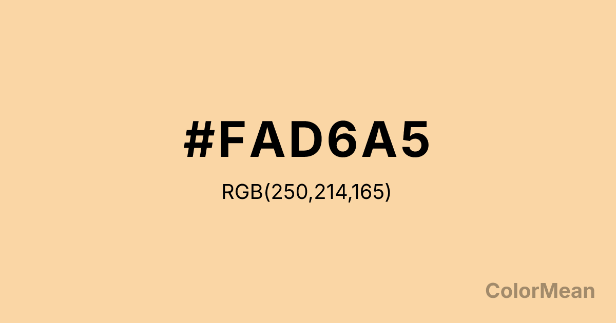
Tuscan (#FAD6A5) Color Information
Tuscan (#FAD6A5) RGB value is (250, 214, 165). The hex color red value is 250, green is 214, and blue is 165. Its HSL format shows a hue of 35°, saturation of 89 percent, and lightness of 81 percent. The CMYK process values are 0 percent, 14 percent, 34 percent, 2 percent.
Tuscan (#FAD6A5) Color Meaning
Tuscan (#FAD6A5) conveys soft warmth, approachable elegance, and gentle vitality. This light golden-beige shade encourages calm, optimistic energy, and grounded comfort. Tuscan (#FAD6A5) psychologically supports relaxation, emotional ease, and practical optimism. Culturally, Tuscan (#FAD6A5) reflects rustic charm, classical elegance, and inviting warmth in Western contexts. Eastern traditions associate it with stability, grounding, and restorative energy. Fengshui interprets this pale golden tone as harmonizing, ideal for living areas, creative spaces, or meditative environments. Spiritually, Tuscan (#FAD6A5) resonates with the Root and Solar Plexus Chakras, enhancing personal confidence, grounded energy, and warmth. Designers use this soft light shade in interiors, textiles, and branding to convey approachable sophistication and gentle visual comfort. Its muted saturation ensures subtle impact.
Color Conversion
Convert Tuscan (#FAD6A5) across different color models and formats. These conversions help designers work seamlessly between digital and print media, ensuring this color maintains its intended appearance across RGB screens, CMYK printers, and HSL color manipulations.
RGB Values & CMYK Values
RGB Values
CMYK Values
Color Variations
Tuscan (#FAD6A5) harmonies come to life through carefully balanced shades, tints, and tones, giving this color depth and flexibility across light and dark variations. Shades add richness, tints bring an airy softness, and tones soften intensity, making it easy to pair in clean, modern palettes.
Color Harmonies
Tuscan (#FAD6A5) harmonies create beautiful relationships with other colors based on their position on the color wheel. Each harmony type offers unique design possibilities, enabling cohesive and visually appealing color schemes.
Analogous
Colors adjacent on the color wheel (30° apart)
Complementary
Colors opposite on the color wheel (180° apart)
Split Complementary
Three colors using one base hue and the two hues beside its opposite
Triadic
Three colors evenly spaced (120° apart)
Tetradic
Four colors forming a rectangle on the wheel
Square
Four colors evenly spaced (90° apart)
Double Split
Four colors formed from two base hues and the colors next to their opposites
Monochromatic
Variations of a single hue
Contrast Checker
(WCAG 2.1) Test Tuscan (#FAD6A5) for accessibility compliance against white and black backgrounds. Proper contrast ensures this color remains readable and usable for all audiences, meeting WCAG 2.1 standards for both normal and large text applications.
Sample Text
This is how your text will look with these colors.
Large Text (18pt+)
Normal Text
UI Components
Color Blindness Simulator
See how #FAD6A5 appears to people with different types of color vision deficiencies. These simulations help create more inclusive designs that consider how this color is perceived across various visual abilities.
Normal Vision
protanopia
Note: These simulations are approximations. Actual color vision deficiency varies by individual.
CSS Examples
Background Color
Text Color
Sample Text
Border Color
Box Shadow
Text Shadow
Sample Text
Gradient
Tuscan (#FAD6A5) Color FAQs
Frequently asked questions about Tuscan (#FAD6A5) color meaning, symbolism, and applications. Click on any question to expand detailed answers.
