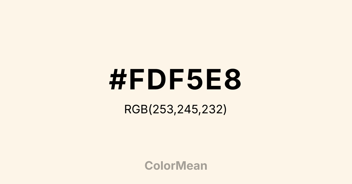
#FDF5E8 Color Information
#FDF5E8 RGB value is (253, 245, 232). The hex color red value is 253, green is 245, and blue is 232. Its HSL format shows a hue of 37°, saturation of 84 percent, and lightness of 95 percent. The CMYK process values are 0 percent, 3 percent, 8 percent, 1 percent.
#FDF5E8 Color Meaning
Color #FDF5E8 softens purity into warmth. #FDF5E8 creamy off-white—named after antique textile—avoids the void-like quality of #FFFFFF by embedding faint ivory undertones that evoke aged linen and handmade paper. Color #FDF5E8 functions as a background that breathes, offering contrast without coldness. Color #FDF5E8 frames content like a museum mat—reverent but invisible. In accessibility design, color #FDF5E8 improves readability for users with photophobia or migraines by reducing screen glare while maintaining sufficient luminance contrast against dark text. Unlike clinical whites, color #FDF5E8 feels tactile—like a page turned, not a pixel lit. Designers use color #FDF5E8 in editorial, archival, and luxury e-commerce to signal care. Culturally, #FDF5E8 ties to domestic heritage, bridal traditions, and quiet elegance. In responsive web design, color #FDF5E8 adapts gracefully across devices, never appearing yellowed or washed out. Paired with deep burgundy or forest green, color #FDF5E8 creates contrast that feels inherited, not designed. #FDF5E8’s not empty—#FDF5E8’s intentional.
Color Conversion
Convert #FDF5E8 across different color models and formats. These conversions help designers work seamlessly between digital and print media, ensuring this color maintains its intended appearance across RGB screens, CMYK printers, and HSL color manipulations.
RGB Values & CMYK Values
RGB Values
CMYK Values
Color Variations
#FDF5E8 harmonies come to life through carefully balanced shades, tints, and tones, giving this color depth and flexibility across light and dark variations. Shades add richness, tints bring an airy softness, and tones soften intensity, making it easy to pair in clean, modern palettes.
Color Harmonies
#FDF5E8 harmonies create beautiful relationships with other colors based on their position on the color wheel. Each harmony type offers unique design possibilities, enabling cohesive and visually appealing color schemes.
Analogous
Colors adjacent on the color wheel (30° apart)
Complementary
Colors opposite on the color wheel (180° apart)
Split Complementary
Three colors using one base hue and the two hues beside its opposite
Triadic
Three colors evenly spaced (120° apart)
Tetradic
Four colors forming a rectangle on the wheel
Square
Four colors evenly spaced (90° apart)
Double Split
Four colors formed from two base hues and the colors next to their opposites
Monochromatic
Variations of a single hue
Contrast Checker
(WCAG 2.1) Test #FDF5E8 for accessibility compliance against white and black backgrounds. Proper contrast ensures this color remains readable and usable for all audiences, meeting WCAG 2.1 standards for both normal and large text applications.
Sample Text
This is how your text will look with these colors.
Large Text (18pt+)
Normal Text
UI Components
Color Blindness Simulator
See how #FDF5E8 appears to people with different types of color vision deficiencies. These simulations help create more inclusive designs that consider how this color is perceived across various visual abilities.
Normal Vision
protanopia
Note: These simulations are approximations. Actual color vision deficiency varies by individual.
CSS Examples
Background Color
Text Color
Sample Text
Border Color
Box Shadow
Text Shadow
Sample Text
Gradient
#FDF5E8 Color FAQs
Frequently asked questions about #FDF5E8 color meaning, symbolism, and applications. Click on any question to expand detailed answers.

