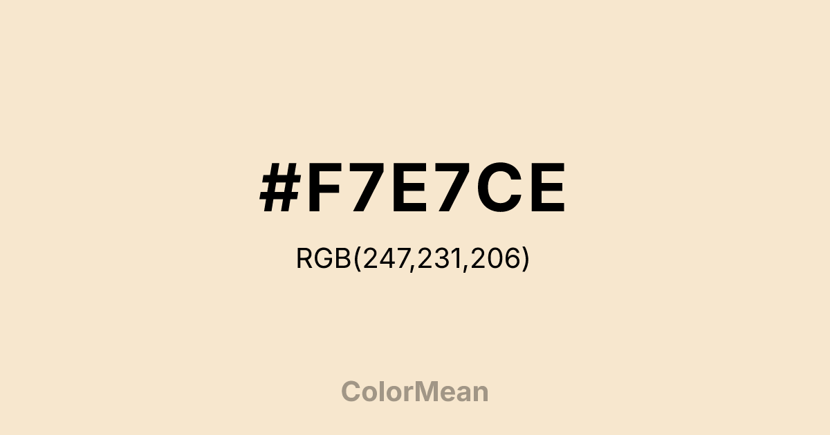
Champagne (#F7E7CE) Color Information
Champagne (#F7E7CE) RGB value is (247, 231, 206). The hex color red value is 247, green is 231, and blue is 206. Its HSL format shows a hue of 37°, saturation of 72 percent, and lightness of 89 percent. The CMYK process values are 0 percent, 6 percent, 17 percent, 3 percent.
Champagne (#F7E7CE) Color Meaning
Champagne (#F7E7CE) conveys luminous softness, celebratory elegance, and accessible luxury. Champagne (#F7E7CE) is a warm off-white with subtle peach undertones—named after the effervescent wine but defined by its gentle radiance. Unlike stark white, it carries warmth; unlike beige, it retains luminosity. In hospitality and fashion branding, Champagne (#F7E7CE) signals refinement without exclusivity. Psychological research shows that such warm neutrals increase perceived approachability in luxury contexts, making them ideal for bridal, skincare, and premium travel. Functionally, Champagne (#F7E7CE) excels as a background in print and digital media. It reduces eye strain better than pure white while maintaining excellent contrast for dark text. It’s a staple in high-end packaging, editorial layouts, and mobile interfaces where “breathing room” enhances readability. Print consistency is high, though designers often specify bright white stock to preserve its delicate warmth. Consumer testing reveals higher perceived value for products presented against Champagne (#F7E7CE) versus standard ivory. Symbolically, Champagne (#F7E7CE) represents joy that includes. It is not the gold of power but the shimmer of shared moments—weddings, milestones, quiet victories. In spiritual contexts, it aligns with the solar plexus chakra’s confident mode: self-worth expressed gently. Designers choose Champagne (#F7E7CE) when they want to signal elegance without distance. Its luxury is lived-in, not locked away.
Color Conversion
Convert Champagne (#F7E7CE) across different color models and formats. These conversions help designers work seamlessly between digital and print media, ensuring this color maintains its intended appearance across RGB screens, CMYK printers, and HSL color manipulations.
RGB Values & CMYK Values
RGB Values
CMYK Values
Color Variations
Champagne (#F7E7CE) harmonies come to life through carefully balanced shades, tints, and tones, giving this color depth and flexibility across light and dark variations. Shades add richness, tints bring an airy softness, and tones soften intensity, making it easy to pair in clean, modern palettes.
Color Harmonies
Champagne (#F7E7CE) harmonies create beautiful relationships with other colors based on their position on the color wheel. Each harmony type offers unique design possibilities, enabling cohesive and visually appealing color schemes.
Analogous
Colors adjacent on the color wheel (30° apart)
Complementary
Colors opposite on the color wheel (180° apart)
Split Complementary
Three colors using one base hue and the two hues beside its opposite
Triadic
Three colors evenly spaced (120° apart)
Tetradic
Four colors forming a rectangle on the wheel
Square
Four colors evenly spaced (90° apart)
Double Split
Four colors formed from two base hues and the colors next to their opposites
Monochromatic
Variations of a single hue
Contrast Checker
(WCAG 2.1) Test Champagne (#F7E7CE) for accessibility compliance against white and black backgrounds. Proper contrast ensures this color remains readable and usable for all audiences, meeting WCAG 2.1 standards for both normal and large text applications.
Sample Text
This is how your text will look with these colors.
Large Text (18pt+)
Normal Text
UI Components
Color Blindness Simulator
See how #F7E7CE appears to people with different types of color vision deficiencies. These simulations help create more inclusive designs that consider how this color is perceived across various visual abilities.
Normal Vision
protanopia
Note: These simulations are approximations. Actual color vision deficiency varies by individual.
CSS Examples
Background Color
Text Color
Sample Text
Border Color
Box Shadow
Text Shadow
Sample Text
Gradient
Champagne (#F7E7CE) Color FAQs
Frequently asked questions about Champagne (#F7E7CE) color meaning, symbolism, and applications. Click on any question to expand detailed answers.
