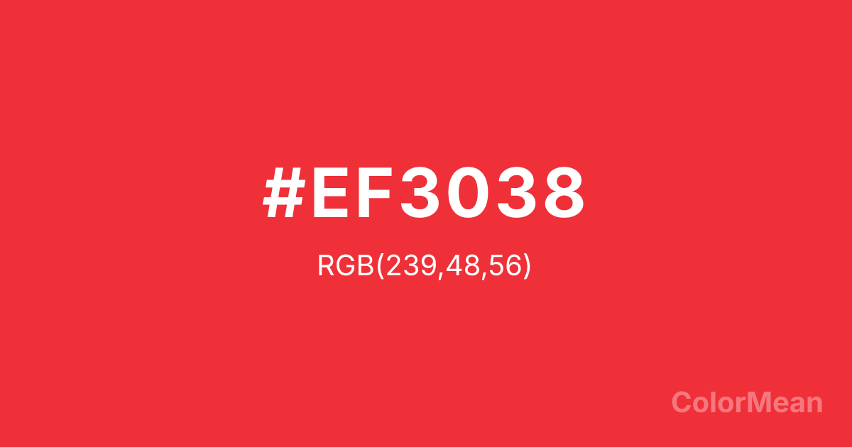
Deep Carmine Pink (#EF3038) Color Information
Deep Carmine Pink (#EF3038) RGB value is (239, 48, 56). The hex color red value is 239, green is 48, and blue is 56. Its HSL format shows a hue of 357°, saturation of 86 percent, and lightness of 56 percent. The CMYK process values are 0 percent, 80 percent, 77 percent, 6 percent.
Deep Carmine Pink (#EF3038) Color Meaning
Deep Carmine Pink (#EF3038) signifies urgent attraction, focused danger, and modern vibrancy. This bright, pure red with a slight orange undertone commands immediate visual attention, suggesting alarm systems, bold branding, and ripe berries. Psychologically, Deep Carmine Pink (#EF3038) stimulates excitement, raises energy levels, and signals a call to action that is both lively and precise. It culturally references fast-paced consumer culture, emergency stop buttons, and contemporary graphic design. Spiritually, this color represents vital force in its most direct and uncomplicated form, the spark of instantaneous life, and energy that demands engagement, acting as a powerful and unambiguous stimulant.
Color Conversion
Convert Deep Carmine Pink (#EF3038) across different color models and formats. These conversions help designers work seamlessly between digital and print media, ensuring this color maintains its intended appearance across RGB screens, CMYK printers, and HSL color manipulations.
RGB Values & CMYK Values
RGB Values
CMYK Values
Color Variations
Deep Carmine Pink (#EF3038) harmonies come to life through carefully balanced shades, tints, and tones, giving this color depth and flexibility across light and dark variations. Shades add richness, tints bring an airy softness, and tones soften intensity, making it easy to pair in clean, modern palettes.
Color Harmonies
Deep Carmine Pink (#EF3038) harmonies create beautiful relationships with other colors based on their position on the color wheel. Each harmony type offers unique design possibilities, enabling cohesive and visually appealing color schemes.
Analogous
Colors adjacent on the color wheel (30° apart)
Complementary
Colors opposite on the color wheel (180° apart)
Split Complementary
Three colors using one base hue and the two hues beside its opposite
Triadic
Three colors evenly spaced (120° apart)
Tetradic
Four colors forming a rectangle on the wheel
Square
Four colors evenly spaced (90° apart)
Double Split
Four colors formed from two base hues and the colors next to their opposites
Monochromatic
Variations of a single hue
Contrast Checker
(WCAG 2.1) Test Deep Carmine Pink (#EF3038) for accessibility compliance against white and black backgrounds. Proper contrast ensures this color remains readable and usable for all audiences, meeting WCAG 2.1 standards for both normal and large text applications.
Sample Text
This is how your text will look with these colors.
Large Text (18pt+)
Normal Text
UI Components
Color Blindness Simulator
See how #EF3038 appears to people with different types of color vision deficiencies. These simulations help create more inclusive designs that consider how this color is perceived across various visual abilities.
Normal Vision
protanopia
Note: These simulations are approximations. Actual color vision deficiency varies by individual.
CSS Examples
Background Color
Text Color
Sample Text
Border Color
Box Shadow
Text Shadow
Sample Text
Gradient
Deep Carmine Pink (#EF3038) Color FAQs
Frequently asked questions about Deep Carmine Pink (#EF3038) color meaning, symbolism, and applications. Click on any question to expand detailed answers.
