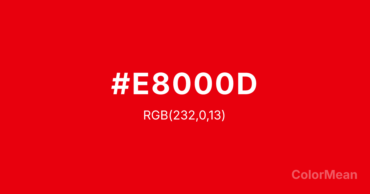
KU Crimson (#E8000D) Color Information
KU Crimson (#E8000D) RGB value is (232, 0, 13). The hex color red value is 232, green is 0, and blue is 13. Its HSL format shows a hue of 357°, saturation of 100 percent, and lightness of 45 percent. The CMYK process values are 0 percent, 100 percent, 94 percent, 9 percent.
KU Crimson (#E8000D) Color Meaning
KU Crimson (#E8000D) radiates urgent pride, institutional loyalty, and unapologetic visibility. As the official red of the University of Kansas, this near-pure spectral red (RGB 232, 0, 13) maximizes chromatic impact—designed to stand out in stadiums, banners, and digital feeds. KU Crimson (#E8000D) is not subtle; it’s a signal. Its high luminance ensures legibility at distance, critical for sports and emergency contexts. Psychologically, KU Crimson (#E8000D) spikes alertness and emotional arousal. Studies show red enhances performance in physical tasks but can impair complex cognition—making it ideal for rallying calls, not reflective spaces. Culturally, it embodies collective identity: alumni, athletes, and communities united under one pulse. Symbolically, KU Crimson (#E8000D) represents passion with purpose. It’s not random energy—it’s directed heat. In branding beyond academia, it works best when paired with neutral tones to prevent visual overload. Spiritually, it echoes the Lakota concept of wówačhaŋtognaka: generosity through spirited action.
Color Conversion
Convert KU Crimson (#E8000D) across different color models and formats. These conversions help designers work seamlessly between digital and print media, ensuring this color maintains its intended appearance across RGB screens, CMYK printers, and HSL color manipulations.
RGB Values & CMYK Values
RGB Values
CMYK Values
Color Variations
KU Crimson (#E8000D) harmonies come to life through carefully balanced shades, tints, and tones, giving this color depth and flexibility across light and dark variations. Shades add richness, tints bring an airy softness, and tones soften intensity, making it easy to pair in clean, modern palettes.
Color Harmonies
KU Crimson (#E8000D) harmonies create beautiful relationships with other colors based on their position on the color wheel. Each harmony type offers unique design possibilities, enabling cohesive and visually appealing color schemes.
Analogous
Colors adjacent on the color wheel (30° apart)
Complementary
Colors opposite on the color wheel (180° apart)
Split Complementary
Three colors using one base hue and the two hues beside its opposite
Triadic
Three colors evenly spaced (120° apart)
Tetradic
Four colors forming a rectangle on the wheel
Square
Four colors evenly spaced (90° apart)
Double Split
Four colors formed from two base hues and the colors next to their opposites
Monochromatic
Variations of a single hue
Contrast Checker
(WCAG 2.1) Test KU Crimson (#E8000D) for accessibility compliance against white and black backgrounds. Proper contrast ensures this color remains readable and usable for all audiences, meeting WCAG 2.1 standards for both normal and large text applications.
Sample Text
This is how your text will look with these colors.
Large Text (18pt+)
Normal Text
UI Components
Color Blindness Simulator
See how #E8000D appears to people with different types of color vision deficiencies. These simulations help create more inclusive designs that consider how this color is perceived across various visual abilities.
Normal Vision
protanopia
Note: These simulations are approximations. Actual color vision deficiency varies by individual.
CSS Examples
Background Color
Text Color
Sample Text
Border Color
Box Shadow
Text Shadow
Sample Text
Gradient
KU Crimson (#E8000D) Color FAQs
Frequently asked questions about KU Crimson (#E8000D) color meaning, symbolism, and applications. Click on any question to expand detailed answers.
