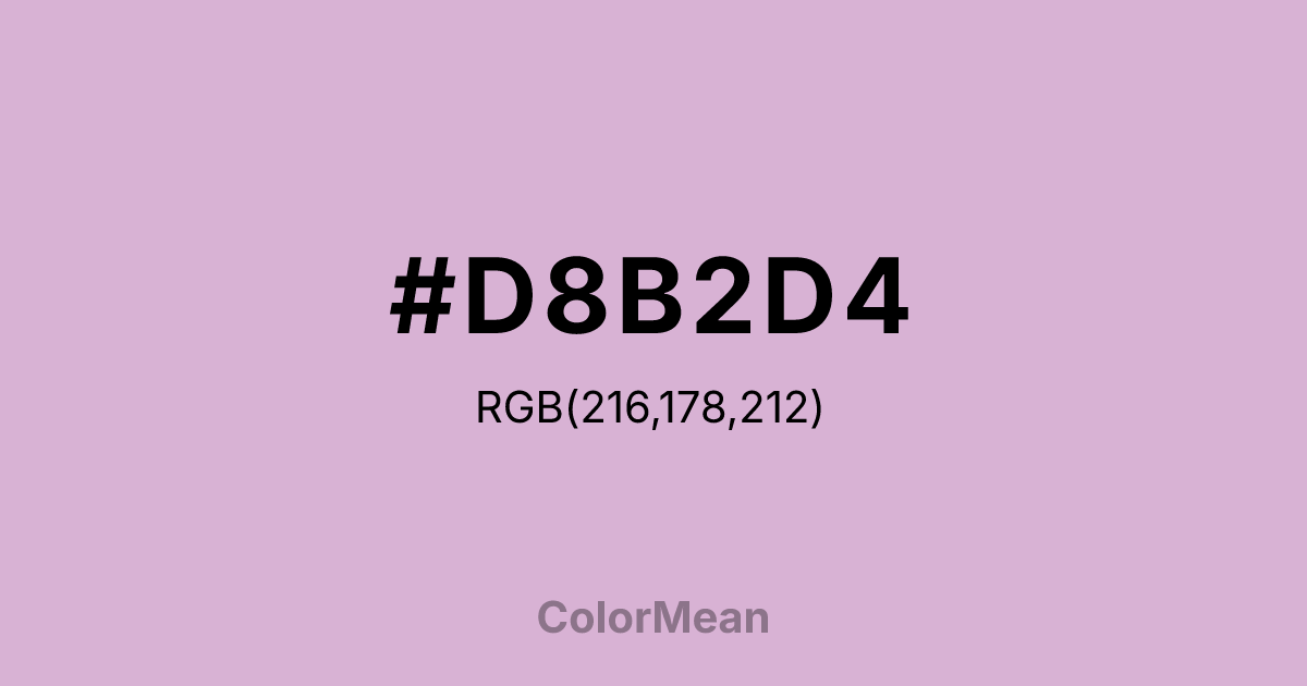
#D8B2D4 Color Information
#D8B2D4 RGB value is (216, 178, 212). The hex color red value is 216, green is 178, and blue is 212. Its HSL format shows a hue of 306°, saturation of 33 percent, and lightness of 77 percent. The CMYK process values are 0 percent, 18 percent, 2 percent, 15 percent.
#D8B2D4 Color Meaning
Color #D8B2D4 signifies nostalgic grace, gentle melancholy, and faded romance. #D8B2D4 muted, greyish purple-pink resembles dried lavender, vintage sachets, and weathered rose petals, suggesting sentiment preserved from a bygone era. Psychologically, color #D8B2D4 is soothing and introspective, promoting feelings of wistful memory, dignified affection, and a quiet, personal sense of beauty. #D8B2D4 calms emotional agitation with its soft, dusty warmth and connection to gentle tradition. #D8B2D4 color feels both elegant and lonely. Culturally, color #D8B2D4 is linked to shabby chic decor, historical romance novels, and heritage crafts, symbolizing heirloom quality, gentle aging, and a soft-focus view of the past. Symbolically, #D8B2D4 represents love letters kept in a drawer, perfume that lingers, and the quiet persistence of memory. Color #D8B2D4 provides a sophisticated, emotionally complex pastel that speaks of sensitivity, history, and a romance that is cherished more for its memory than its present intensity.
Color Conversion
Convert #D8B2D4 across different color models and formats. These conversions help designers work seamlessly between digital and print media, ensuring this color maintains its intended appearance across RGB screens, CMYK printers, and HSL color manipulations.
RGB Values & CMYK Values
RGB Values
CMYK Values
Color Variations
#D8B2D4 harmonies come to life through carefully balanced shades, tints, and tones, giving this color depth and flexibility across light and dark variations. Shades add richness, tints bring an airy softness, and tones soften intensity, making it easy to pair in clean, modern palettes.
Color Harmonies
#D8B2D4 harmonies create beautiful relationships with other colors based on their position on the color wheel. Each harmony type offers unique design possibilities, enabling cohesive and visually appealing color schemes.
Analogous
Colors adjacent on the color wheel (30° apart)
Complementary
Colors opposite on the color wheel (180° apart)
Split Complementary
Three colors using one base hue and the two hues beside its opposite
Triadic
Three colors evenly spaced (120° apart)
Tetradic
Four colors forming a rectangle on the wheel
Square
Four colors evenly spaced (90° apart)
Double Split
Four colors formed from two base hues and the colors next to their opposites
Monochromatic
Variations of a single hue
Contrast Checker
(WCAG 2.1) Test #D8B2D4 for accessibility compliance against white and black backgrounds. Proper contrast ensures this color remains readable and usable for all audiences, meeting WCAG 2.1 standards for both normal and large text applications.
Sample Text
This is how your text will look with these colors.
Large Text (18pt+)
Normal Text
UI Components
Color Blindness Simulator
See how #D8B2D4 appears to people with different types of color vision deficiencies. These simulations help create more inclusive designs that consider how this color is perceived across various visual abilities.
Normal Vision
protanopia
Note: These simulations are approximations. Actual color vision deficiency varies by individual.
CSS Examples
Background Color
Text Color
Sample Text
Border Color
Box Shadow
Text Shadow
Sample Text
Gradient
#D8B2D4 Color FAQs
Frequently asked questions about #D8B2D4 color meaning, symbolism, and applications. Click on any question to expand detailed answers.

