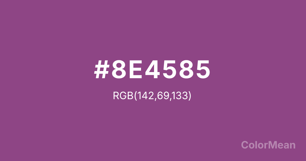
Plum (#8E4585) Color Information
Plum (#8E4585) RGB value is (142, 69, 133). The hex color red value is 142, green is 69, and blue is 133. Its HSL format shows a hue of 307°, saturation of 35 percent, and lightness of 41 percent. The CMYK process values are 0 percent, 51 percent, 6 percent, 44 percent.
Plum (#8E4585) Color Meaning
Plum (#8E4585) embodies mysterious depth, spiritual richness, and creative introspection. This dark, reddish-purple is the color of the ripe fruit, twilight skies, and royal velvets, suggesting hidden knowledge, transformative passion, and a connection to the subconscious. Psychologically, Plum (#8E4585) is absorbing and contemplative, encouraging deep feeling, imaginative exploration, and a sense of dignified mystery. It soothes with its gravity while stimulating the intuitive mind. This color feels both luxurious and profoundly introspective. Culturally, Plum (#8E4585) is linked to creativity, spirituality, and certain traditions of royalty and academia, symbolizing wisdom, ambition, and the fruitful results of deep work. Symbolically, it represents the harvest of the inner world, the sweetness found in shadow, and a bridge between earthly desire and higher understanding. Plum (#8E4585) provides a rich, dark alternative to brighter purples, carrying connotations of maturity, abundance, and sophisticated soul-searching.
Color Conversion
Convert Plum (#8E4585) across different color models and formats. These conversions help designers work seamlessly between digital and print media, ensuring this color maintains its intended appearance across RGB screens, CMYK printers, and HSL color manipulations.
RGB Values & CMYK Values
RGB Values
CMYK Values
Color Variations
Plum (#8E4585) harmonies come to life through carefully balanced shades, tints, and tones, giving this color depth and flexibility across light and dark variations. Shades add richness, tints bring an airy softness, and tones soften intensity, making it easy to pair in clean, modern palettes.
Color Harmonies
Plum (#8E4585) harmonies create beautiful relationships with other colors based on their position on the color wheel. Each harmony type offers unique design possibilities, enabling cohesive and visually appealing color schemes.
Analogous
Colors adjacent on the color wheel (30° apart)
Complementary
Colors opposite on the color wheel (180° apart)
Split Complementary
Three colors using one base hue and the two hues beside its opposite
Triadic
Three colors evenly spaced (120° apart)
Tetradic
Four colors forming a rectangle on the wheel
Square
Four colors evenly spaced (90° apart)
Double Split
Four colors formed from two base hues and the colors next to their opposites
Monochromatic
Variations of a single hue
Contrast Checker
(WCAG 2.1) Test Plum (#8E4585) for accessibility compliance against white and black backgrounds. Proper contrast ensures this color remains readable and usable for all audiences, meeting WCAG 2.1 standards for both normal and large text applications.
Sample Text
This is how your text will look with these colors.
Large Text (18pt+)
Normal Text
UI Components
Color Blindness Simulator
See how #8E4585 appears to people with different types of color vision deficiencies. These simulations help create more inclusive designs that consider how this color is perceived across various visual abilities.
Normal Vision
protanopia
Note: These simulations are approximations. Actual color vision deficiency varies by individual.
CSS Examples
Background Color
Text Color
Sample Text
Border Color
Box Shadow
Text Shadow
Sample Text
Gradient
Plum (#8E4585) Color FAQs
Frequently asked questions about Plum (#8E4585) color meaning, symbolism, and applications. Click on any question to expand detailed answers.
