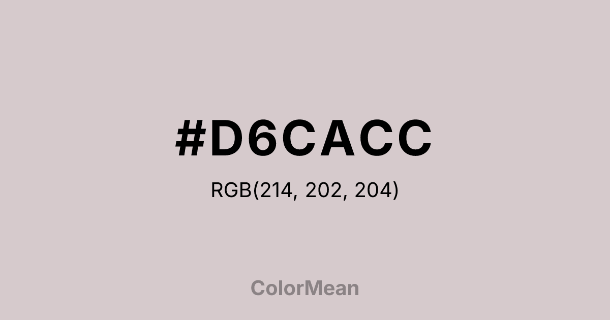
#D6CACC Color Information
#D6CACC RGB value is (214, 202, 204). The hex color red value is 214, green is 202, and blue is 204. Its HSL format shows a hue of 350°, saturation of 13 percent, and lightness of 82 percent. The CMYK process values are 0 percent, 6 percent, 5 percent, 16 percent.
#D6CACC Color Meaning
Color #D6CACC conveys gentle neutrality, soft balance, and visual openness. #D6CACC light grey shade encourages calm observation, low-stimulation focus, and subtle sophistication. Color #D6CACC psychologically reduces stress, fosters clarity, and creates spacious environments. In Western design, color #D6CACC reflects minimalism, modernity, and neutral elegance. Eastern symbolism associates #D6CACC with clarity, neutrality, and unobtrusive harmony. Fengshui uses #D6CACC as a stabilizing color to expand perception and lighten spaces without distraction. Spiritually, color #D6CACC aligns with the Crown Chakra, promoting objectivity, mindfulness, and contemplative openness. Designers favor #D6CACC light tone for backgrounds, web design, interiors, and printed materials where subtle neutrality is essential. Its pale shade harmonizes with almost any palette.
Color Conversion
Convert #D6CACC across different color models and formats. These conversions help designers work seamlessly between digital and print media, ensuring this color maintains its intended appearance across RGB screens, CMYK printers, and HSL color manipulations.
RGB Values & CMYK Values
RGB Values
CMYK Values
Color Variations
#D6CACC harmonies come to life through carefully balanced shades, tints, and tones, giving this color depth and flexibility across light and dark variations. Shades add richness, tints bring an airy softness, and tones soften intensity, making it easy to pair in clean, modern palettes.
Color Harmonies
#D6CACC harmonies create beautiful relationships with other colors based on their position on the color wheel. Each harmony type offers unique design possibilities, enabling cohesive and visually appealing color schemes.
Analogous
Colors adjacent on the color wheel (30° apart)
Complementary
Colors opposite on the color wheel (180° apart)
Split Complementary
Three colors using one base hue and the two hues beside its opposite
Triadic
Three colors evenly spaced (120° apart)
Tetradic
Four colors forming a rectangle on the wheel
Square
Four colors evenly spaced (90° apart)
Double Split
Four colors formed from two base hues and the colors next to their opposites
Monochromatic
Variations of a single hue
Contrast Checker
(WCAG 2.1) Test #D6CACC for accessibility compliance against white and black backgrounds. Proper contrast ensures this color remains readable and usable for all audiences, meeting WCAG 2.1 standards for both normal and large text applications.
Sample Text
This is how your text will look with these colors.
Large Text (18pt+)
Normal Text
UI Components
Color Blindness Simulator
See how #D6CACC appears to people with different types of color vision deficiencies. These simulations help create more inclusive designs that consider how this color is perceived across various visual abilities.
Normal Vision
protanopia
Note: These simulations are approximations. Actual color vision deficiency varies by individual.
CSS Examples
Background Color
Text Color
Sample Text
Border Color
Box Shadow
Text Shadow
Sample Text
Gradient
#D6CACC Color FAQs
Frequently asked questions about #D6CACC color meaning, symbolism, and applications. Click on any question to expand detailed answers.
