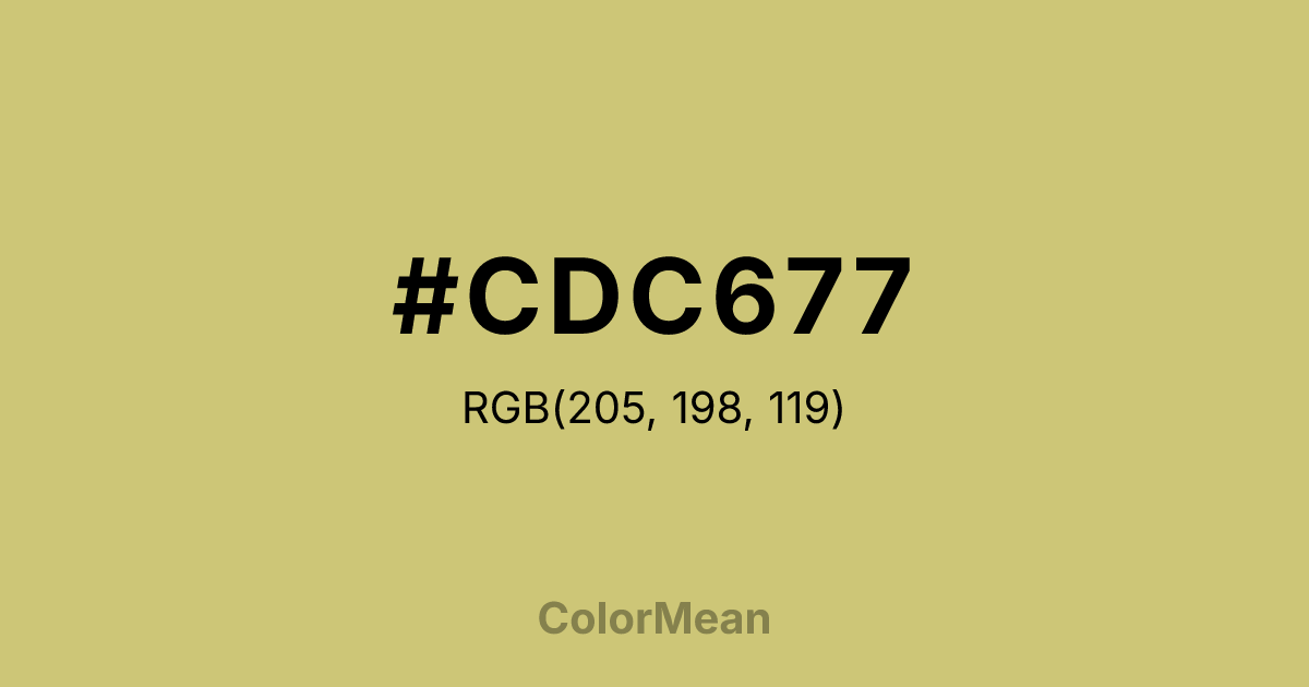
#CDC677 Color Information
#CDC677 RGB value is (205, 198, 119). The hex color red value is 205, green is 198, and blue is 119. Its HSL format shows a hue of 55°, saturation of 46 percent, and lightness of 64 percent. The CMYK process values are 0 percent, 3 percent, 42 percent, 20 percent.
#CDC677 Color Meaning
Color #CDC677 conveys weathered utility, tempered warmth, and functional elegance. #CDC677 mid-tone olive-yellow (RGB 205, 198, 115) sits firmly in the earth spectrum—darker than parchment but lighter than military drab—making #CDC677 both versatile and distinctive. Color #CDC677 feels archival yet alive, like aged leather journals or sun-dried flax, blending historical weight with tactile warmth. Its balanced saturation ensures #CDC677 works as both a foreground and background element without visual fatigue. Historically rooted in military and expedition wear, color #CDC677 evolved into a staple of workwear and artisanal craft, symbolizing durability over decoration. In contemporary branding, #CDC677 appears in sustainable fashion, organic food packaging, and heritage product lines that emphasize time-tested quality. Unlike trendy neutrals, color #CDC677 resists obsolescence—#CDC677 looks better with age, not worse. From a cognitive perspective, #CDC677 hue supports sustained attention by offering moderate contrast without sharp edges. #CDC677’s particularly effective in data visualization where category distinction matters but emotional neutrality is required. Symbolically, color #CDC677 represents stewardship: the careful use of resources, respect for process, and quiet pride in doing things well. #CDC677 doesn’t seek applause—#CDC677 simply endures.
Color Conversion
Convert #CDC677 across different color models and formats. These conversions help designers work seamlessly between digital and print media, ensuring this color maintains its intended appearance across RGB screens, CMYK printers, and HSL color manipulations.
RGB Values & CMYK Values
RGB Values
CMYK Values
Color Variations
#CDC677 harmonies come to life through carefully balanced shades, tints, and tones, giving this color depth and flexibility across light and dark variations. Shades add richness, tints bring an airy softness, and tones soften intensity, making it easy to pair in clean, modern palettes.
Color Harmonies
#CDC677 harmonies create beautiful relationships with other colors based on their position on the color wheel. Each harmony type offers unique design possibilities, enabling cohesive and visually appealing color schemes.
Analogous
Colors adjacent on the color wheel (30° apart)
Complementary
Colors opposite on the color wheel (180° apart)
Split Complementary
Three colors using one base hue and the two hues beside its opposite
Triadic
Three colors evenly spaced (120° apart)
Tetradic
Four colors forming a rectangle on the wheel
Square
Four colors evenly spaced (90° apart)
Double Split
Four colors formed from two base hues and the colors next to their opposites
Monochromatic
Variations of a single hue
Contrast Checker
(WCAG 2.1) Test #CDC677 for accessibility compliance against white and black backgrounds. Proper contrast ensures this color remains readable and usable for all audiences, meeting WCAG 2.1 standards for both normal and large text applications.
Sample Text
This is how your text will look with these colors.
Large Text (18pt+)
Normal Text
UI Components
Color Blindness Simulator
See how #CDC677 appears to people with different types of color vision deficiencies. These simulations help create more inclusive designs that consider how this color is perceived across various visual abilities.
Normal Vision
protanopia
Note: These simulations are approximations. Actual color vision deficiency varies by individual.
CSS Examples
Background Color
Text Color
Sample Text
Border Color
Box Shadow
Text Shadow
Sample Text
Gradient
#CDC677 Color FAQs
Frequently asked questions about #CDC677 color meaning, symbolism, and applications. Click on any question to expand detailed answers.
