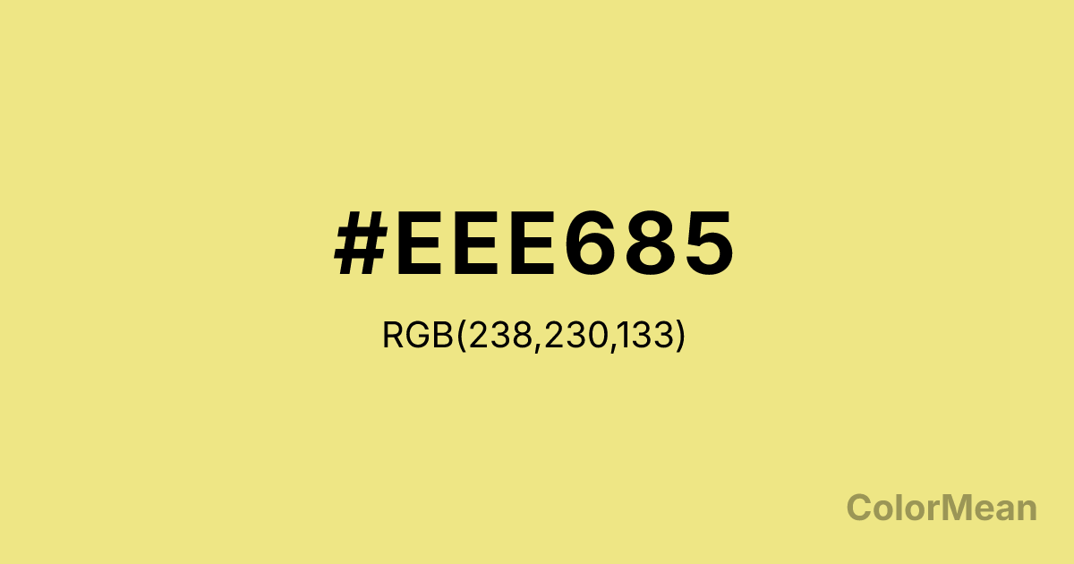
Khaki2 (#EEE685) Color Information
Khaki2 (#EEE685) RGB value is (238, 230, 133). The hex color red value is 238, green is 230, and blue is 133. Its HSL format shows a hue of 55°, saturation of 76 percent, and lightness of 73 percent. The CMYK process values are 0 percent, 3 percent, 44 percent, 7 percent.
Khaki2 (#EEE685) Color Meaning
Khaki2 (#EEE685) offers balanced luminosity, grounded brightness, and approachable warmth. Slightly deeper than Khaki1 but still high in reflectance (RGB 238, 230, 133), it mimics the color of ripe wheat or parchment under overcast sun—natural, readable, and quietly confident. Khaki2 (#EEE685) avoids the sterility of white and the intensity of yellow, making it ideal for backgrounds that must support both text and imagery without competing. Designers use Khaki2 (#EEE685) in editorial design, e-commerce product displays, and educational platforms where visual fatigue must be minimized. Its historical presence in the X11 color palette gives it digital legitimacy, while its organic tone ensures it never feels cold or mechanical. Culturally, it aligns with agrarian rhythms—harvest, storage, and reuse—suggesting sustainability through practicality rather than activism. In perceptual studies, hues like Khaki2 (#EEE685) enhance visual scanning efficiency because they provide contrast without glare. Unlike saturated yellows that cause afterimages, this tone supports prolonged screen use. Symbolically, Khaki2 (#EEE685) stands for dependable abundance: not flashy wealth, but the steady yield of consistent effort. It’s the color of full granaries and well-organized shelves—quiet assurance made visible.
Color Conversion
Convert Khaki2 (#EEE685) across different color models and formats. These conversions help designers work seamlessly between digital and print media, ensuring this color maintains its intended appearance across RGB screens, CMYK printers, and HSL color manipulations.
RGB Values & CMYK Values
RGB Values
CMYK Values
Color Variations
Khaki2 (#EEE685) harmonies come to life through carefully balanced shades, tints, and tones, giving this color depth and flexibility across light and dark variations. Shades add richness, tints bring an airy softness, and tones soften intensity, making it easy to pair in clean, modern palettes.
Color Harmonies
Khaki2 (#EEE685) harmonies create beautiful relationships with other colors based on their position on the color wheel. Each harmony type offers unique design possibilities, enabling cohesive and visually appealing color schemes.
Analogous
Colors adjacent on the color wheel (30° apart)
Complementary
Colors opposite on the color wheel (180° apart)
Split Complementary
Three colors using one base hue and the two hues beside its opposite
Triadic
Three colors evenly spaced (120° apart)
Tetradic
Four colors forming a rectangle on the wheel
Square
Four colors evenly spaced (90° apart)
Double Split
Four colors formed from two base hues and the colors next to their opposites
Monochromatic
Variations of a single hue
Contrast Checker
(WCAG 2.1) Test Khaki2 (#EEE685) for accessibility compliance against white and black backgrounds. Proper contrast ensures this color remains readable and usable for all audiences, meeting WCAG 2.1 standards for both normal and large text applications.
Sample Text
This is how your text will look with these colors.
Large Text (18pt+)
Normal Text
UI Components
Color Blindness Simulator
See how #EEE685 appears to people with different types of color vision deficiencies. These simulations help create more inclusive designs that consider how this color is perceived across various visual abilities.
Normal Vision
protanopia
Note: These simulations are approximations. Actual color vision deficiency varies by individual.
CSS Examples
Background Color
Text Color
Sample Text
Border Color
Box Shadow
Text Shadow
Sample Text
Gradient
Khaki2 (#EEE685) Color FAQs
Frequently asked questions about Khaki2 (#EEE685) color meaning, symbolism, and applications. Click on any question to expand detailed answers.
