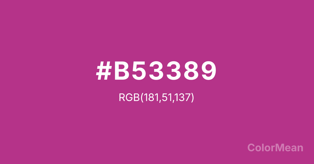
Fandango (#B53389) Color Information
Fandango (#B53389) RGB value is (181, 51, 137). The hex color red value is 181, green is 51, and blue is 137. Its HSL format shows a hue of 320°, saturation of 56 percent, and lightness of 45 percent. The CMYK process values are 0 percent, 72 percent, 24 percent, 29 percent.
Fandango (#B53389) Color Meaning
Fandango (#B53389) expresses rhythmic passion, dramatic flair, and emotional movement. Inspired by dance and performance, this saturated pink purple tone suggests motion and charisma. Therefore, Fandango (#B53389) feels alive, theatrical, and emotionally expressive. Psychologically, Fandango (#B53389) heightens emotional awareness and creative flow. It supports confidence in social settings and encourages expressive communication. Because it balances warmth and depth, it avoids feeling superficial. In symbolic and cultural contexts, Fandango (#B53389) reflects celebration, artistic tradition, and expressive storytelling. It often represents joy that carries intensity rather than softness. On a deeper plane, it suggests emotional honesty and the courage to feel fully.
Color Conversion
Convert Fandango (#B53389) across different color models and formats. These conversions help designers work seamlessly between digital and print media, ensuring this color maintains its intended appearance across RGB screens, CMYK printers, and HSL color manipulations.
RGB Values & CMYK Values
RGB Values
CMYK Values
Color Variations
Fandango (#B53389) harmonies come to life through carefully balanced shades, tints, and tones, giving this color depth and flexibility across light and dark variations. Shades add richness, tints bring an airy softness, and tones soften intensity, making it easy to pair in clean, modern palettes.
Color Harmonies
Fandango (#B53389) harmonies create beautiful relationships with other colors based on their position on the color wheel. Each harmony type offers unique design possibilities, enabling cohesive and visually appealing color schemes.
Analogous
Colors adjacent on the color wheel (30° apart)
Complementary
Colors opposite on the color wheel (180° apart)
Split Complementary
Three colors using one base hue and the two hues beside its opposite
Triadic
Three colors evenly spaced (120° apart)
Tetradic
Four colors forming a rectangle on the wheel
Square
Four colors evenly spaced (90° apart)
Double Split
Four colors formed from two base hues and the colors next to their opposites
Monochromatic
Variations of a single hue
Contrast Checker
(WCAG 2.1) Test Fandango (#B53389) for accessibility compliance against white and black backgrounds. Proper contrast ensures this color remains readable and usable for all audiences, meeting WCAG 2.1 standards for both normal and large text applications.
Sample Text
This is how your text will look with these colors.
Large Text (18pt+)
Normal Text
UI Components
Color Blindness Simulator
See how #B53389 appears to people with different types of color vision deficiencies. These simulations help create more inclusive designs that consider how this color is perceived across various visual abilities.
Normal Vision
protanopia
Note: These simulations are approximations. Actual color vision deficiency varies by individual.
CSS Examples
Background Color
Text Color
Sample Text
Border Color
Box Shadow
Text Shadow
Sample Text
Gradient
Fandango (#B53389) Color FAQs
Frequently asked questions about Fandango (#B53389) color meaning, symbolism, and applications. Click on any question to expand detailed answers.
