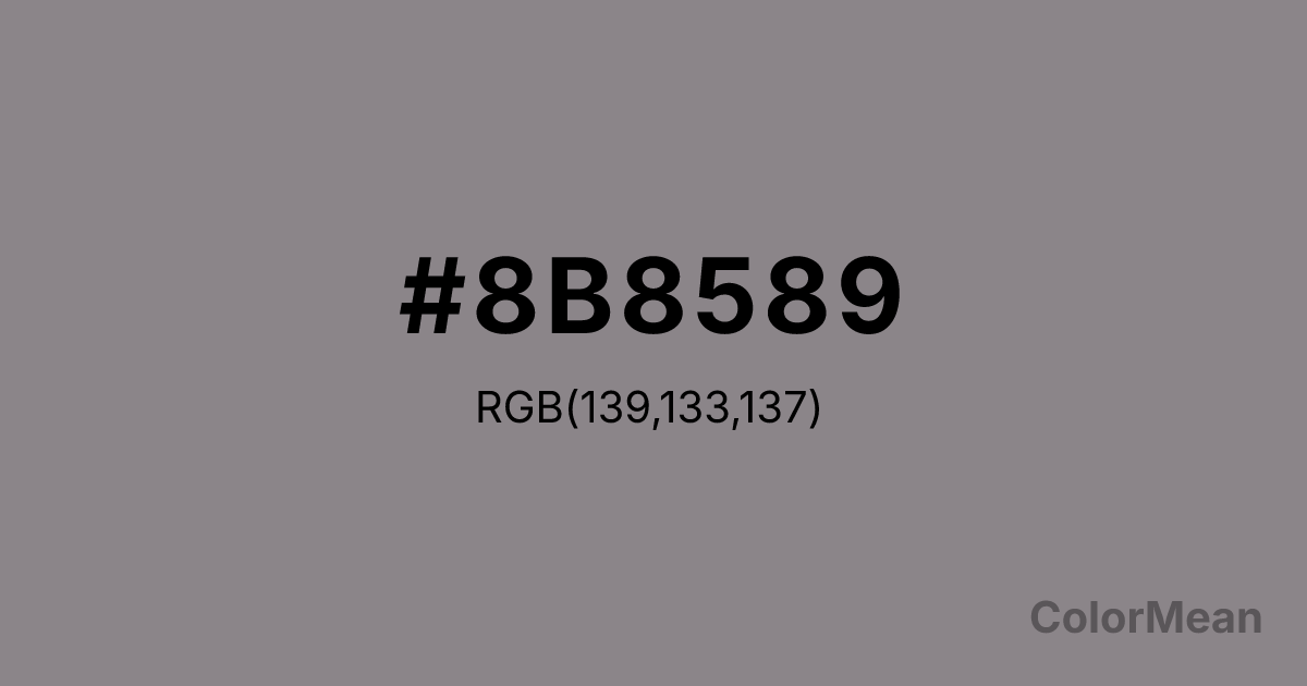
Taupe Gray (#8B8589) Color Information
Taupe Gray (#8B8589) RGB value is (139, 133, 137). The hex color red value is 139, green is 133, and blue is 137. Its HSL format shows a hue of 320°, saturation of 3 percent, and lightness of 53 percent. The CMYK process values are 0 percent, 4 percent, 1 percent, 45 percent.
Taupe Gray (#8B8589) Color Meaning
Taupe Gray (#8B8589) conveys quiet neutrality, balanced detachment, and sophisticated calm. This medium grey with brown undertones provides a soft, stabilizing visual presence. Taupe Gray (#8B8589) psychologically promotes reflection, composure, and subtle focus, creating spaces that feel steady yet unobtrusive. Culturally, Taupe Gray (#8B8589) signals elegance and restraint in Western design, often applied in modern interiors, clothing, and accessories. In Eastern symbolism, it represents modesty, adaptability, and calm. Fengshui views Taupe Gray as a stabilizing, non-distracting color that harmonizes with almost any interior element. Spiritually, Taupe Gray (#8B8589) resonates with the Root Chakra, reinforcing grounding energy and contemplative stillness. Artists and designers use it as a sophisticated neutral in layered palettes, pairing it with both vivid and muted tones. Its medium shade ensures balance, subtlety, and visual comfort.
Color Conversion
Convert Taupe Gray (#8B8589) across different color models and formats. These conversions help designers work seamlessly between digital and print media, ensuring this color maintains its intended appearance across RGB screens, CMYK printers, and HSL color manipulations.
RGB Values & CMYK Values
RGB Values
CMYK Values
Color Variations
Taupe Gray (#8B8589) harmonies come to life through carefully balanced shades, tints, and tones, giving this color depth and flexibility across light and dark variations. Shades add richness, tints bring an airy softness, and tones soften intensity, making it easy to pair in clean, modern palettes.
Color Harmonies
Taupe Gray (#8B8589) harmonies create beautiful relationships with other colors based on their position on the color wheel. Each harmony type offers unique design possibilities, enabling cohesive and visually appealing color schemes.
Analogous
Colors adjacent on the color wheel (30° apart)
Complementary
Colors opposite on the color wheel (180° apart)
Split Complementary
Three colors using one base hue and the two hues beside its opposite
Triadic
Three colors evenly spaced (120° apart)
Tetradic
Four colors forming a rectangle on the wheel
Square
Four colors evenly spaced (90° apart)
Double Split
Four colors formed from two base hues and the colors next to their opposites
Monochromatic
Variations of a single hue
Contrast Checker
(WCAG 2.1) Test Taupe Gray (#8B8589) for accessibility compliance against white and black backgrounds. Proper contrast ensures this color remains readable and usable for all audiences, meeting WCAG 2.1 standards for both normal and large text applications.
Sample Text
This is how your text will look with these colors.
Large Text (18pt+)
Normal Text
UI Components
Color Blindness Simulator
See how #8B8589 appears to people with different types of color vision deficiencies. These simulations help create more inclusive designs that consider how this color is perceived across various visual abilities.
Normal Vision
protanopia
Note: These simulations are approximations. Actual color vision deficiency varies by individual.
CSS Examples
Background Color
Text Color
Sample Text
Border Color
Box Shadow
Text Shadow
Sample Text
Gradient
Taupe Gray (#8B8589) Color FAQs
Frequently asked questions about Taupe Gray (#8B8589) color meaning, symbolism, and applications. Click on any question to expand detailed answers.
