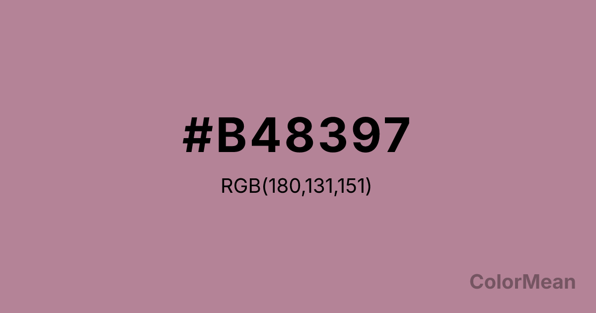
#B48397 Color Information
#B48397 RGB value is (180, 131, 151). The hex color red value is 180, green is 131, and blue is 151. Its HSL format shows a hue of 336°, saturation of 25 percent, and lightness of 61 percent. The CMYK process values are 0 percent, 27 percent, 16 percent, 29 percent.
#B48397 Color Meaning
Color #B48397 suggests gentle refinement, nostalgic warmth, and emotional equilibrium. Unlike floral lavenders that lean cool, #B48397 dusty rose-purple carries earthy undertones, evoking pressed flowers in linen drawers and faded heirloom textiles. Color #B48397 softens digital interfaces by lowering visual contrast without sacrificing readability—a balance verified by accessibility studies on color perception in aging populations. In cultural contexts, color #B48397 bridges Victorian sentimentality and modern minimalism, making #B48397 ideal for self-care, literary, and heritage brands. #B48397 avoids the saccharine by embracing muted realism. Spiritually, color #B48397 represents emotional maturity: the ability to hold tenderness and strength in the same breath. #B48397 is not naive; #B48397 has chosen kindness after experience. Designers use #B48397 to humanize data, soften transitions, and signal thoughtful curation.
Color Conversion
Convert #B48397 across different color models and formats. These conversions help designers work seamlessly between digital and print media, ensuring this color maintains its intended appearance across RGB screens, CMYK printers, and HSL color manipulations.
RGB Values & CMYK Values
RGB Values
CMYK Values
Color Variations
#B48397 harmonies come to life through carefully balanced shades, tints, and tones, giving this color depth and flexibility across light and dark variations. Shades add richness, tints bring an airy softness, and tones soften intensity, making it easy to pair in clean, modern palettes.
Color Harmonies
#B48397 harmonies create beautiful relationships with other colors based on their position on the color wheel. Each harmony type offers unique design possibilities, enabling cohesive and visually appealing color schemes.
Analogous
Colors adjacent on the color wheel (30° apart)
Complementary
Colors opposite on the color wheel (180° apart)
Split Complementary
Three colors using one base hue and the two hues beside its opposite
Triadic
Three colors evenly spaced (120° apart)
Tetradic
Four colors forming a rectangle on the wheel
Square
Four colors evenly spaced (90° apart)
Double Split
Four colors formed from two base hues and the colors next to their opposites
Monochromatic
Variations of a single hue
Contrast Checker
(WCAG 2.1) Test #B48397 for accessibility compliance against white and black backgrounds. Proper contrast ensures this color remains readable and usable for all audiences, meeting WCAG 2.1 standards for both normal and large text applications.
Sample Text
This is how your text will look with these colors.
Large Text (18pt+)
Normal Text
UI Components
Color Blindness Simulator
See how #B48397 appears to people with different types of color vision deficiencies. These simulations help create more inclusive designs that consider how this color is perceived across various visual abilities.
Normal Vision
protanopia
Note: These simulations are approximations. Actual color vision deficiency varies by individual.
CSS Examples
Background Color
Text Color
Sample Text
Border Color
Box Shadow
Text Shadow
Sample Text
Gradient
#B48397 Color FAQs
Frequently asked questions about #B48397 color meaning, symbolism, and applications. Click on any question to expand detailed answers.
