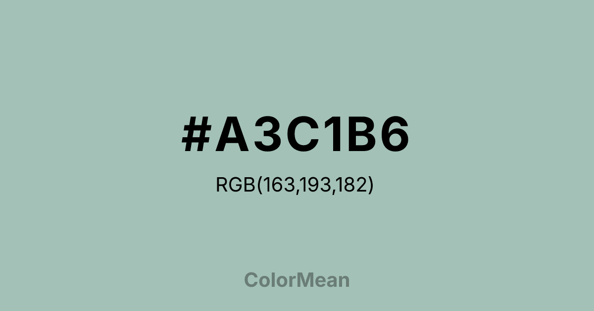
#A3C1B6 Color Information
#A3C1B6 RGB value is (163, 193, 182). The hex color red value is 163, green is 193, and blue is 182. Its HSL format shows a hue of 158°, saturation of 19 percent, and lightness of 70 percent. The CMYK process values are 16 percent, 0 percent, 6 percent, 24 percent.
#A3C1B6 Color Meaning
Color #A3C1B6 suggests scholarly serenity, institutional calm, and refined neutrality. Color #A3C1B6 is a soft, greyed green-blue historically tied to the University of Cambridge’s rowing and academic regalia. Its muted saturation makes #A3C1B6 ideal for environments where distraction must be minimized but warmth preserved. Unlike clinical pastels, color #A3C1B6 carries enough green to feel organic and enough grey to feel disciplined. Psychological research on classroom color schemes shows that tones like color #A3C1B6 improve concentration in adolescents by reducing overstimulation without inducing drowsiness. In branding, color #A3C1B6 signals heritage with humility. #A3C1B6 appears in educational nonprofits, editorial platforms, and heritage fashion where quiet confidence outweighs bold claims. Because #A3C1B6 sits near the threshold of green and blue, color #A3C1B6 bridges emotional calm (blue) and growth mindset (green)—a rare duality. Digital accessibility tests confirm #A3C1B6 meets contrast standards for body text when paired with deep charcoals, making #A3C1B6 viable for inclusive design. Its subtlety demands thoughtful pairing, which elevates the perception of craftsmanship. Symbolically, color #A3C1B6 represents the space between knowledge and wisdom—the pause before conclusion. #A3C1B6 is not the color of debate but of reflection. In spiritual design, #A3C1B6 mirrors the stillness of mist over water: clarity emerging slowly. Color #A3C1B6 rarely dominates a palette; instead, #A3C1B6 supports, stabilizes, and softens. Designers use #A3C1B6 when the goal is to invite contemplation, not command attention—making #A3C1B6 a chromatic whisper with institutional weight.
Color Conversion
Convert #A3C1B6 across different color models and formats. These conversions help designers work seamlessly between digital and print media, ensuring this color maintains its intended appearance across RGB screens, CMYK printers, and HSL color manipulations.
RGB Values & CMYK Values
RGB Values
CMYK Values
Color Variations
#A3C1B6 harmonies come to life through carefully balanced shades, tints, and tones, giving this color depth and flexibility across light and dark variations. Shades add richness, tints bring an airy softness, and tones soften intensity, making it easy to pair in clean, modern palettes.
Color Harmonies
#A3C1B6 harmonies create beautiful relationships with other colors based on their position on the color wheel. Each harmony type offers unique design possibilities, enabling cohesive and visually appealing color schemes.
Analogous
Colors adjacent on the color wheel (30° apart)
Complementary
Colors opposite on the color wheel (180° apart)
Split Complementary
Three colors using one base hue and the two hues beside its opposite
Triadic
Three colors evenly spaced (120° apart)
Tetradic
Four colors forming a rectangle on the wheel
Square
Four colors evenly spaced (90° apart)
Double Split
Four colors formed from two base hues and the colors next to their opposites
Monochromatic
Variations of a single hue
Contrast Checker
(WCAG 2.1) Test #A3C1B6 for accessibility compliance against white and black backgrounds. Proper contrast ensures this color remains readable and usable for all audiences, meeting WCAG 2.1 standards for both normal and large text applications.
Sample Text
This is how your text will look with these colors.
Large Text (18pt+)
Normal Text
UI Components
Color Blindness Simulator
See how #A3C1B6 appears to people with different types of color vision deficiencies. These simulations help create more inclusive designs that consider how this color is perceived across various visual abilities.
Normal Vision
protanopia
Note: These simulations are approximations. Actual color vision deficiency varies by individual.
CSS Examples
Background Color
Text Color
Sample Text
Border Color
Box Shadow
Text Shadow
Sample Text
Gradient
#A3C1B6 Color FAQs
Frequently asked questions about #A3C1B6 color meaning, symbolism, and applications. Click on any question to expand detailed answers.

