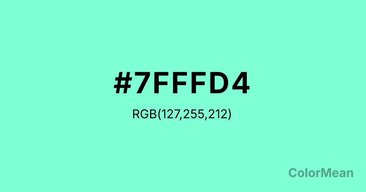
Aquamarine1 (#7FFFD4) Color Information
Aquamarine1 (#7FFFD4) RGB value is (127, 255, 212). The hex color red value is 127, green is 255, and blue is 212. Its HSL format shows a hue of 160°, saturation of 100 percent, and lightness of 75 percent. The CMYK process values are 50 percent, 0 percent, 17 percent, 0 percent.
Aquamarine1 (#7FFFD4) Color Meaning
Aquamarine1 (#7FFFD4) conveys serene fluidity, emotional detoxification, and coastal clarity. Named after the sea-green gemstone, this bright cyan-green mirrors tropical shallows where light and water merge. Psychologically, Aquamarine1 (#7FFFD4) reduces anxiety by simulating immersion in clean, shallow water—ideal for meditation apps, spa branding, and pediatric healthcare where calm must feel active, not passive. Unlike cooler blues that suggest distance, Aquamarine1 pulls the viewer inward through warmth and brightness. In color therapy, it’s linked to throat chakra resonance—encouraging honest, gentle communication. Spiritually, Aquamarine1 represents emotional tides that cleanse without overwhelming. Use Aquamarine1 (#7FFFD4) when your brand bridges wellness and aesthetics, especially in contexts where healing feels light, not heavy.
Color Conversion
Convert Aquamarine1 (#7FFFD4) across different color models and formats. These conversions help designers work seamlessly between digital and print media, ensuring this color maintains its intended appearance across RGB screens, CMYK printers, and HSL color manipulations.
RGB Values & CMYK Values
RGB Values
CMYK Values
Color Variations
Aquamarine1 (#7FFFD4) harmonies come to life through carefully balanced shades, tints, and tones, giving this color depth and flexibility across light and dark variations. Shades add richness, tints bring an airy softness, and tones soften intensity, making it easy to pair in clean, modern palettes.
Color Harmonies
Aquamarine1 (#7FFFD4) harmonies create beautiful relationships with other colors based on their position on the color wheel. Each harmony type offers unique design possibilities, enabling cohesive and visually appealing color schemes.
Analogous
Colors adjacent on the color wheel (30° apart)
Complementary
Colors opposite on the color wheel (180° apart)
Split Complementary
Three colors using one base hue and the two hues beside its opposite
Triadic
Three colors evenly spaced (120° apart)
Tetradic
Four colors forming a rectangle on the wheel
Square
Four colors evenly spaced (90° apart)
Double Split
Four colors formed from two base hues and the colors next to their opposites
Monochromatic
Variations of a single hue
Contrast Checker
(WCAG 2.1) Test Aquamarine1 (#7FFFD4) for accessibility compliance against white and black backgrounds. Proper contrast ensures this color remains readable and usable for all audiences, meeting WCAG 2.1 standards for both normal and large text applications.
Sample Text
This is how your text will look with these colors.
Large Text (18pt+)
Normal Text
UI Components
Color Blindness Simulator
See how #7FFFD4 appears to people with different types of color vision deficiencies. These simulations help create more inclusive designs that consider how this color is perceived across various visual abilities.
Normal Vision
protanopia
Note: These simulations are approximations. Actual color vision deficiency varies by individual.
CSS Examples
Background Color
Text Color
Sample Text
Border Color
Box Shadow
Text Shadow
Sample Text
Gradient
Aquamarine1 (#7FFFD4) Color FAQs
Frequently asked questions about Aquamarine1 (#7FFFD4) color meaning, symbolism, and applications. Click on any question to expand detailed answers.
