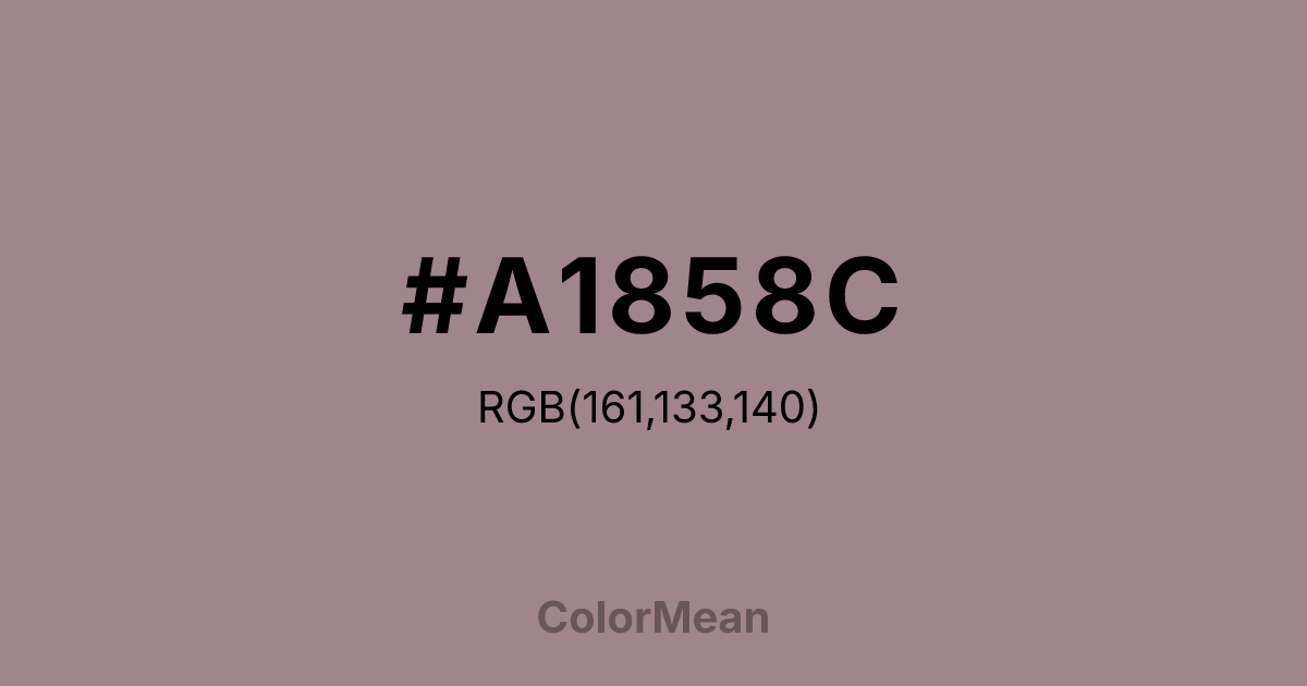
#A1858C Color Information
#A1858C RGB value is (161, 133, 140). The hex color red value is 161, green is 133, and blue is 140. Its HSL format shows a hue of 345°, saturation of 13 percent, and lightness of 58 percent. The CMYK process values are 0 percent, 17 percent, 13 percent, 37 percent.
#A1858C Color Meaning
Color #A1858C conveys muted elegance, historical sentiment, and complex subtlety. #A1858C dusty, grayish purple-brown suggests faded tapestry, antique pottery, or shadows in an old garden. Psychologically, color #A1858C is sophisticated and introspective, encouraging a nuanced understanding of history, memory, and layered emotion. #A1858C soothes with its complexity, offering a color space that feels rich with unspoken stories and dignified age. #A1858C color is emotionally resonant but quiet and reserved. Symbolically, color #A1858C represents the patina of experience, beauty that is inseparable from time, and mystery that has been integrated into the everyday. #A1858C is the color of a forgotten, leather-bound journal. Culturally, #A1858C appears in heritage branding, period film costuming, and museum displays, where #A1858C conveys authenticity, depth, and a tangible connection to the past. Color #A1858C provides a visual language for expressing tradition, subtlety, and refined melancholy.
Color Conversion
Convert #A1858C across different color models and formats. These conversions help designers work seamlessly between digital and print media, ensuring this color maintains its intended appearance across RGB screens, CMYK printers, and HSL color manipulations.
RGB Values & CMYK Values
RGB Values
CMYK Values
Color Variations
#A1858C harmonies come to life through carefully balanced shades, tints, and tones, giving this color depth and flexibility across light and dark variations. Shades add richness, tints bring an airy softness, and tones soften intensity, making it easy to pair in clean, modern palettes.
Color Harmonies
#A1858C harmonies create beautiful relationships with other colors based on their position on the color wheel. Each harmony type offers unique design possibilities, enabling cohesive and visually appealing color schemes.
Analogous
Colors adjacent on the color wheel (30° apart)
Complementary
Colors opposite on the color wheel (180° apart)
Split Complementary
Three colors using one base hue and the two hues beside its opposite
Triadic
Three colors evenly spaced (120° apart)
Tetradic
Four colors forming a rectangle on the wheel
Square
Four colors evenly spaced (90° apart)
Double Split
Four colors formed from two base hues and the colors next to their opposites
Monochromatic
Variations of a single hue
Contrast Checker
(WCAG 2.1) Test #A1858C for accessibility compliance against white and black backgrounds. Proper contrast ensures this color remains readable and usable for all audiences, meeting WCAG 2.1 standards for both normal and large text applications.
Sample Text
This is how your text will look with these colors.
Large Text (18pt+)
Normal Text
UI Components
Color Blindness Simulator
See how #A1858C appears to people with different types of color vision deficiencies. These simulations help create more inclusive designs that consider how this color is perceived across various visual abilities.
Normal Vision
protanopia
Note: These simulations are approximations. Actual color vision deficiency varies by individual.
CSS Examples
Background Color
Text Color
Sample Text
Border Color
Box Shadow
Text Shadow
Sample Text
Gradient
#A1858C Color FAQs
Frequently asked questions about #A1858C color meaning, symbolism, and applications. Click on any question to expand detailed answers.

