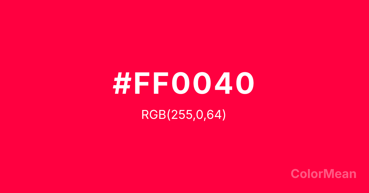
Carmine (#FF0040) Color Information
Carmine (#FF0040) RGB value is (255, 0, 64). The hex color red value is 255, green is 0, and blue is 64. Its HSL format shows a hue of 345°, saturation of 100 percent, and lightness of 50 percent. The CMYK process values are 0 percent, 100 percent, 75 percent, 0 percent.
Carmine (#FF0040) Color Meaning
Carmine (#FF0040) radiates unfiltered intensity, chromatic dominance, and performative passion. Carmine (#FF0040) is a synthetic, high-saturation red-pink that leans boldly toward magenta—electric, immediate, and impossible to ignore. Unlike historical carmine, this modern variant prioritizes visual impact over organic origin. In advertising and entertainment, Carmine (#FF0040) triggers rapid attention: studies show it increases dwell time on digital ads by up to 22% compared to standard reds. Its near-neon quality makes it ideal for youth markets, nightlife branding, and pop culture. Functionally, Carmine (#FF0040) demands careful handling. It excels as a focal point—logos, sale tags, social icons—but overwhelms in large fields. Accessibility tests reveal challenges for colorblind users, necessitating shape or texture reinforcement in critical interfaces. Yet in fashion and cosmetics, its vibrancy signals confidence and modernity. Print applications benefit from its CMYK vibrancy, though it may require spot color for true fidelity. Carmine (#FF0040) is not subtle—but it’s not meant to be. Culturally, Carmine (#FF0040) reflects the rise of bold femininity—think punk aesthetics, drag performance, and body positivity movements. It rejects “soft” stereotypes in favor of unapologetic presence. Spiritually, it aligns with the sacral chakra’s expressive mode: desire voiced, not hidden. Designers use Carmine (#FF0040) when the goal is to electrify perception. It doesn’t ask for permission—it takes the stage.
Color Conversion
Convert Carmine (#FF0040) across different color models and formats. These conversions help designers work seamlessly between digital and print media, ensuring this color maintains its intended appearance across RGB screens, CMYK printers, and HSL color manipulations.
RGB Values & CMYK Values
RGB Values
CMYK Values
Color Variations
Carmine (#FF0040) harmonies come to life through carefully balanced shades, tints, and tones, giving this color depth and flexibility across light and dark variations. Shades add richness, tints bring an airy softness, and tones soften intensity, making it easy to pair in clean, modern palettes.
Color Harmonies
Carmine (#FF0040) harmonies create beautiful relationships with other colors based on their position on the color wheel. Each harmony type offers unique design possibilities, enabling cohesive and visually appealing color schemes.
Analogous
Colors adjacent on the color wheel (30° apart)
Complementary
Colors opposite on the color wheel (180° apart)
Split Complementary
Three colors using one base hue and the two hues beside its opposite
Triadic
Three colors evenly spaced (120° apart)
Tetradic
Four colors forming a rectangle on the wheel
Square
Four colors evenly spaced (90° apart)
Double Split
Four colors formed from two base hues and the colors next to their opposites
Monochromatic
Variations of a single hue
Contrast Checker
(WCAG 2.1) Test Carmine (#FF0040) for accessibility compliance against white and black backgrounds. Proper contrast ensures this color remains readable and usable for all audiences, meeting WCAG 2.1 standards for both normal and large text applications.
Sample Text
This is how your text will look with these colors.
Large Text (18pt+)
Normal Text
UI Components
Color Blindness Simulator
See how #FF0040 appears to people with different types of color vision deficiencies. These simulations help create more inclusive designs that consider how this color is perceived across various visual abilities.
Normal Vision
protanopia
Note: These simulations are approximations. Actual color vision deficiency varies by individual.
CSS Examples
Background Color
Text Color
Sample Text
Border Color
Box Shadow
Text Shadow
Sample Text
Gradient
Carmine (#FF0040) Color FAQs
Frequently asked questions about Carmine (#FF0040) color meaning, symbolism, and applications. Click on any question to expand detailed answers.
