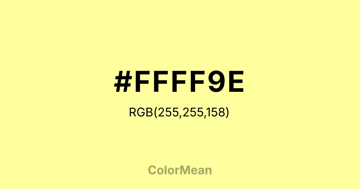
#FFFF9E Color Information
#FFFF9E RGB value is (255, 255, 158). The hex color red value is 255, green is 255, and blue is 158. Its HSL format shows a hue of 60°, saturation of 100 percent, and lightness of 81 percent. The CMYK process values are 0 percent, 0 percent, 38 percent, 0 percent.
#FFFF9E Color Meaning
Color #FFFF9E radiates unguarded optimism, cognitive alertness, and unfiltered joy. Color #FFFF9E is a high-key yellow so close to white that #FFFF9E retains brightness without harshness. Unlike cadmium yellow, #FFFF9E lacks intensity, favoring accessibility over dominance. In educational design, color #FFFF9E is used to highlight key information because the human eye processes light yellows faster than any other hue. However, research cautions against large areas—extended exposure can cause visual vibration, especially on screens. Thus, color #FFFF9E works best as an accent for calls to action or interactive elements. Functionally, color #FFFF9E bridges childlike energy and professional clarity. #FFFF9E appears in wayfinding systems, early-learning apps, and safety gear where instant recognition matters. Unlike neon yellows, its slight desaturation prevents sensory overload, making #FFFF9E more inclusive for neurodiverse users. Branding studies show that color #FFFF9E increases perceived friendliness in service industries—think customer support or community banking—without sacrificing modernity. Paired with deep navies or charcoals, #FFFF9E achieves balance between play and precision. Symbolically, color #FFFF9E represents unguarded hope—the kind that precedes experience. #FFFF9E is the color of first light, new notebooks, and open doors. In spiritual contexts, #FFFF9E aligns with mental clarity before overthinking sets in. Designers use color #FFFF9E when they want to signal accessibility, not naivety. Its power lies in its simplicity: no hidden tones, no irony. Color #FFFF9E invites engagement by promising ease, not complexity.
Color Conversion
Convert #FFFF9E across different color models and formats. These conversions help designers work seamlessly between digital and print media, ensuring this color maintains its intended appearance across RGB screens, CMYK printers, and HSL color manipulations.
RGB Values & CMYK Values
RGB Values
CMYK Values
Color Variations
#FFFF9E harmonies come to life through carefully balanced shades, tints, and tones, giving this color depth and flexibility across light and dark variations. Shades add richness, tints bring an airy softness, and tones soften intensity, making it easy to pair in clean, modern palettes.
Color Harmonies
#FFFF9E harmonies create beautiful relationships with other colors based on their position on the color wheel. Each harmony type offers unique design possibilities, enabling cohesive and visually appealing color schemes.
Analogous
Colors adjacent on the color wheel (30° apart)
Complementary
Colors opposite on the color wheel (180° apart)
Split Complementary
Three colors using one base hue and the two hues beside its opposite
Triadic
Three colors evenly spaced (120° apart)
Tetradic
Four colors forming a rectangle on the wheel
Square
Four colors evenly spaced (90° apart)
Double Split
Four colors formed from two base hues and the colors next to their opposites
Monochromatic
Variations of a single hue
Contrast Checker
(WCAG 2.1) Test #FFFF9E for accessibility compliance against white and black backgrounds. Proper contrast ensures this color remains readable and usable for all audiences, meeting WCAG 2.1 standards for both normal and large text applications.
Sample Text
This is how your text will look with these colors.
Large Text (18pt+)
Normal Text
UI Components
Color Blindness Simulator
See how #FFFF9E appears to people with different types of color vision deficiencies. These simulations help create more inclusive designs that consider how this color is perceived across various visual abilities.
Normal Vision
protanopia
Note: These simulations are approximations. Actual color vision deficiency varies by individual.
CSS Examples
Background Color
Text Color
Sample Text
Border Color
Box Shadow
Text Shadow
Sample Text
Gradient
#FFFF9E Color FAQs
Frequently asked questions about #FFFF9E color meaning, symbolism, and applications. Click on any question to expand detailed answers.

