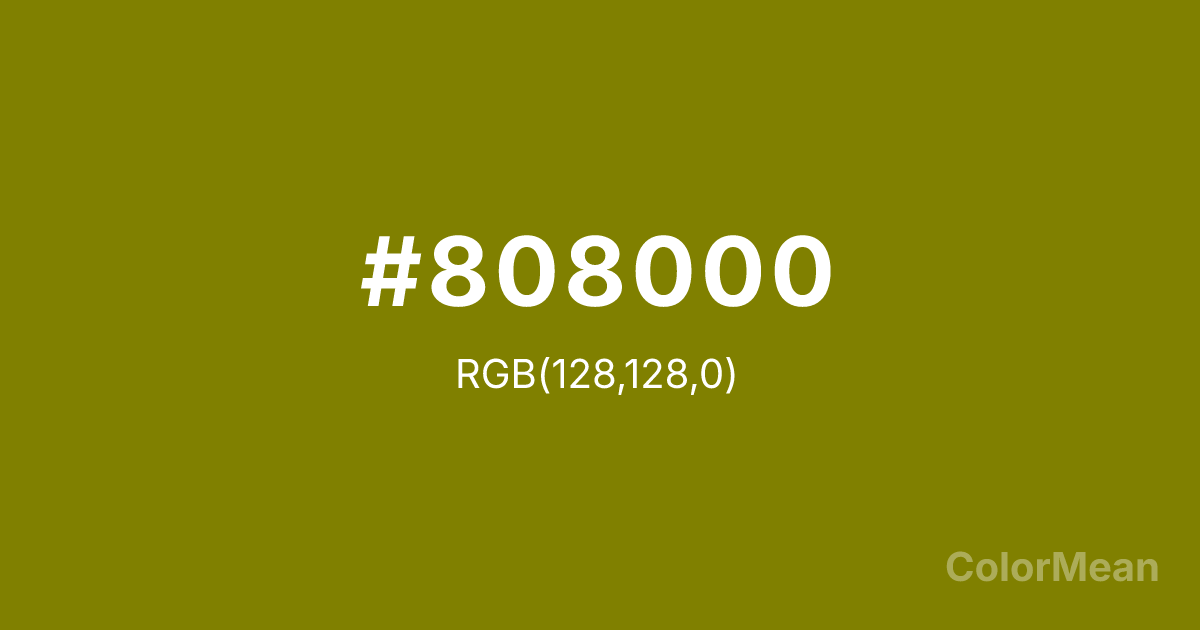
Olive (#808000) Color Information
Olive (#808000) RGB value is (128, 128, 0). The hex color red value is 128, green is 128, and blue is 0. Its HSL format shows a hue of 60°, saturation of 100 percent, and lightness of 25 percent. The CMYK process values are 0 percent, 0 percent, 100 percent, 50 percent.
Olive (#808000) Color Meaning
Olive (#808000) balances aggression and neutrality. This mid-tone green-brown originated in military uniforms for its camouflage properties, yet evolved into a symbol of uneasy peace—think olive branches held by weary negotiators. Olive (#808000) doesn’t soothe like sky blue or energize like emerald; it steadies. It acknowledges conflict while choosing restraint. Its psychological effect is complex: it calms through familiarity, not purity. Environmental studies show that olive tones reduce perceived threat in high-stress environments (e.g., hospitals, transit hubs) because they mimic natural, non-floral foliage—suggesting survival, not beauty. Olive (#808000) feels pragmatic, not poetic. In contemporary design, it signals eco-consciousness without idealism. Brands use Olive (#808000) to communicate resilience, adaptability, and grounded ethics—avoiding the greenwashing connotations of brighter greens. It’s the color of real sustainability: hard-won, not pretty.
Convert Olive (#808000) across different color models and formats. These conversions help designers work seamlessly between digital and print media, ensuring this color maintains its intended appearance across RGB screens, CMYK printers, and HSL color manipulations.
RGB Values
CMYK Values
Olive (#808000) harmonies come to life through carefully balanced shades, tints, and tones, giving this color depth and flexibility across light and dark variations. Shades add richness, tints bring an airy softness, and tones soften intensity, making it easy to pair in clean, modern palettes.
Olive (#808000) harmonies create beautiful relationships with other colors based on their position on the color wheel. Each harmony type offers unique design possibilities, enabling cohesive and visually appealing color schemes.
Analogous
Colors adjacent on the color wheel (30° apart)
Complementary
Colors opposite on the color wheel (180° apart)
Split Complementary
Three colors using one base hue and the two hues beside its opposite
Triadic
Three colors evenly spaced (120° apart)
Tetradic
Four colors forming a rectangle on the wheel
Square
Four colors evenly spaced (90° apart)
Double Split
Four colors formed from two base hues and the colors next to their opposites
Monochromatic
Variations of a single hue
(WCAG 2.1) Test Olive (#808000) for accessibility compliance against white and black backgrounds. Proper contrast ensures this color remains readable and usable for all audiences, meeting WCAG 2.1 standards for both normal and large text applications.
Sample Text
This is how your text will look with these colors.
Large Text (18pt+)
Normal Text
UI Components
See how #808000 appears to people with different types of color vision deficiencies. These simulations help create more inclusive designs that consider how this color is perceived across various visual abilities.
Normal Vision
protanopia
Note: These simulations are approximations. Actual color vision deficiency varies by individual.
Background Color
Text Color
Sample Text
Border Color
Box Shadow
Text Shadow
Sample Text
Gradient
Olive (#808000) Color FAQs
Frequently asked questions about Olive (#808000) color meaning, symbolism, and applications. Click on any question to expand detailed answers.
