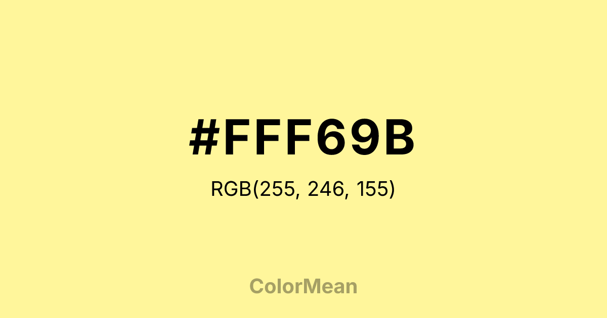
#FFF69B Color Information
#FFF69B RGB value is (255, 246, 155). The hex color red value is 255, green is 246, and blue is 155. Its HSL format shows a hue of 55°, saturation of 100 percent, and lightness of 80 percent. The CMYK process values are 0 percent, 4 percent, 39 percent, 0 percent.
#FFF69B Color Meaning
Color #FFF69B signifies intellectual cheer, diffused optimism, and focused lightness. #FFF69B pale, greenish-yellow resembles fresh butter, lemon curd, or sunlight on a notebook page, suggesting clear-minded joy and alert calm. Psychologically, color #FFF69B gently stimulates the intellect and lifts the spirits, promoting feelings of hope, clarity, and cheerful concentration. #FFF69B combats gloom with a persistent, soft luminosity, making #FFF69B ideal for workspaces, kitchens, or study areas where a positive, alert atmosphere is desired. Symbolically, color #FFF69B represents enlightened thinking, new ideas dawning, and wisdom that is cheerful and accessible. #FFF69B is the color of a sudden "aha!" moment bathed in friendly light. Culturally, #FFF69B is a staple in mid-century modern design, cheerful branding, and educational materials for children. Color #FFF69B embodies the visual concept of a "bright idea," providing a hue that is inherently optimistic, mentally stimulating, and warmly inviting.
Color Conversion
Convert #FFF69B across different color models and formats. These conversions help designers work seamlessly between digital and print media, ensuring this color maintains its intended appearance across RGB screens, CMYK printers, and HSL color manipulations.
RGB Values & CMYK Values
RGB Values
CMYK Values
Color Variations
#FFF69B harmonies come to life through carefully balanced shades, tints, and tones, giving this color depth and flexibility across light and dark variations. Shades add richness, tints bring an airy softness, and tones soften intensity, making it easy to pair in clean, modern palettes.
Color Harmonies
#FFF69B harmonies create beautiful relationships with other colors based on their position on the color wheel. Each harmony type offers unique design possibilities, enabling cohesive and visually appealing color schemes.
Analogous
Colors adjacent on the color wheel (30° apart)
Complementary
Colors opposite on the color wheel (180° apart)
Split Complementary
Three colors using one base hue and the two hues beside its opposite
Triadic
Three colors evenly spaced (120° apart)
Tetradic
Four colors forming a rectangle on the wheel
Square
Four colors evenly spaced (90° apart)
Double Split
Four colors formed from two base hues and the colors next to their opposites
Monochromatic
Variations of a single hue
Contrast Checker
(WCAG 2.1) Test #FFF69B for accessibility compliance against white and black backgrounds. Proper contrast ensures this color remains readable and usable for all audiences, meeting WCAG 2.1 standards for both normal and large text applications.
Sample Text
This is how your text will look with these colors.
Large Text (18pt+)
Normal Text
UI Components
Color Blindness Simulator
See how #FFF69B appears to people with different types of color vision deficiencies. These simulations help create more inclusive designs that consider how this color is perceived across various visual abilities.
Normal Vision
protanopia
Note: These simulations are approximations. Actual color vision deficiency varies by individual.
CSS Examples
Background Color
Text Color
Sample Text
Border Color
Box Shadow
Text Shadow
Sample Text
Gradient
#FFF69B Color FAQs
Frequently asked questions about #FFF69B color meaning, symbolism, and applications. Click on any question to expand detailed answers.
