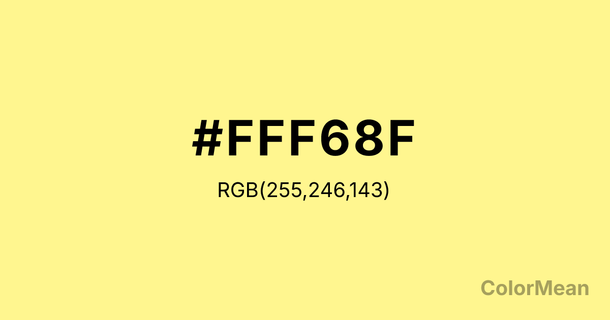
Khaki1 (#FFF68F) Color Information
Khaki1 (#FFF68F) RGB value is (255, 246, 143). The hex color red value is 255, green is 246, and blue is 143. Its HSL format shows a hue of 55°, saturation of 100 percent, and lightness of 78 percent. The CMYK process values are 0 percent, 4 percent, 44 percent, 0 percent.
Khaki1 (#FFF68F) Color Meaning
Khaki1 (#FFF68F) radiates luminous ease, cheerful neutrality, and sun-bleached simplicity. As the lightest in the Khaki series (RGB 255, 246, 143), it borders on pale gold but retains a greenish undertone that prevents it from feeling gaudy or artificial. Khaki1 (#FFF68F) glows with the diffused warmth of morning light through linen curtains—inviting but never demanding. This high-key tone improves mood in interior spaces while maintaining enough complexity to avoid visual flatness, unlike pure pastels. In digital contexts, Khaki1 (#FFF68F) functions as a highlight or accent that draws the eye without overwhelming. Its inclusion in the X11 color list ties it to early computing graphics, yet its organic feel keeps it relevant in modern wellness and lifestyle branding. Culturally, it evokes dried wildflowers, sun-bleached driftwood, and vintage postcards—linking it to nostalgia without sentimentality. Khaki1 (#FFF68F) suggests memory preserved in amber: warm, transparent, slightly faded. Psychologically, this hue balances stimulation and calm. While bright yellows can induce anxiety in large doses, Khaki1 (#FFF68F)’s green bias tempers its energy, creating a tone that uplifts without agitating. It’s especially effective in children’s learning apps or senior care interfaces where clarity and comfort must coexist. Symbolically, Khaki1 (#FFF68F) represents gentle awakening—awareness that arrives softly, like dawn after a long night.
Color Conversion
Convert Khaki1 (#FFF68F) across different color models and formats. These conversions help designers work seamlessly between digital and print media, ensuring this color maintains its intended appearance across RGB screens, CMYK printers, and HSL color manipulations.
RGB Values & CMYK Values
RGB Values
CMYK Values
Color Variations
Khaki1 (#FFF68F) harmonies come to life through carefully balanced shades, tints, and tones, giving this color depth and flexibility across light and dark variations. Shades add richness, tints bring an airy softness, and tones soften intensity, making it easy to pair in clean, modern palettes.
Color Harmonies
Khaki1 (#FFF68F) harmonies create beautiful relationships with other colors based on their position on the color wheel. Each harmony type offers unique design possibilities, enabling cohesive and visually appealing color schemes.
Analogous
Colors adjacent on the color wheel (30° apart)
Complementary
Colors opposite on the color wheel (180° apart)
Split Complementary
Three colors using one base hue and the two hues beside its opposite
Triadic
Three colors evenly spaced (120° apart)
Tetradic
Four colors forming a rectangle on the wheel
Square
Four colors evenly spaced (90° apart)
Double Split
Four colors formed from two base hues and the colors next to their opposites
Monochromatic
Variations of a single hue
Contrast Checker
(WCAG 2.1) Test Khaki1 (#FFF68F) for accessibility compliance against white and black backgrounds. Proper contrast ensures this color remains readable and usable for all audiences, meeting WCAG 2.1 standards for both normal and large text applications.
Sample Text
This is how your text will look with these colors.
Large Text (18pt+)
Normal Text
UI Components
Color Blindness Simulator
See how #FFF68F appears to people with different types of color vision deficiencies. These simulations help create more inclusive designs that consider how this color is perceived across various visual abilities.
Normal Vision
protanopia
Note: These simulations are approximations. Actual color vision deficiency varies by individual.
CSS Examples
Background Color
Text Color
Sample Text
Border Color
Box Shadow
Text Shadow
Sample Text
Gradient
Khaki1 (#FFF68F) Color FAQs
Frequently asked questions about Khaki1 (#FFF68F) color meaning, symbolism, and applications. Click on any question to expand detailed answers.

