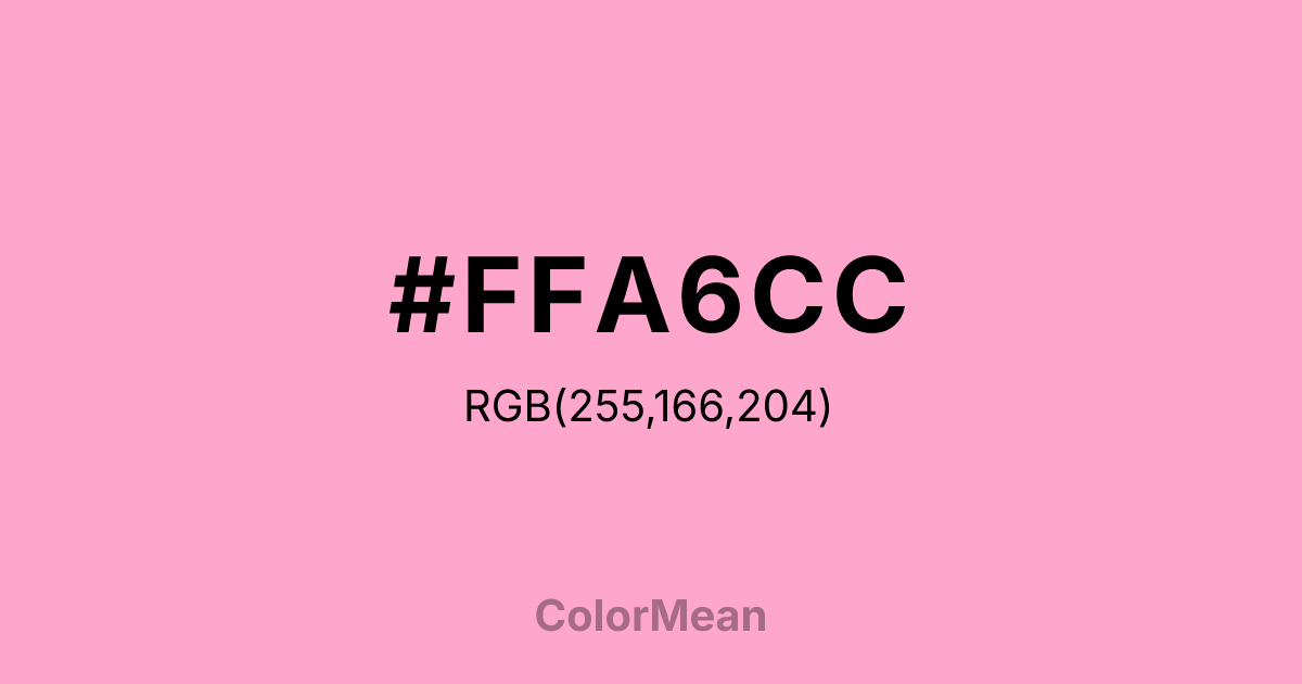
#FFA6CC Color Information
#FFA6CC RGB value is (255, 166, 204). The hex color red value is 255, green is 166, and blue is 204. Its HSL format shows a hue of 334°, saturation of 100 percent, and lightness of 83 percent. The CMYK process values are 0 percent, 35 percent, 20 percent, 0 percent.
#FFA6CC Color Meaning
Color #FFA6CC expresses gentle festivity, nostalgic warmth, and accessible affection. Color #FFA6CC is a soft, slightly peachy rose inspired by the ruffled petals of the carnation flower—a bloom long associated with maternal love and ceremonial celebration. Unlike bolder pinks, #FFA6CC carries enough white to feel light and enough warmth to avoid clinical sterility. In color psychology, #FFA6CC mid-saturation pink reduces stress responses more effectively than stark whites in caregiving environments, which explains its use in senior living spaces and pediatric clinics. Color #FFA6CC doesn’t demand attention; #FFA6CC offers comfort. Functionally, color #FFA6CC bridges generational aesthetics. #FFA6CC appears in heritage branding, greeting cards, and floral packaging where tradition must feel tender, not tired. Digital tests show #FFA6CC meets contrast standards against deep charcoals for readable body text, expanding its role beyond decorative accents. In fashion, #FFA6CC’s resurging as a “quiet luxury” neutral—softer than beige, warmer than grey. Consumer studies reveal that products in color #FFA6CC are perceived as more thoughtful and handmade, especially in gifting contexts. Symbolically, color #FFA6CC represents love that endures through ritual—Mother’s Day bouquets, graduation corsages, wedding centerpieces. #FFA6CC is not the pink of rebellion but of remembrance. In spiritual design, #FFA6CC aligns with the heart chakra’s nurturing mode: care expressed through consistency. Designers choose color #FFA6CC when they want to signal warmth without whimsy. Its power lies in its quiet continuity—a chromatic embrace that never lets go.
Color Conversion
Convert #FFA6CC across different color models and formats. These conversions help designers work seamlessly between digital and print media, ensuring this color maintains its intended appearance across RGB screens, CMYK printers, and HSL color manipulations.
RGB Values & CMYK Values
RGB Values
CMYK Values
Color Variations
#FFA6CC harmonies come to life through carefully balanced shades, tints, and tones, giving this color depth and flexibility across light and dark variations. Shades add richness, tints bring an airy softness, and tones soften intensity, making it easy to pair in clean, modern palettes.
Color Harmonies
#FFA6CC harmonies create beautiful relationships with other colors based on their position on the color wheel. Each harmony type offers unique design possibilities, enabling cohesive and visually appealing color schemes.
Analogous
Colors adjacent on the color wheel (30° apart)
Complementary
Colors opposite on the color wheel (180° apart)
Split Complementary
Three colors using one base hue and the two hues beside its opposite
Triadic
Three colors evenly spaced (120° apart)
Tetradic
Four colors forming a rectangle on the wheel
Square
Four colors evenly spaced (90° apart)
Double Split
Four colors formed from two base hues and the colors next to their opposites
Monochromatic
Variations of a single hue
Contrast Checker
(WCAG 2.1) Test #FFA6CC for accessibility compliance against white and black backgrounds. Proper contrast ensures this color remains readable and usable for all audiences, meeting WCAG 2.1 standards for both normal and large text applications.
Sample Text
This is how your text will look with these colors.
Large Text (18pt+)
Normal Text
UI Components
Color Blindness Simulator
See how #FFA6CC appears to people with different types of color vision deficiencies. These simulations help create more inclusive designs that consider how this color is perceived across various visual abilities.
Normal Vision
protanopia
Note: These simulations are approximations. Actual color vision deficiency varies by individual.
CSS Examples
Background Color
Text Color
Sample Text
Border Color
Box Shadow
Text Shadow
Sample Text
Gradient
#FFA6CC Color FAQs
Frequently asked questions about #FFA6CC color meaning, symbolism, and applications. Click on any question to expand detailed answers.

