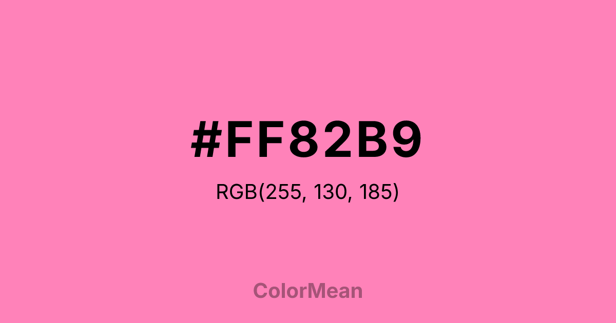
#FF82B9 Color Information
#FF82B9 RGB value is (255, 130, 185). The hex color red value is 255, green is 130, and blue is 185. Its HSL format shows a hue of 334°, saturation of 100 percent, and lightness of 75 percent. The CMYK process values are 0 percent, 49 percent, 27 percent, 0 percent.
#FF82B9 Color Meaning
Color #FF82B9 projects playful extravagance, sugary romance, and theatrical joy. #FF82B9 bright, cool-toned pink is bold and festive, reminiscent of rosewater confections, silk parasols, and opulent celebration. Psychologically, color #FF82B9 is uplifting and flirtatious, promoting feelings of lighthearted affection, playful self-expression, and unapologetic delight. #FF82B9 captures attention with its cheerful vibrancy, making #FF82B9 a color of celebration, charm, and vivacious personality. #FF82B9 shade is romantic in a bold, declarative way. Culturally, color #FF82B9 is associated with festive occasions, traditional costumes, and the lavish decorative arts of courtly life, symbolizing joy, beauty, and a love of ornate display. Symbolically, #FF82B9 represents love worn on the sleeve, joy as a public virtue, and beauty that is cultivated, shared, and celebrated. Therefore, color #FF82B9 embodies an aesthetic of generous exuberance, rejecting subtlety in favor of a warm, sugary, and openly expressive form of delight.
Color Conversion
Convert #FF82B9 across different color models and formats. These conversions help designers work seamlessly between digital and print media, ensuring this color maintains its intended appearance across RGB screens, CMYK printers, and HSL color manipulations.
RGB Values & CMYK Values
RGB Values
CMYK Values
Color Variations
#FF82B9 harmonies come to life through carefully balanced shades, tints, and tones, giving this color depth and flexibility across light and dark variations. Shades add richness, tints bring an airy softness, and tones soften intensity, making it easy to pair in clean, modern palettes.
Color Harmonies
#FF82B9 harmonies create beautiful relationships with other colors based on their position on the color wheel. Each harmony type offers unique design possibilities, enabling cohesive and visually appealing color schemes.
Analogous
Colors adjacent on the color wheel (30° apart)
Complementary
Colors opposite on the color wheel (180° apart)
Split Complementary
Three colors using one base hue and the two hues beside its opposite
Triadic
Three colors evenly spaced (120° apart)
Tetradic
Four colors forming a rectangle on the wheel
Square
Four colors evenly spaced (90° apart)
Double Split
Four colors formed from two base hues and the colors next to their opposites
Monochromatic
Variations of a single hue
Contrast Checker
(WCAG 2.1) Test #FF82B9 for accessibility compliance against white and black backgrounds. Proper contrast ensures this color remains readable and usable for all audiences, meeting WCAG 2.1 standards for both normal and large text applications.
Sample Text
This is how your text will look with these colors.
Large Text (18pt+)
Normal Text
UI Components
Color Blindness Simulator
See how #FF82B9 appears to people with different types of color vision deficiencies. These simulations help create more inclusive designs that consider how this color is perceived across various visual abilities.
Normal Vision
protanopia
Note: These simulations are approximations. Actual color vision deficiency varies by individual.
CSS Examples
Background Color
Text Color
Sample Text
Border Color
Box Shadow
Text Shadow
Sample Text
Gradient
#FF82B9 Color FAQs
Frequently asked questions about #FF82B9 color meaning, symbolism, and applications. Click on any question to expand detailed answers.
