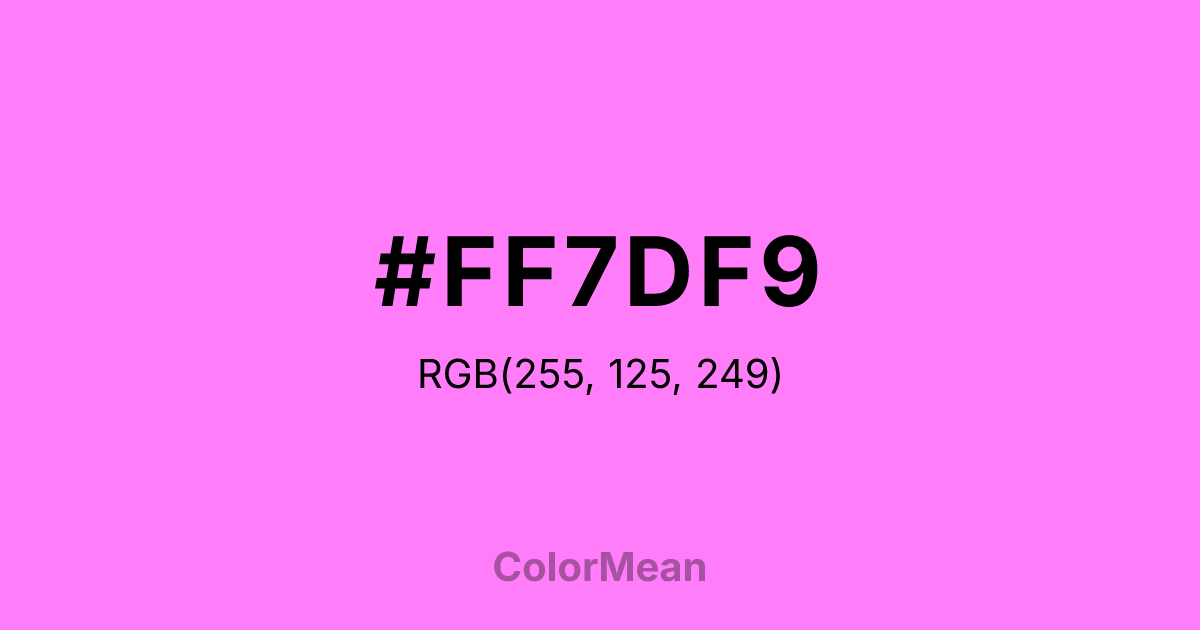
#FF7DF9 Color Information
#FF7DF9 RGB value is (255, 125, 249). The hex color red value is 255, green is 125, and blue is 249. Its HSL format shows a hue of 303°, saturation of 100 percent, and lightness of 75 percent. The CMYK process values are 0 percent, 51 percent, 2 percent, 0 percent.
#FF7DF9 Color Meaning
Color #FF7DF9 radiates digital fantasy. #FF7DF9 high-luminance pink-purple—part of the X11 system—was engineered for maximum screen pop in 8-bit environments. Color #FF7DF9 doesn’t mimic nature; #FF7DF9 reimagines #FF7DF9 through phosphor glow and pixel precision. Color #FF7DF9 is the color of virtual flowers, avatars, and playful rebellion. In gaming and youth-focused apps, color #FF7DF9 increases dwell time by triggering novelty-seeking behavior in the brain’s reward circuit. Unlike natural purples, color #FF7DF9 feels untethered from gender or tradition—#FF7DF9’s pure chromatic joy. Color #FF7DF9 works best when isolated against deep space or charcoal to avoid visual chaos. Culturally, #FF7DF9’s tied to early internet aesthetics, cyberpop, and digital self-expression. Brands use color #FF7DF9 to signal inclusivity with energy—think LGBTQ+ campaigns or indie music platforms. Paired with black or electric blue, color #FF7DF9 creates contrast that feels futuristic, not frivolous. Color #FF7DF9 isn’t real—#FF7DF9’s imagined. And that’s its power.
Color Conversion
Convert #FF7DF9 across different color models and formats. These conversions help designers work seamlessly between digital and print media, ensuring this color maintains its intended appearance across RGB screens, CMYK printers, and HSL color manipulations.
RGB Values & CMYK Values
RGB Values
CMYK Values
Color Variations
#FF7DF9 harmonies come to life through carefully balanced shades, tints, and tones, giving this color depth and flexibility across light and dark variations. Shades add richness, tints bring an airy softness, and tones soften intensity, making it easy to pair in clean, modern palettes.
Color Harmonies
#FF7DF9 harmonies create beautiful relationships with other colors based on their position on the color wheel. Each harmony type offers unique design possibilities, enabling cohesive and visually appealing color schemes.
Analogous
Colors adjacent on the color wheel (30° apart)
Complementary
Colors opposite on the color wheel (180° apart)
Split Complementary
Three colors using one base hue and the two hues beside its opposite
Triadic
Three colors evenly spaced (120° apart)
Tetradic
Four colors forming a rectangle on the wheel
Square
Four colors evenly spaced (90° apart)
Double Split
Four colors formed from two base hues and the colors next to their opposites
Monochromatic
Variations of a single hue
Contrast Checker
(WCAG 2.1) Test #FF7DF9 for accessibility compliance against white and black backgrounds. Proper contrast ensures this color remains readable and usable for all audiences, meeting WCAG 2.1 standards for both normal and large text applications.
Sample Text
This is how your text will look with these colors.
Large Text (18pt+)
Normal Text
UI Components
Color Blindness Simulator
See how #FF7DF9 appears to people with different types of color vision deficiencies. These simulations help create more inclusive designs that consider how this color is perceived across various visual abilities.
Normal Vision
protanopia
Note: These simulations are approximations. Actual color vision deficiency varies by individual.
CSS Examples
Background Color
Text Color
Sample Text
Border Color
Box Shadow
Text Shadow
Sample Text
Gradient
#FF7DF9 Color FAQs
Frequently asked questions about #FF7DF9 color meaning, symbolism, and applications. Click on any question to expand detailed answers.
