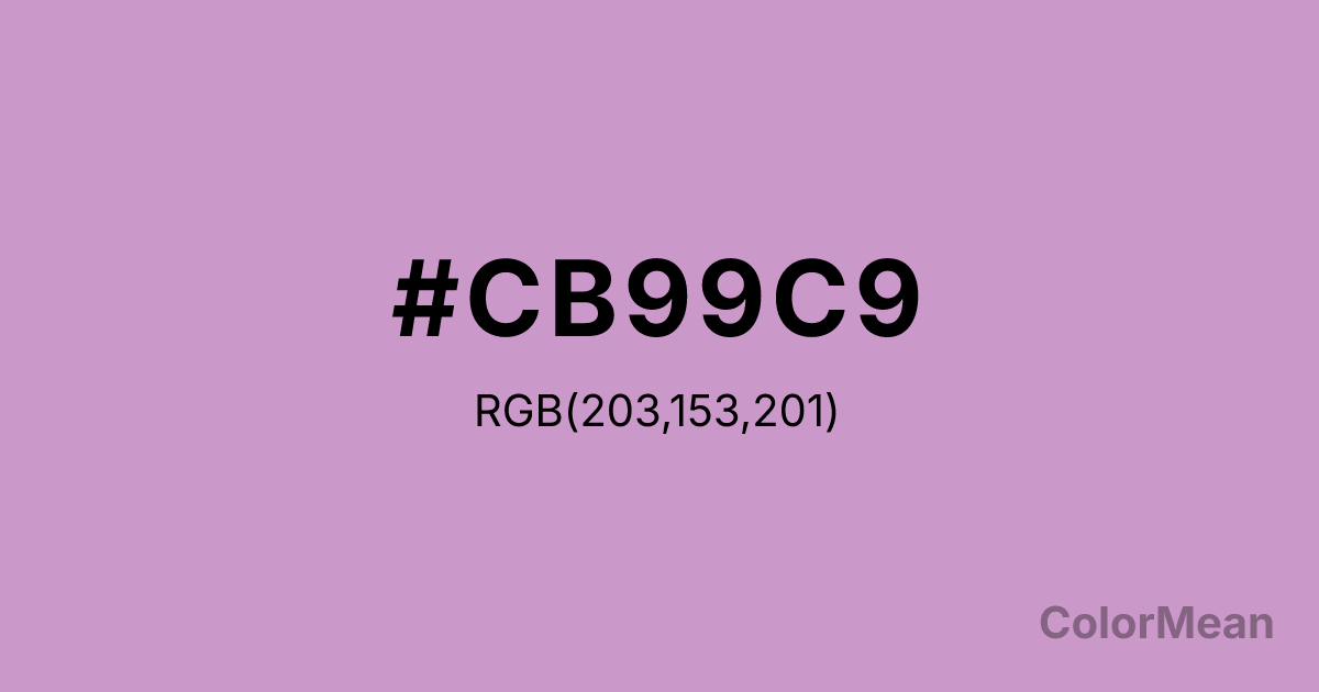
Pastel Violet (#CB99C9) Color Information
Pastel Violet (#CB99C9) RGB value is (203, 153, 201). The hex color red value is 203, green is 153, and blue is 201. Its HSL format shows a hue of 302°, saturation of 32 percent, and lightness of 70 percent. The CMYK process values are 0 percent, 25 percent, 1 percent, 20 percent.
Pastel Violet (#CB99C9) Color Meaning
Pastel Violet (#CB99C9) projects playful spirituality, synthetic whimsy, and digital charm. This light, pinkish-purple is bright and cheerful, reminiscent of fairy floss, animated magic, and retro plastics. Psychologically, Pastel Violet (#CB99C9) stimulates lighthearted creativity and a sense of fun individuality. It makes spiritual or imaginative concepts feel accessible, friendly, and free from dogma, perfect for engaging younger audiences or conveying a brand personality that is quirky and optimistic. This color is mystical and fun. Culturally, Pastel Violet (#CB99C9) is prevalent in fantasy genres, toy design, and branding for creative or spiritual services with a modern, inclusive vibe. Symbolically, it represents personalized magic, joyful intuition, and a DIY approach to wonder. Therefore, Pastel Violet (#CB99C9) acts as a bridge between childlike imagination and adult creativity, offering a color that codes for "special" and "unique" in a way that is entirely approachable and undeniably sweet.
Color Conversion
Convert Pastel Violet (#CB99C9) across different color models and formats. These conversions help designers work seamlessly between digital and print media, ensuring this color maintains its intended appearance across RGB screens, CMYK printers, and HSL color manipulations.
RGB Values & CMYK Values
RGB Values
CMYK Values
Color Variations
Pastel Violet (#CB99C9) harmonies come to life through carefully balanced shades, tints, and tones, giving this color depth and flexibility across light and dark variations. Shades add richness, tints bring an airy softness, and tones soften intensity, making it easy to pair in clean, modern palettes.
Color Harmonies
Pastel Violet (#CB99C9) harmonies create beautiful relationships with other colors based on their position on the color wheel. Each harmony type offers unique design possibilities, enabling cohesive and visually appealing color schemes.
Analogous
Colors adjacent on the color wheel (30° apart)
Complementary
Colors opposite on the color wheel (180° apart)
Split Complementary
Three colors using one base hue and the two hues beside its opposite
Triadic
Three colors evenly spaced (120° apart)
Tetradic
Four colors forming a rectangle on the wheel
Square
Four colors evenly spaced (90° apart)
Double Split
Four colors formed from two base hues and the colors next to their opposites
Monochromatic
Variations of a single hue
Contrast Checker
(WCAG 2.1) Test Pastel Violet (#CB99C9) for accessibility compliance against white and black backgrounds. Proper contrast ensures this color remains readable and usable for all audiences, meeting WCAG 2.1 standards for both normal and large text applications.
Sample Text
This is how your text will look with these colors.
Large Text (18pt+)
Normal Text
UI Components
Color Blindness Simulator
See how #CB99C9 appears to people with different types of color vision deficiencies. These simulations help create more inclusive designs that consider how this color is perceived across various visual abilities.
Normal Vision
protanopia
Note: These simulations are approximations. Actual color vision deficiency varies by individual.
CSS Examples
Background Color
Text Color
Sample Text
Border Color
Box Shadow
Text Shadow
Sample Text
Gradient
Pastel Violet (#CB99C9) Color FAQs
Frequently asked questions about Pastel Violet (#CB99C9) color meaning, symbolism, and applications. Click on any question to expand detailed answers.
