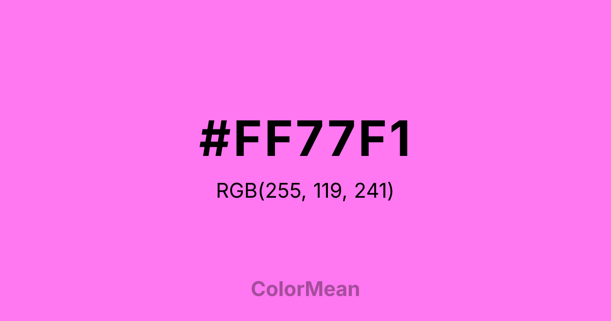
#FF77F1 Color Information
#FF77F1 RGB value is (255, 119, 241). The hex color red value is 255, green is 119, and blue is 241. Its HSL format shows a hue of 306°, saturation of 100 percent, and lightness of 73 percent. The CMYK process values are 0 percent, 53 percent, 5 percent, 0 percent.
#FF77F1 Color Meaning
Color #FF77F1 signifies outrageous flamboyance, artificial joy, and unapologetic spectacle. #FF77F1 intensely bright, purplish-pink is synthetic and eye-searing, evoking plastic lawn ornaments, neon signs, and cartoonish extravagance. Psychologically, color #FF77F1 is overstimulating and joyfully garish, promoting a sense of kitschy fun, bold self-parody, and a rejection of subtlety. #FF77F1 doesn't whisper; #FF77F1 screams with playful, artificial delight. #FF77F1 color is a celebration of the deliberately tacky and the vibrantly absurd. Culturally, color #FF77F1 is an icon of mid-century American suburban kitsch and retro Americana, symbolizing a playful, mass-produced approach to leisure and decoration. Symbolically, #FF77F1 represents individuality through conformity, humor found in bad taste, and a democratic, accessible form of flamboyance. Therefore, color #FF77F1 acts as a cultural shorthand for a specific, ironic, and cheerfully lowbrow aesthetic, embracing artificiality as a source of communal joy and identity.
Color Conversion
Convert #FF77F1 across different color models and formats. These conversions help designers work seamlessly between digital and print media, ensuring this color maintains its intended appearance across RGB screens, CMYK printers, and HSL color manipulations.
RGB Values & CMYK Values
RGB Values
CMYK Values
Color Variations
#FF77F1 harmonies come to life through carefully balanced shades, tints, and tones, giving this color depth and flexibility across light and dark variations. Shades add richness, tints bring an airy softness, and tones soften intensity, making it easy to pair in clean, modern palettes.
Color Harmonies
#FF77F1 harmonies create beautiful relationships with other colors based on their position on the color wheel. Each harmony type offers unique design possibilities, enabling cohesive and visually appealing color schemes.
Analogous
Colors adjacent on the color wheel (30° apart)
Complementary
Colors opposite on the color wheel (180° apart)
Split Complementary
Three colors using one base hue and the two hues beside its opposite
Triadic
Three colors evenly spaced (120° apart)
Tetradic
Four colors forming a rectangle on the wheel
Square
Four colors evenly spaced (90° apart)
Double Split
Four colors formed from two base hues and the colors next to their opposites
Monochromatic
Variations of a single hue
Contrast Checker
(WCAG 2.1) Test #FF77F1 for accessibility compliance against white and black backgrounds. Proper contrast ensures this color remains readable and usable for all audiences, meeting WCAG 2.1 standards for both normal and large text applications.
Sample Text
This is how your text will look with these colors.
Large Text (18pt+)
Normal Text
UI Components
Color Blindness Simulator
See how #FF77F1 appears to people with different types of color vision deficiencies. These simulations help create more inclusive designs that consider how this color is perceived across various visual abilities.
Normal Vision
protanopia
Note: These simulations are approximations. Actual color vision deficiency varies by individual.
CSS Examples
Background Color
Text Color
Sample Text
Border Color
Box Shadow
Text Shadow
Sample Text
Gradient
#FF77F1 Color FAQs
Frequently asked questions about #FF77F1 color meaning, symbolism, and applications. Click on any question to expand detailed answers.
